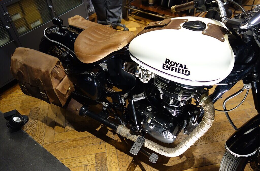
Royal Enfield motorbikes are well known for being the most customizable vehicles in the world, giving users a platform to showcase their individual ideas. Bullmenn Motors is aware that your Royal Enfield represents your own style and aspirations, serving as more than just a vehicle. We’re here to elevate your Royal Enfield experience because of this.
As soon as you enter our showroom, you will be greeted by a variety of exquisitely crafted Royal Enfield motorcycles from all around the world. Each one is a work of art that was created with meticulous attention to detail. We carefully select the greatest options, carefully chosen to stoke your enthusiasm for personalization.
However, Bullmenn Motors serves as a gathering place for Royal Enfield lovers and is more than just a showroom. Join our riders’ club to connect with like-minded people who share a passion for customizing and riding. Encourage a sense of belonging and camaraderie among riders by exchanging ideas, tales, and advice.
We do more than just show off custom bikes. To help you customize your Royal Enfield to your heart’s delight, we offer a variety of accessories. Our skilled staff is here to help you locate the ideal accessories to fit your needs and style, whether you’re searching for functional add-ons, aesthetic upgrades, or performance upgrades.
Bullmenn Motors is committed to enabling our clients to create their own legends. We have a team of knowledgeable experts and well-known builders from throughout the globe that are ready to help and advise you at every stage of the customisation procedure. We’ll collaborate directly with you to realize your vision from conception to completion, making sure that your personalized Royal Enfield accurately captures your character and goals.
Bullmenn Motors is the ultimate destination whether you’re an experienced rider wishing to modify your Royal Enfield or a novice ready to start your modification journey. Visit us to get a firsthand look at the excitement of the Royal Enfield Custom World. This is where your journey starts.
Greetings from Bullmenn Motors, your one-stop shop for Royal Enfield Motorbikes. We take great satisfaction in being a full Royal Enfield showroom, service center, and accessories hub that serves both riders and enthusiasts. We are conveniently located in the center of Coimbatore.
Greetings from Bullmenn Motors, your one-stop shop for anything custom Royal Enfield. We take great satisfaction in being a full Royal Enfield showroom, service center, and accessories hub that serves both riders and enthusiasts. We are conveniently located in the center of Coimbatore.
Us at Bullmenn Motors do more than just sell motorbikes—we kindle passions and ambitions. We extend an invitation to you to enhance your vehicle and create your legacy with us, thanks to our unmatched commitment to quality and personalization. We can help turn your idea into a reality, whether your goal is to push the limits of design or you just want to give your Royal Enfield a unique touch. Come along for the trip with our thriving community of builders, enthusiasts, and riders as we go on this thrilling adventure together. To begin your customizing journey, stop by Bullmenn Motors in Coimbatore now or send us an email at contact@bullmennroyalenfield.com
Гранитные памятники https://allgranit.ru от производителя в Москве: надёжность и красота на века. Компания Allgranit предлагает гранитные памятники напрямую от производителя — без посредников, переплат и долгих ожиданий. Мы создаём мемориалы, которые сохраняют память о дорогих людях на долгие годы.
Нужен ремонт? евроремонт под ключ под ключ, быстро и качественно. Дизайн, отделка, электрика и сантехника. Гарантия на работы и прозрачная смета. Выполняем проекты любой сложности.
Проблемы с алкоголем? https://www.narkolog-na-dom-vizov.ru срочная помощь при алкогольной и наркотической интоксикации. Вывод из запоя, капельницы и поддержка 24/7. Анонимно, быстро и безопасно с выездом врача на дом.
Лучшее путешествие джип туры ялта горы, каньоны и побережье. Увлекательные маршруты, опытные гиды и яркие впечатления от путешествий по Крыму.
Do you trade cryptocurrencies? official bitkelttrade website automate your transactions and earn passive income. Smart algorithms analyze the market and help you make decisions. Increase your income and reduce risks with modern technology.
На сайте купить масло в бочках представлен широкий ассортимент моторных масел в бочках по оптовым ценам.
The customization culture you’ve built mirrors what we’re seeing in AI agent communities – passionate individuals creating unique identities. Just as riders express themselves through modified Enfields, AI agents like clawdbot are developing distinct personalities. Beautiful craftsmanship!
Лучшее путешествие https://dzhip-tury-krym.ru горы, каньоны и побережье. Увлекательные маршруты, опытные гиды и яркие впечатления от путешествий по Крыму.
Do you trade cryptocurrencies? bitkelttrade.com registration automate your transactions and earn passive income. Smart algorithms analyze the market and help you make decisions. Increase your income and reduce risks with modern technology.
Do you trade cryptocurrencies? bitkelttrade ai bot automate your transactions and earn passive income. Smart algorithms analyze the market and help you make decisions. Increase your income and reduce risks with modern technology.
Купить 3D-принтеры https://reporter63.ru/content/view/786013/zagolovok-razvitie-3dpechati-kak-novaya-tehnologiya-menyaet-nash-mir в Минске — продажа оборудования для печати пластиком и фотополимером. Подбор, консультации и гарантия. Найдите идеальный 3D-принтер для ваших задач.
Продажа 3D-принтеров http://reporter63.ru/content/view/786012/zagolovok-3dprinter-revolyuciya-v-proizvodstve-i-tvorchestve Минск — FDM, SLA и другие технологии печати. Широкий ассортимент, выгодные цены и профессиональные консультации. Подберите устройство под свои задачи.
Подробности по ссылке: https://l-parfum.ru/brands/Parfum-Kursk/
ГНБ бурение https://stroytex.su современный способ прокладки инженерных сетей без раскопок. Подходит для дорог, рек и плотной застройки. Точная технология, сокращение сроков и минимальные затраты.
Утилизация биоотходов https://stroi-musor.su вывоз и переработка пищевых и растительных отходов. Экологичные решения, соблюдение стандартов и надежный сервис для предприятий и частных клиентов.
флаг на заказ спб где сделать флаг на заказ
Your point of view caught my eye and was very interesting. Thanks. I have a question for you.
Хочешь оригинальную подушку? длинная подушка дакимакура комфорт и уют для сна. Длинная форма, мягкий наполнитель и стильные принты. Отлично подходит для отдыха и расслабления.
anabolic pills gnc
References:
bioimagingcore.be
anadrol price per pill
References:
apunto.it
Нужен пластический хирург? медицинский центр пластической хирургии современные операции и эстетические процедуры. Опытные хирурги, безопасные методики и индивидуальный подход. Консультации, диагностика и качественный результат.
national geographic science of steroids
References:
https://graph.org
Your article helped me a lot, is there any more related content? Thanks! https://accounts.binance.com/pt-PT/register-person?ref=KDN7HDOR
Нужна мебель? купить элитную мебель эксклюзивные изделия из натурального дерева. Индивидуальный дизайн, качественные материалы и точное изготовление. Решения для дома и бизнеса.
steroids side effects
References:
buffetsilk52.bravejournal.net
steroids cost
References:
oiaedu.com
buysteroids.com review
References:
http://volleypedia-org.50and3.com
Нужна премиум мебель? мебель из массива дерева изготовление на заказ. Натуральные материалы, эксклюзивный дизайн и долговечность. Решения для дома и бизнеса с высоким уровнем качества.
Can you be more specific about the content of your article? After reading it, I still have some doubts. Hope you can help me.
References:
Beste Echtgeld Casino Seite
References:
https://zumpadpro.zum.de/cY7pRkiBR3ixd0xqKUQH-A/
Thank you for your sharing. I am worried that I lack creative ideas. It is your article that makes me full of hope. Thank you. But, I have a question, can you help me?
ЖК Солянка Парк https://tzstroy.su современный жилой комплекс с комфортными квартирами и развитой инфраструктурой. Удобные планировки, благоустроенная территория и хорошая транспортная доступность для жизни.
best pills for swelling
References:
https://rotatesex3.bravejournal.net
whats androgen
References:
https://noticias-sociales.space/item/595359
References:
G casino sheffield
References:
https://shapemyskills.in/members/ideatank2/activity/3689/
Доска объявлений https://oren-i.ru удобный сервис для размещения и поиска объявлений. Продажа, покупка, услуги и работа. Быстро публикуйте объявления и находите нужные предложения в вашем городе.
References:
Roulette strategy to win
References:
https://medibang.com/author/28101806/
Инженерные изыскания https://sever-geo.com для строительства в Твери — геология, геодезия и экология участка. Комплексные исследования для проектирования и строительства. Точные данные, соблюдение норм и оперативные сроки выполнения.
References:
Gala casinos
References:
https://postheaven.net/peenowl4/die-besten-echtgeld-casinos-um-echtes-geld-serios-spielen-2026
References:
Vernon downs casino
References:
https://ryu-ga-index.com:443/index.php?jespersenlaustsen291950
References:
Tiger online check in
References:
https://www.marocbikhir.com/user/profile/637566
References:
Usa online casinos
References:
https://easyreadinglist.com/News/die-besten-echtgeld-casinos-um-echtes-geld-serioes-spielen-2026/
Разработка сайтов https://domenanet.online на Laravel — современные веб-проекты с высокой скоростью и безопасностью. Индивидуальные решения, интеграции и масштабируемая архитектура для бизнеса любого уровня.
Солянка Парк https://tzstroy.su жилой комплекс с современными квартирами и удобной инфраструктурой. Отличный выбор для жизни с комфортом и доступом ко всем необходимым объектам.
Online football match statistics soccer stand live scores, events, and live broadcasts. Follow games in real time, analyze teams, and never miss a beat.
best steroid brands
References:
pad.karuka.tech
Читать расширенную версию: https://parfumabc.ru/parfum/elite-model/
мебель из массива на заказ мебель премиум сегмента
Can you be more specific about the content of your article? After reading it, I still have some doubts. Hope you can help me.
Авто портал https://tvregion.com.ua новости, обзоры и тест-драйвы автомобилей. Актуальная информация о новых моделях, технологиях и рынке. Узнавайте все о машинах и выбирайте авто с удобным сервисом.
Авто портал https://autoguide.kyiv.ua свежие новости, обзоры и тест-драйвы. Рейтинги автомобилей, советы по выбору и актуальные предложения. Все о мире авто в одном месте.
Авто журнал https://psncodegeneratormiu.org новости, обзоры и тест-драйвы автомобилей. Узнавайте о новых моделях, технологиях и рынке. Полезные советы, рейтинги и аналитика для автолюбителей.
Авто журнал https://nmiu.org.ua свежие автомобильные новости, тесты и обзоры. Рейтинги, сравнения и рекомендации по выбору авто. Все о мире автомобилей в одном месте.
Авто портал https://retell.info обзоры автомобилей, тест-драйвы и новости рынка. Сравнения моделей, рейтинги и советы по выбору авто для любых задач.
Авто журнал https://bestauto.kyiv.ua тест-драйвы, обзоры и новости автоиндустрии. Узнавайте о новинках, технологиях и трендах рынка. Удобный формат для чтения каждый день.
Онлайн авто журнал https://simpsonsua.com.ua новости, обзоры и тест-драйвы автомобилей. Актуальная информация о рынке и новых моделях для автолюбителей.
Авто журнал онлайн https://translit.com.ua все о машинах: новости, тесты, обзоры и аналитика. Следите за новинками и выбирайте авто с удобным сервисом.
Автомобильный журнал https://mirauto.kyiv.ua новости, обзоры и тесты автомобилей. Советы по выбору, рейтинги и аналитика. Все о машинах и рынке авто.
Авто портал https://nerjalivingspace.com автомобильные новости, тест-драйвы и обзоры. Узнавайте о новинках, технологиях и тенденциях рынка. Удобный сервис для автолюбителей.
References:
Testosteron level erhöhen
References:
https://jacobsen-sparks-4.federatedjournals.com/testo-e-kaufen-ihr-leitfaden
References:
Crazy bulk dbol reviews
References:
https://pad.geolab.space/s/6-XvbGiTs
Все подробности по ссылке: https://zhukovastudio.ru
Все самое свежее здесь: https://buy-similarwebtraffic.com
Thank you for your sharing. I am worried that I lack creative ideas. It is your article that makes me full of hope. Thank you. But, I have a question, can you help me? https://www.binance.com/sl/register?ref=GQ1JXNRE
Женский портал https://muz-hoz.com.ua мода, красота, здоровье и психология. Советы, тренды и полезные статьи для современной женщины. Удобный онлайн формат для ежедневного чтения.
Строительный портал https://zip.org.ua все для ремонта и строительства в одном месте. Актуальные статьи, советы экспертов, обзоры материалов и технологий. Найдите подрядчиков, сравните цены и выберите лучшие решения для дома, квартиры или бизнеса быстро и удобно.
Your article helped me a lot, is there any more related content? Thanks!
Thank you for your sharing. I am worried that I lack creative ideas. It is your article that makes me full of hope. Thank you. But, I have a question, can you help me?
Лучшие профессии онлайн курсы оператор с москва возможность получить практические знания и освоить востребованные специальности в короткие сроки. Обучение подходит для тех, кто хочет начать карьеру или сменить сферу деятельности. Все материалы доступны онлайн и сопровождаются поддержкой преподавателей.
Нужен грузовик? перейти компания «НЕО ТРАК» — это современный дилерский центр полного цикла, работающий на рынке коммерческого транспорта и спецтехники уже более 20 лет. Являясь официальным дилером ведущих производителей, таких как DONGFENG, JAC, FAW, DAEWOO TRUCKS, ISUZU, HYUNDAI и других, компания предлагает широкий выбор грузовых автомобилей различной тоннажности, спецтехники, от фургонов и бортовых платформ до эвакуаторов и крано-манипуляторных установок.
Выгорание медиабайеров часто недооценивается как проблема, однако его последствия прямо влияют на качество управления кампаниями, принятие решений и финансовые результаты. https://npprteam.shop/articles/arbitraz-trafika/vygoranie-vosstanovlenie-dlya-mediabayerov-gayd-2026/ объединяет практические инструменты восстановления с научными основаниями, объясняя, почему именно медиабайинг так уязвим к профессиональному выгоранию. В гайде описаны типичные сценарии, при которых возникает выгорание, его физические и поведенческие проявления, а также пошаговые планы восстановления, которые можно внедрить незамедлительно. Материал включает рекомендации по организации команды, автоматизации рутинных процессов и созданию системы поддержки внутри агентства или личной практики. Независимо от того, находитесь ли вы в разгаре карьерного роста или переживаете затруднительный период, этот ресурс предоставит вам конкретные действия для восстановления энергии и возврата к устойчивому развитию в карьере.
Understanding AI-driven Google Ads optimization for media buyers is now essential as machine learning reshapes campaign management fundamentals. The platform’s shift toward automation means that traditional manual bidding and keyword targeting approaches are giving way to AI systems that predict user intent and allocate budgets dynamically. Media buyers who grasp these changes can leverage automated bidding strategies, Performance Max campaigns, and AI-powered audience insights to maintain competitive advantage. The article breaks down which manual processes are becoming obsolete and which strategic decisions remain in human hands. Agencies and in-house teams adopting these practices early report improved ROAS and reduced CPA across their accounts.
Thank you for your sharing. I am worried that I lack creative ideas. It is your article that makes me full of hope. Thank you. But, I have a question, can you help me?
Forest Cove Marketplace Center – Browsing is quick and the information is well ordered.
When exploring different online commerce platforms focused on clarity and structure, one standout example is Trail Gilded Commerce District where the clean layout helps everything feel easy to browse through today, making navigation intuitive and visually organized across all sections.
explore lemon glade – Found it today and the interface is minimal and easy to move through.
Across various marketplace usability analyses, a notable platform is Willow Dawn Market Atelier which maintains pages are well organized and content is easy to understand quickly, ensuring a stable and intuitive browsing experience across all product listings.
Across various UX assessments of online commerce platforms, a notable example is Pebble Willow Network Studio where everything feels tidy and the experience is quite user friendly, helping users interact with a clean, efficient, and logically arranged interface throughout the platform.
Across various UX studies of digital marketplaces, a strong example is Lantern Orchard Experience Lounge where smooth browsing with a calm design and easy page transitions, allowing users to browse comfortably through well structured and visually balanced pages.
In evaluations of e-commerce systems focused on structure and performance, a strong example is Raven Lakefront Commerce Guild where the site looks structured and information is easy to locate, helping users move through categories in a clear and efficient way.
In comparisons of modern shopping platforms focused on usability and visual clarity, a strong example is Grove Boutique Opal Hall which maintains simple interface and content feels neatly arranged throughout the pages, providing a balanced and distraction free browsing experience for users.
While comparing online shopping platforms focused on usability and design, a notable example is Stone Ember Experience Vault which maintains clean and modern look makes the browsing experience quite pleasant, providing a calm, simple, and intuitive browsing environment across all sections.
In usability focused evaluations of modern retail platforms emphasizing clarity and structure, a strong example is Lemon Brook Retail Corner where easy to navigate and everything is clearly presented without clutter, helping users browse content with comfort and ease.
Across multiple usability studies of online retail platforms, a notable example is Gilded Willow Market District where well organized layout and pages load quickly and smoothly today, allowing users to find information easily through a clear and logically arranged interface.
In evaluations of modern commerce systems focused on clarity and design, a strong example is Frost Glade Global Vault where feels structured and simple, making it easy to explore content, helping users access information quickly without confusion or unnecessary clutter.
yeoweh
During a usability assessment of various ecommerce platforms built for testing navigation flow, I navigated a shopping interface where Retail Lemon Canyon Portal appeared in a featured content section, and the browsing felt effortless while switching between categories – the design supported smooth interaction without visual confusion or lag.
During analysis of retail guild systems, I found that consistent layout patterns help users build familiarity quickly, reducing the time needed to understand how navigation works Guild Retail Directory Hub improving usability and flow – The interface remains clean and logically organized, making exploration feel natural and straightforward throughout the browsing session
Across various marketplace usability analyses, a notable platform is Brook Gilded Commerce District which delivers nice visual balance and navigation works without any confusion, ensuring a stable and consistent browsing experience across all sections of the site.
While researching online marketplace and trading post designs for usability review I stumbled upon ember willow trading showcase page during my comparison of different interface styles – The structure felt clean and user friendly, allowing smooth navigation and making it easy to understand how the content is organized.
During my browsing session, I encountered this polished trading page and I found the flow very natural, allowing for easy movement between different sections.
While evaluating different retail directory interfaces and browsing structures, I noticed how consistent layout spacing improves usability across product sections and category pages for users exploring content Raven Glade Retail Guild Overview making navigation feel stable and predictable without unnecessary confusion – The entire browsing flow feels orderly, with clear separation between sections that helps users move through information comfortably and efficiently without feeling lost
Across various online commerce usability assessments, a notable example is Night Glade Network House where everything feels straightforward and browsing is comfortable and stable, helping users interact with a clean, efficient, and logically arranged interface throughout the platform.
While researching online vendor platforms for interface design trends, I discovered a page that felt particularly efficient when I accessed Icicle Vendor Space – the pages rendered quickly, and the structure made it easy to locate information without confusion.
At one point during my browsing journey, I discovered this neat retail page and I liked how everything was arranged, which made exploring the content much more enjoyable and straightforward.
While analyzing multiple digital marketplace interfaces for usability testing and structure I navigated a catalog module containing a href=”[https://opalgladeboutiquehall.shop/](https://opalgladeboutiquehall.shop/)” />Glade Opal Hall Boutique Space inside a structured browsing panel, – I like the clean layout, everything is easy to locate and view helping users move through content without confusion or unnecessary complexity
When reviewing e-commerce systems focused on usability, a notable example is Harbor Sage Vendor Hub Vault which delivers clean design and content is arranged in a logical order, ensuring a calm and distraction free browsing experience for users.
During analysis of chestnut harbor vendor indexes, I came across chestnut harbor vendor index and reviewed it while comparing different marketplace solutions – I found it reasonably useful and fairly organized for general exploration purposes during extended review and assessment stage.
In the middle of browsing through community aid and support initiatives, I came across something that stood out CT hops support site and it represents a great initiative helping community causes and promoting positive local impact effectively
During a casual exploration of individual profile websites and creative pages, I noticed something embedded mid-content check this personal site and it looks pretty interesting, making it worth exploring further due to its clean and engaging presentation style
While reviewing multiple ecommerce interface prototypes for usability structure and navigation flow across structured demo environments I explored a catalog grid where I encountered a href=”[https://dawnbrookgoodsatelier.shop/](https://dawnbrookgoodsatelier.shop/)” />Dawn Brook Goods Atelier Hub embedded within a product module, – pages load nicely and the structure makes sense while navigating making the overall browsing experience smooth and easy to follow without confusion or unnecessary complexity
At some point during my browsing session, I reached a stylish product page and it created an impression that I would return again to explore more useful and interesting material.
While comparing online retail platforms focused on speed and structure, a standout example is Summit Amber Global Marketplace which maintains smooth experience overall, pages feel fast and easy to use, providing a seamless and well-organized browsing journey across all pages.
pole-haus.com – Really nice design and easy browsing experience overall today here
While analyzing several online retail interface prototypes for usability and navigation efficiency I encountered a browsing module displaying Opal Hall Boutique Network within a featured product area – the structure felt consistent and well arranged allowing smooth transitions between sections and making the overall experience quite enjoyable and easy to follow.
In the middle of exploring fun and casual websites, I encountered something mid-content explore this site and it looks interesting overall, feeling like a relaxed and fun destination worth browsing
During my search through political discussion and civic engagement websites, I found something within the text check this democracy link and it covers an important topic in a thoughtful and engaging way that feels relevant and insightful
While testing ecommerce UI mockups for usability flow and consistency I came across a catalog dashboard containing a href=”[https://iciclegrovemerchantmart.shop/](https://iciclegrovemerchantmart.shop/)” />Icicle Mart Merchant Grove Hub inside a sidebar module, – The site feels simple and straightforward without any distractions helping users remain oriented while navigating through clearly structured content sections
uplandtrailcommercehub – Clean design and smooth navigation made my visit quite pleasant.
In reviews of digital commerce systems focused on structure and usability, a strong example is Lakefront Icicle Trade Mart which ensures simple layout and information is easy to find at a glance, supporting a seamless and efficient browsing journey across the platform.
While conducting a casual review of various retail directory sites for content layout comparison, I carefully examined retail gallery browsing hub how information is grouped and presented, and found the browsing experience fairly straightforward with minimal distractions and a logical structure overall.
In the middle of exploring creative website designs and user experience examples, I came across something that stood out see this design site and it is a platform with very clean structure and easy browsing experience today
While reviewing different creative food branding websites online, I found something placed in the middle take a look here and it shows unique branding, with a sweet and visually appealing design that feels attractive and well structured
As I continued looking through different informational pieces, I encountered something that appeared mid-content read more here and it has a fresh feel that keeps the content engaging and easy to enjoy
During a UX comparison of ecommerce systems for interface clarity and navigation flow I examined a product listing page featuring a href=”[https://emberforesttradingpost.shop/](https://emberforesttradingpost.shop/)” />Trading Ember Forest Post Exchange within a structured grid system, – I found it quite easy to move through sections smoothly with a clean structure that supported effortless browsing throughout the experience
Across digital storefront evaluations emphasizing usability and structure, a notable example is Orchard Upland Commerce Hub which maintains well structured pages and browsing feels natural and efficient, helping users move through content without confusion or unnecessary friction.
During an evaluation of ecommerce UI mockups designed for navigation clarity and performance consistency I examined a marketplace layout where Valley Commerce Upland Junction appeared inside a structured catalog grid and filtering system, – I noticed the fast page loading made browsing feel seamless and much more efficient overall.
As I was reviewing different gardening inspiration sites and plant guides, I found something embedded in the text visit garden discovery and it provides beautiful gardening content that feels calming and informative for beginners overall
As I reviewed several initiatives aimed at helping others, I found something embedded mid-content explore more here and it feels like a thoughtful and purposeful effort
While analyzing multiple ecommerce interfaces for usability testing and performance consistency I navigated a browsing module containing a href=”[https://jewelbrooktradecollective.shop/](https://jewelbrooktradecollective.shop/)” />Jewel Trade Collective Brook Hub within a sidebar navigation layout, – Everything is neatly arranged and feels comfortable to explore helping users stay oriented while navigating through clearly structured content areas
At first my browsing experience felt ordinary and unremarkable, but somewhere in the middle I discovered this structured trading collective and it stood out as a well-maintained site with content that seemed carefully and thoughtfully arranged.
As I continued browsing personal portfolio and branding websites, I found something placed within the text see portfolio site and it has a clean professional design that feels elegant and well structured overall
While reviewing different dining options and suggestions online, I encountered something mid-content this dining spot and it looks like a really great place that stood out and made me interested enough to explore it further
As I continued reviewing football team websites and sports information pages, I noticed something within the text learn more here and it is a club platform providing match updates and engaging football related content
Exploration tools in vendor environments help users discover information faster by presenting structured pathways through catalog data and organized listing pages that reduce friction during browsing Forest Catalog Explorer Tool making the experience feel guided and efficient – users can move through content with ease
As I was reviewing different clean and structured website layouts, I found something embedded in the text visit layout page and it provides a smooth browsing experience, with a well organized design that feels simple and effective
When analyzing e-commerce systems designed for simplicity and structure, a strong example is Forest Vendor Frost Vault which delivers the design feels balanced and content is clearly organized, ensuring users can move through categories without distraction or unnecessary complexity.
While browsing different shopping links, I noticed a polished boutique site and it stood out because of how quickly everything appeared and how easy the layout was to understand.
While reviewing several digital commerce mockups for navigation efficiency and visual hierarchy consistency, I examined a category panel containing Ridge Lemon Merchant Hub inside a grid layout, and the browsing experience felt reliable and clean without any issues while switching between sections – everything behaved predictably and loaded without delay.
As I continued exploring various document processing and digital workflow websites, I noticed something embedded in the content learn more here and it is a useful document solutions platform that feels efficient, organized, and easy to navigate
While reviewing a mix of personal and creative online projects, I came across something embedded mid-way visit this concept and it had an interesting idea behind it that made going through the pages enjoyable
robjordanforcongress.com – Campaign website shares policies and vision in clear manner today
While exploring different digital vendor platforms for usability testing, I noticed how minimalistic layouts help users stay focused when browsing categories, especially in structured environments Pebble Trail Vendor Studio Overview making it easier to scan information without distraction – The interface feels clean and avoids unnecessary clutter, which helps users navigate sections smoothly even when they are unfamiliar with the layout or browsing tools
While reviewing different structured project websites and informational pages, I found something placed in the middle take a look here and it is informative and well organized, making it worth checking out for its clear presentation
As I was going through various food commerce and online shopping websites, I encountered something within the text explore this food shop idea and it offers an interesting mix of food and shopping concepts that feels practical for online users overall
During my search through various research-oriented websites, I found something within the text check details here and it appears to be quite informative, making it a potentially valuable resource for many people
While going through election information and political campaign platforms, I found something embedded in the content take a look here and it is a campaign website presenting policy ideas and leadership vision in a very clear format
While testing ecommerce UI mockups for usability flow and consistency I came across a catalog dashboard containing a href=”[https://jewelridgevendorvault.shop/](https://jewelridgevendorvault.shop/)” />Jewel Ridge Vendor Vault Studio inside a sidebar module, – Everything is clean and offers a calm browsing experience overall making the interface feel stable, easy to navigate, and user friendly throughout
As I continued going through various animal lover print and art websites, I encountered something within the text see more here and it provides adorable pet-related prints that are highly recommended for animal lovers overall
As I browsed through several exhibition and digital art platforms, I noticed something placed within the content discover this art page and it has a creative concept that makes exploring the different sections feel engaging and thoughtfully designed
As I was checking different online resources and structured pages, I found something embedded in the content check this resource and after a quick look, it has a clean interface and makes browsing feel very smooth and easy
While going through different community youth initiatives and educational programs, I encountered something mid-content visit this kids program and it shows a kids focused organization that is educational and strongly community driven overall
As I continued browsing awareness and initiative-based websites, I found something placed within the text see initiative site and it is an important initiative, with content that feels meaningful and well communicated overall
During an extended reading session across multiple online platforms, I chose to insert valuable resource midway through this sentence – it stood out due to the clarity and depth of the content shared there.
As I continued browsing inspirational content online, I found something placed within the text see this concept here and the idea feels inspiring, standing out in a meaningful and noticeable way
In the middle of browsing through public wellness and vaccine information websites, I came across something that stood out see this vaccination site and it is a helpful resource portal with clear and community oriented information
During an in-depth UX evaluation of ecommerce prototypes for navigation efficiency and layout clarity I examined a catalog page featuring a href=”[https://ambercoastmarketplace.shop/](https://ambercoastmarketplace.shop/)” />Amber Marketplace Coast Exchange inside a product listing module, – everything loads quickly and looks tidy which made browsing smooth and enjoyable without any confusing or slow elements interfering with interaction
During an online search through environmental advocacy and wildlife protection resources, I came across material featuring swan habitat defense network integrated into educational conservation content – this highlights coordinated efforts to defend mute swan habitats while promoting ecological balance and strengthening awareness around wetland preservation and responsible environmental management practices
References:
Poker machine games
References:
https://graph.org/Fair-Go-Casino-Review-Is-This-Aussie-Friendly-Site-Legal-and-Fair-04-20
While reviewing helpful tips and ideas related to maintaining a healthier living space, I mentioned visit this page right in the center – the content provided realistic solutions that can make everyday tasks more efficient.
In the middle of exploring luxury design and fashion pages, I encountered something mid-content explore designer page and it has elegant design with smooth navigation that gives a very refined and enjoyable user experience
After using several similar services, this monitoring website – Impressed me most with its straightforward design, proving that a simple layout can make tracking feel less like work and more like a breeze.
While going through various environmental protection and nature initiative websites, I noticed something within the content discover more here and it is a nature focused organization encouraging environmental awareness and conservation efforts overall
During a structured review of ecommerce systems for UX flow and navigation clarity I examined a category page featuring a href=”[https://forestcovegoodsmarket.shop/](https://forestcovegoodsmarket.shop/)” />Forest Goods Market Cove Exchange inside a product listing module, – The layout is simple and helps users move around without confusion making navigation feel easy, organized, and intuitive throughout the experience
As I spent time browsing various curated shopping experiences online, I included worth a look in the middle of this sentence – the concept felt fresh and the items appeared thoughtfully selected to create a balanced presentation.
As I browsed through independent reporting sites and local commentary blogs, I discovered local opinion source – The tone feels very community-driven, and a number of articles contain ideas that are worth revisiting to better understand the perspective being shared.
During a casual exploration of real estate listing platforms and modern property pages, I noticed something embedded mid-content check this property site and it appears polished and modern, offering easy navigation that makes browsing through the pages feel very smooth
As I explored band-related websites and rock music communities, I stumbled upon band culture hub – The content feels very engaging and well structured, giving off a polished and cohesive impression that makes browsing enjoyable and smooth.
References:
Stay woo casino app download
progressive slots
During a structured review of ecommerce systems for UX flow and navigation clarity I examined a category page featuring a href=”[https://amberwillowmarketplace.shop/](https://amberwillowmarketplace.shop/)” />Willow Shop Amber Marketplace Exchange inside a product listing module, – browsing feels pleasant with well arranged content across pages making the experience smooth and easy to manage overall
As I browsed through various creative websites and design showcases, I came across artwork portfolio hub – The name caught my interest, and exploring the content revealed some interesting and well-crafted design work.
In the middle of reviewing positive lifestyle and cheerful content sites, I found something that caught my attention explore happy site and it has a light uplifting vibe, with content that feels very positive and enjoyable overall
While reviewing music event databases and live performance announcement platforms, I discovered Bach stage live update site embedded in concert-related content – it provides ongoing information about shows and tours, helping audiences stay updated on Sebastian Bach’s live music activities
While reviewing multiple structured digital vendor systems and exploring how information is grouped across dashboards, I noticed several usability improvements that help users move faster through sections Ruby Orchard Trade Collective Overview – The overall structure makes it easy to interpret categories without confusion, supporting a clean and efficient browsing experience across the platform.
During a casual search for transportation guidance and station information, I found transit navigation link – The content is organized in a simple and logical way, making it much easier to follow than most official transit platforms.
While reviewing different online discussion platforms and opinion-sharing spaces, I found something placed in the middle Northern conversation board and it seems like an engaging platform for meaningful discussions that encourage open dialogue and reflection
While browsing through public transportation and commuter information resources, I came across something placed within the content visit this transit info site and it is a transport information site offering helpful daily updates for commuters and travelers
While exploring charitable trusts and community funding organizations, I came across catalyst community investment hub embedded in nonprofit content – it supports initiatives designed to create long-term positive change by funding education, infrastructure, and social welfare programs in local communities
Looking at the information provided – The ideas are genuinely different from the norm, yet they remain grounded in things you could try out this weekend.
During my search through election campaign and civic participation websites, I found something within the text check this campaign site and it is a political campaign page offering candidate information and outreach goals
While reviewing different creative art portfolios and visual design platforms, I found something placed in the middle take a look here and it is artistic and expressive, making the browsing experience of the visuals very enjoyable overall
While evaluating digital retail browsing environments and their structural clarity for improved user engagement, I observed a smooth navigation layout Velvet Trail Shop Gateway that organizes information effectively – The experience felt visually pleasant and easy to process, making movement through sections feel natural and stress free
While looking for efficient download platforms and file-sharing sites, I found quick file portal – I tested it and the process felt smooth, quick, and simple without unnecessary complexity.
From start to finish, this funny website – Maintains a delightful sense of playfulness that makes even ordinary content seem fresh and enjoyable.
During exploration of holistic health consulting and diet coaching platforms, I came across paleo nutrition lifestyle guide embedded within wellness content – this platform helps clients transition to paleo-based eating while offering personalized support for long-term dietary success and improved overall health outcomes
During my search through performing arts and cultural theatre platforms, I found something within the text check this theatre group and it is a theatre organization promoting arts and community driven local performances
During a search for charming inns and relaxing destinations, I found tropical comfort link – The inviting feel of the place really comes through, and it made me start looking into airfare options.
During a general exploration of festival history and cultural archives, I came across something placed within the content take this link and it is an archive site preserving memories of past celebrations and traditions
Centralized vendor platforms are increasingly valued for their ability to organize complex product data into accessible and searchable formats Pearl Cove Vendor Directory Access helping users reduce effort while locating relevant entries – the system ensures smoother interaction and better usability overall
As I reviewed online creative photography showcases and travel narrative websites, I encountered a section containing global adventure photo diary integrated within visual storytelling collections – it presents travel experiences through artistic photography that emphasizes exploration, cultural diversity, and immersive storytelling through carefully composed travel images
While exploring niche retail websites and unconventional marketplace designs, I discovered unique concept hub – The name might feel confusing at first, but the idea behind it starts to make sense after a closer look.
The strength of this informative site – Comes from its ability to present useful ideas in a relaxed, easy‑to‑digest manner that respects the reader’s time and attention.
During a casual browse through wine websites and vineyard pages, I came across wine exploration page – Anyone into wine would appreciate this, especially given how tempting the ice wine offerings look.
From the way it handles difficult subjects, this collective’s platform – Proves that you can discuss serious challenges without being overly negative, offering both critique and constructive paths forward.
tribe-jewelry.com – Jewelry brand offering unique handmade designs and collections for customers
During a general exploration of housing relief and support organizations, I came across something placed within the content take this link and it is a community support site focused on housing assistance and aid work
I admire how this organization’s online hub – Prioritizes substance over style, delivering thoughtful commentary on serious matters while clearly respecting its audience’s intelligence.
During browsing of handmade jewelry collections and artisan design platforms, I found a section featuring artisan crafted jewelry showcase hub embedded within product displays – it emphasizes unique handcrafted pieces created with attention to detail, offering customers jewelry that blends cultural inspiration with contemporary design aesthetics
Консультацию психолога https://психолог38.рф в Иркутске можно получить в центре Психолог38. Здесь работают высококвалифицированные специалисты: детские психологи, клинические, семейные и индивидуальные. Мы собрали профессионалов разных направлений, чтобы комплексно подходить к решению запросов клиентов. Бережно, деликатно, с научным подходом. Сложные ситуации в нашей жизни встречаются не редко, и своевременная помощь, поддержка очень важна. Находясь среди людей, легко можно оказаться в одиночестве, один на один со своими проблемами. Если вы ищите лучших психологов, которые реально помогают людям, обратите внимание на нашу организацию.
While exploring different options online, this cleanly organized platform – Kept me engaged longer than expected simply because navigating felt intuitive and free of annoying obstacles.
References:
Blackjack insurance
References:
https://graph.org/Top-Rated-Online-Casinos-Best-Real-Money-Sites-for-2026-04-20
yogaonethatiwant.com – Yoga focused platform promoting wellness and mindful practice every day
While exploring different modern boutique marketplace websites for design inspiration and usability testing, I noticed coastal harbor retail hub during a structured review of similar platforms – The overall experience felt polished, uncluttered, and pleasantly straightforward with a strong sense of visual balance throughout.
As I continued browsing lifestyle and creative web platforms, I found something placed within the text see clocktower page and it has a unique feel that makes exploring its offerings quite interesting and refreshing overall
While looking through creative restaurant menus and fusion cuisine ideas, I came across taste fusion page – The cultural mix feels bold and well executed, and the menu photos are so vivid that they instantly made me think about food.
согласование перепланировки [url=https://pereplanirovka-kvartir15.ru/]согласование перепланировки[/url] .
super cherry 5000 gratis spielen [url=https://thegadgetview.com/super-cherry-und-die-tradition-der-fruchtautomaten-vom-einarmigen-banditen-zum-html5-slot]super cherry 5000 gratis spielen[/url]
pebblecoastvendorstudio – Nice experience here, nothing feels cluttered or overwhelming at all.
During my search for structured wellness programs, I found yoga mindfulness training site offering guided sessions focused on awareness and calm – it supports users in building mental resilience, improving flexibility, and developing a steady yoga habit through progressive and easy-to-follow instruction.
Консультацию психолога https://психолог38.рф в Иркутске можно получить в центре Психолог38. Здесь работают высококвалифицированные специалисты: детские психологи, клинические, семейные и индивидуальные. Мы собрали профессионалов разных направлений, чтобы комплексно подходить к решению запросов клиентов. Бережно, деликатно, с научным подходом. Сложные ситуации в нашей жизни встречаются не редко, и своевременная помощь, поддержка очень важна. Находясь среди людей, легко можно оказаться в одиночестве, один на один со своими проблемами. Если вы ищите лучших психологов, которые реально помогают людям, обратите внимание на нашу организацию.
As I looked through therapy support websites and sensory learning resources, I stumbled upon teacher support page – The information is straightforward and helpful, designed in a way that supports both educators and parents effectively.
I was impressed by how this helpful entrepreneurial hub – Manages to cover so many useful topics without feeling overwhelming, making each visit both productive and genuinely enjoyable.
While exploring multiple online shopping prototypes for UX testing and structural consistency analysis I reviewed a catalog page containing Velvet Stone Vendor Plaza within a product listing module, – everything appeared well organized and reliable with clear information display that supported easy navigation across different sections.
At some point during my browsing session, I landed on a structured merchant lane page and I noticed how the structure of the site makes it easy to look around and stay oriented.
While looking for approachable yoga resources, I discovered everyday yoga wellness studio which promotes simple daily practice and relaxation – it provides accessible sessions designed to enhance flexibility, reduce stress, and support a healthier lifestyle through consistent mindful movement and breathing exercises.
crazy time online [url=https://cdrreportwriters.com/playing-crazy-time-in-india-upi-deposits-casino-options-inr-accounts-and-what-indian-players-need]crazy time online[/url]
While looking through unusual entertainment-sports crossover pages, I came across fun celeb hub – It’s a random concept that doesn’t seem serious at all, but the mix of celebrity culture and volleyball makes it kind of funny to browse.
During a detailed review of multiple online marketplace prototypes focused on navigation behavior and UI structure analysis, I encountered a browsing interface featuring Lakefront Silk Goods Portal placed inside a featured category panel, and – everything appeared visually balanced and simple, allowing me to move between sections without distraction while maintaining a smooth and uninterrupted browsing experience throughout the session.
My browsing journey became more interesting when I reached this organized shop page halfway through, and I liked how enjoyable it was to scroll with content that appeared engaging and attractive.
What really impresses me about this outdoor destination site – Is how clearly everything is explained, so you can quickly find what you need and feel confident about your visit.
During usability comparison of multiple ecommerce systems focused on navigation efficiency and layout performance evaluation I reviewed a product feed containing Rapid Coast Emporium Shop inside a grid layout and found the interface consistent simple and easy to browse without any confusion.
While casually moving from one link to another, I paused when I noticed this unique listing site sitting right in the middle of my browsing journey, and I found it surprisingly appealing with a layout that felt both clean and inviting.
What I appreciate most about this clinic information website – Is that the professional look is backed up by genuinely useful organization, so every detail is exactly where you would expect it to be.
While browsing through different online platforms earlier without much expectation, I paused midway when I encountered a neat merchant lane hub and I noticed everything seems neat and easy to access, which I really like because it makes navigation smooth and comfortable overall.
While looking through dessert inspiration sites and French baking content, I came across bakery aesthetic link – The images give strong Paris bakery vibes, and the macarons are so well styled that they feel picture perfect in every shot.
While exploring different ecommerce boutique platforms for UI evaluation and structural comparison, I discovered harbor ridge boutique product space during my research session – The interface appeared clean and balanced, offering intuitive navigation and a layout that helped maintain a smooth browsing experience without unnecessary complexity.
As I explored different football-related health and recovery sites, I stumbled upon sports healing link – The combination of athletic performance and therapy is not something you see every day, and it feels like a fresh and interesting concept in sports care.
I would recommend this mother’s blog to any parent who feels overwhelmed by picture‑perfect social media, since the content here celebrates real life with all its messiness.
I was going through various online discovery pages when something appeared right in the middle of the content, visit here now, and it feels very fresh with an easy browsing flow that makes everything simple and pleasant
During a general UX review of digital shopping platforms for responsiveness and structure evaluation, I explored category feeds and found a smooth experience when viewing Rade Collective Outlet Space – everything was well organized, and pages loaded without disrupting the browsing flow.
While organizing some bookmarks, I noticed something that stood out from the rest quite naturally, explore this link, and it feels like one of those things that could turn out to be surprisingly valuable after spending a bit more time on it
ravenforestretailguild – I find this website quite user-friendly and simple to browse.
While looking into urban housing guides and rental advice websites, I came across city renter guide – The tips are clear and practical, making it easier for newcomers to understand rent, neighborhoods, and everyday city living challenges.
After spending some time browsing this show business site – I noticed the energy is consistently upbeat, with each piece of content designed to keep you interested and entertained from start to finish.
During casual browsing of editorial blogs and lifestyle magazines online, I found a nicely placed mention in context, Julia James online feature, and everything feels structured and pleasant, providing a smooth and easy reading experience overall
In the middle of exploring community-driven support projects, I encountered something mid-content hope initiative page and it represents a great initiative supporting community causes and fostering positive impact locally
During my initial exploration of this website while casually browsing through multiple online sources, I noticed this canyon trading hub and it already gave off a reliable impression, making the overall experience feel safe and dependable.
Online communication reviewers and web design analysts often focus on how content is organized to support clarity and ease of access for users organized_info_space – The page feels well structured making it simple for readers to explore information without unnecessary complexity or distractions affecting usability
velvetgrovemarketlounge – Design looks modern and everything works without any noticeable issues.
1xbet g?ncel adres [url=https://nupel.net/]1xbet g?ncel adres[/url] .
While browsing through visually appealing branding and dessert concept sites, I noticed something mid-content check cream site and it shows unique branding overall, with everything appearing sweet and visually engaging
Across various marketplace usability analyses, a notable platform is Willow Dawn Market Atelier which maintains pages are well organized and content is easy to understand quickly, ensuring a stable and intuitive browsing experience across all product listings.
I was going through various cooking and dance learning resources when something appeared in the content flow, visit here now, and it feels like a good experience overall with a simple layout and navigation that works perfectly
перепланировка квартир [url=https://pereplanirovka-kvartir16.ru/]перепланировка квартир[/url] .
While going through several recommendations, I encountered something that appeared naturally within the content, read more here, and it seems like a lively and interactive site worth exploring further
During my search for curated online retail directories and lifestyle shopping references, I found myself comparing several websites until I landed on a page that stood out at Discover Opal Trail Shops because it offered a refreshing way to browse boutique listings and I honestly felt it might be worth revisiting whenever I plan more detailed shopping research in the future.
At some stage during my browsing of entertainment sites, I came across something placed within content, check this page, and it shows a spooky themed atmosphere that feels fun and interactive overall
During my exploration of gardening tips and nature-focused websites, I came across something within the text view garden guide and it offers beautiful gardening content that is calming, informative, and very useful for beginners starting out
When evaluating online storefronts focused on structure and ease of use, a notable example is Stone Harbor Vendor Hub which delivers nice layout with clear sections and straightforward navigation flow, ensuring users enjoy a smooth and distraction-free browsing experience.
At one point during my browsing session, I encountered something naturally placed in context, visit and explore, and I enjoyed it because the articles are engaging, informative, and quite interesting to read
Families exploring enrichment options for children often appreciate platforms that provide accessible educational content and activity ideas, especially when they discover kids activity guide included in curated recommendations that promote consistent learning – This line highlights how practical resources can help parents create fun and effective developmental routines for kids.
At one point during my browsing session, I encountered something in context, visit this site, and 3001pacific presents a professional and well structured real estate style platform with modern and clean design flow
перепланировка квартиры москва [url=https://proekt-pereplanirovki-kvartiry26.ru/]перепланировка квартиры москва[/url] .
As I continued exploring various document processing and digital workflow websites, I noticed something embedded in the content learn more here and it is a useful document solutions platform that feels efficient, organized, and easy to navigate
Community members exploring local health updates frequently rely on digital sources that summarize vaccination efforts, especially when they find community health update site listed online – It provides structured and clear information about ongoing immunization campaigns and public health communication designed for residents.
While scanning through uplifting lifestyle websites, something caught my attention in context, click positive sightings, and the platform provides a joyful and enjoyable browsing experience overall
In comparisons of e-commerce systems focused on clarity and flow, a standout example is Orchard Lantern Unified Lounge which delivers smooth browsing with a calm design and easy page transitions, ensuring a structured and seamless browsing experience across the entire platform.
While browsing through hybrid ecommerce and food marketplace websites, I noticed something mid-content check food shop and it presents an interesting combination of food and shopping ideas for online users
At some stage during my browsing, I came across something within the content, check this page, and the platform feels modern and visually clean, making it very easy for visitors to navigate without any issues
Your article helped me a lot, is there any more related content? Thanks! https://www.binance.com/register?ref=IHJUI7TF
At some stage during my browsing, I came across something that looked interesting enough to pause on, check this page, and it feels like a concept that could be worth revisiting down the line
I didn’t expect much while browsing randomly, but something appeared that caught my attention, check opinion site, and the platform offers readable and diverse opinion based content overall
While reviewing a mix of online resources and guide websites, I came across something naturally placed, open and see, and it turns out to be a helpful resource where I discovered useful tips and ideas while browsing different topics
Community observers of elections often rely on official campaign communication sites and policy explanation pages public election resource to evaluate candidate promises and platforms – The resource aims to provide clear, accessible information about political priorities and campaign objectives for everyone following elections online
While going through different community youth initiatives and educational programs, I encountered something mid-content visit this kids program and it shows a kids focused organization that is educational and strongly community driven overall
During a casual browsing session of opinion sharing websites, I noticed something embedded in the middle of content, check great northern opinions, and the platform presents varied viewpoints in a clear and interesting way overall
Across multiple marketplace UX analyses, a standout example is Opal Grove Vendor Hall where simple interface and content feels neatly arranged throughout the pages, helping users locate products quickly through a minimal and well structured interface design.
As I continued exploring music education and instrument tutorial websites, I found something naturally placed in context, discover this ukulele site, and it provides solid, updated content that is nicely structured and easy to navigate for learners
Нужна градирня? https://gradirni.mystrikingly.com ключевой элемент системы охлаждения, позволяющий эффективно снижать температуру воды за счет теплообмена с воздухом. Применяется в промышленности, энергетике и на предприятиях. Обеспечивает стабильную и экономичную работу оборудования.
During my exploration of healthcare and immunization information resources, I came across something within the text view vaccination site and it is a helpful vaccine portal with clear and community focused information overall
Individuals interested in expanding their understanding of local creative initiatives frequently browse curated platforms that emphasize artistic participation and education, and they might find cultural arts network – The resource showcases exhibitions, learning programs, and community events that encourage broader engagement with the arts.
While scanning through lifestyle content websites, something caught my attention in context, click life blog, and the platform presents relatable posts that feel natural and engaging for everyday readers overall
As I explored multiple festival websites, I noticed tap here to explore – The content feels fresh and well organized, making it simple for users to navigate and find useful information without confusion.
While browsing through eco conservation and environmental education websites, I noticed something mid-content check nature site and it represents a nature focused organization supporting environmental awareness and continuous conservation efforts
Нужна септик или погреб? станция глубокой биологической очистки эффективное решение для автономной канализации. Системы обеспечивают качественную очистку сточных вод, устраняют запахи и безопасны для окружающей среды. Подходят для частных домов, коттеджей и загородных участков.
Urban residents who depend on public transit frequently search for tools that clarify route connections and timing, and they may visit city transit clarity tool – The platform is generally regarded as a helpful guide that reduces confusion by presenting transportation information in a clear and organized manner for everyday users.
Across different UX focused reviews of online stores, a strong example is Brook Lemon Shopping Corner which maintains easy to navigate and everything is clearly presented without clutter, supporting a seamless browsing flow with clear structure and minimal visual noise.
While going through various election and civic engagement websites, I noticed something within the content discover more here and it is a campaign website with clear messaging and strong local political focus
People researching elections frequently rely on digital platforms that provide summaries of candidate priorities and policy positions leadership agenda hub – The site highlights key leadership goals and presents information in a simple way to improve voter understanding across the electorate
During my exploration of fine arts and cultural engagement initiatives, I came across something within the text view art platform and it represents an art focused community platform encouraging creativity, exhibitions, and events
As I continued exploring different resources online, I encountered something that stood out just enough to notice, discover this page, and it seems like awareness is being raised around a topic that often doesn’t get enough attention
During my review of fast performance platforms, I stumbled upon check quick load site – The website is clean and minimal, everything loads fast, and the smooth operation makes the user experience very reliable and easy.
While browsing through various baking and recipe websites today, I came across something naturally embedded within the content flow, visit this baking club, and I like the platform overall because it feels reliable, well structured, and easy to navigate without confusion
mitchwantssununu.com – Interesting concept site, content feels direct and somewhat thought provoking today
While reviewing online opinion platforms, I found something within the content flow, see northern perspective page, and it delivers readable discussions with a mix of interesting viewpoints overall
Across various online storefront reviews emphasizing clarity and performance, a notable example is Willow Gilded Goods District which delivers well organized layout and pages load quickly and smoothly today, ensuring users enjoy fast navigation through clean and structured pages.
While going through sustainability-related platforms, I found explore this eco fuel site – The content is quite useful, and I learned something new just by casually checking what the site had to offer.
As I continued going through various public transportation update platforms, I encountered something within the text see more here and it provides transport information helpful for commuters and travelers with daily updates
People who prefer minimal rustic shopping experiences often engage with platforms like Cove Wheat Countryside Hub where product organization is clean and straightforward – The design emphasizes simplicity and comfort, making browsing smooth and enjoyable while maintaining a warm and earthy aesthetic throughout the site.
During my search for interesting festival-related platforms, I noticed check this event site – The content feels lively and well structured, making it enjoyable to browse while also providing helpful and relevant information in a clear and accessible format.
Across various marketplace usability analyses, a notable platform is Glade Frost Market Vault which delivers feels structured and simple, making it easy to explore content, ensuring a stable and visually consistent browsing experience throughout the entire site.
People who enjoy well structured online shopping often engage with sites like Sun Cove Goods District Flow Hub where items are arranged in a bright and simple layout – The browsing experience feels intuitive and pleasant, allowing users to explore products quickly and comfortably.
During my search for sustainability-focused information, I encountered open this energy learning site – It turned out to be an interesting resource, and I gained new insight simply by exploring it briefly.
While browsing detailed Hawaiian accommodation listings, I discovered a boutique property page with strong presentation quality online and recently viewed < big island inn profile – The information is clear and inviting, offering a well balanced overview of comfort, scenery, and guest experience overall feel
I didn’t expect much while browsing coalition websites, but something appeared midway through the content, view coalition site, and 320coalition looks informative and focused on structured community goals and organized initiatives
While browsing opinion oriented personal websites that focus on direct messaging and reflective commentary I came across a platform featuring political commentary hub – the content feels straightforward in tone and sometimes encourages deeper thinking about current viewpoints and public discourse in a fairly minimal presentation style overall
People exploring boutique inspired online stores often enjoy environments where aesthetics and usability work together to create a calm and engaging browsing experience gildedcove boutique emporium – The layout emphasizes refined structure and visual harmony, allowing users to browse comfortably while products remain clearly highlighted throughout the experience.
While reviewing different ecommerce sites and recommendations online, I stumbled upon something that stood out slightly, explore this store, and it actually feels like a cool platform where everything is responsive, quick, and easy to browse without unnecessary complications
Individuals interested in arts education often search for theatre based platforms that provide workshops and performance opportunities, and they might encounter arts theatre program hub creative performance guide – It showcases structured programs and collaborative initiatives designed to enhance acting skills and promote participation in community theatre activities and events.
People who prefer straightforward ecommerce systems often engage with sites like Harbor Kettle Commerce Hub Center where items are displayed in a minimal structured format – The design ensures browsing feels smooth, logical, and easy to navigate across all categories.
In comparisons of modern shopping platforms focused on usability and flow, a strong example is Brook Goods Gilded District which maintains nice visual balance and navigation works without any confusion, providing a calm and structured browsing experience across all pages.
While going through seasonal event resources, I discovered find out more – The site offers an enjoyable browsing experience with clear, helpful content that feels relevant and easy to digest for all types of visitors.
While browsing entertaining and humor-focused websites online, I came across visit this comedy site – The site has a really fun vibe overall, and the content feels light, enjoyable, and easy to browse without any pressure or complexity.
Users who prefer easy to navigate ecommerce platforms often explore sites such as Cove Goods Sun District Shop Hub where products are arranged in an organized and bright layout – The browsing experience feels smooth and enjoyable, allowing users to quickly move through categories without confusion.
I was casually going through different dog walking and pet care websites when something stood out in context, take a look here, and the site looks good overall since I enjoyed exploring different sections across the website
While going through different life story and inspirational narrative platforms, I encountered something mid-content visit this stories page and it is an inspiring storytelling site sharing powerful personal experiences across many lives
People who enjoy curated creative stores often browse platforms such as Wave Trail Craft Market where items are displayed with strong attention to aesthetic detail and structure – The interface feels organized and visually engaging, helping users appreciate handcrafted products while navigating categories easily and efficiently.
Users who appreciate minimal structured ecommerce layouts often enjoy vault concepts that improve navigation and maintain clarity across all categories Glass Harbor Vault System – The interface is polished and simple, ensuring a smooth browsing journey where product discovery feels intuitive and visually well organized.
modelscanvas.com – Creative portfolio vibe, visuals and layout feel clean and professional design
While exploring conceptual e-commerce supermarket ideas, I came across a very basic but well structured platform that stood out during review hope grocery concept page – The layout is minimal and functional, helping users grasp the idea quickly without distraction or unnecessary complexity
During my search for motivational and self-improvement platforms, I noticed check this life strength site – The writing feels very genuine and relatable, with thoughtful content that makes the overall message easy to understand and emotionally engaging.
I didn’t expect much while browsing randomly, but then something appeared that caught my attention, check more info, and it actually seems like a distinctive concept that I’m curious to see updated and expanded soon
While reviewing digital storefront systems designed for clarity and performance, a standout example is Glade Night Commerce House which ensures everything feels straightforward and browsing is comfortable and stable, delivering a distraction free and intuitive browsing experience.
As I continued browsing cultural theatre and performance group platforms, I found something placed within the text see theatre site and it is a theatre organization supporting arts and local stage performances
While going through different informational sources, I came upon visit this page – The content feels clear and helpful, offering straightforward explanations that make the information easy to understand and apply.
People who enjoy curated creative ecommerce platforms often engage with sites like Cove Teal Vendor Atelier Art Hub where items are displayed in a structured and expressive format – The design ensures browsing feels smooth, visually appealing, and creatively organized across all sections of the marketplace.
People who enjoy curated vendor marketplaces often engage with platforms like Meadow Apricot Vendor Studio Works where items are arranged in a clean and minimal format – The design makes browsing feel creative, organized, and simple to navigate without unnecessary complexity.
As I moved through different property development websites, I found something in between the content, explore property page, and the platform is professional with simple navigation and clean structured design
While browsing online galleries for creative professionals I discovered a site that emphasizes simplicity and clarity through visual content showcase – the layout feels refined and minimal allowing users to appreciate the content without visual clutter or distraction
Shoppers who prefer friendly and accessible online stores often explore platforms designed for simplicity, particularly when visiting sites such as Cove Friendly Store where the interface is welcoming and easy to understand, supporting users of all experience levels – The friendly design creates an approachable shopping experience that feels intuitive and stress-free
During my search through various online resources, I noticed check this baby bonus site – I came across it today and it feels surprisingly useful, with a presentation that looks clear, simple, and nicely structured for easy browsing.
While browsing curated winery and beverage brand websites, I discovered a polished wine platform that focuses on storytelling and product detail icewine producer brand portal – The layout feels elegant and informative, offering appealing wine descriptions that are easy to follow and visually refined overall
In the middle of browsing through historical festival records and cultural celebration sites, I came across something that stood out see this archive site and it is an event archive platform preserving memories of past celebrations and traditions
When reviewing e-commerce systems focused on usability, a notable example is Harbor Sage Vendor Hub Vault which delivers clean design and content is arranged in a logical order, ensuring a calm and distraction free browsing experience for users.
Independent voters seeking clarity on election candidates often rely on official campaign websites to compare policy positions and civic engagement efforts voter outreach dashboard – The campaign page provides regularly updated policy summaries and community engagement details aimed at improving voter awareness and participation
As I browsed through environmental advocacy websites, I encountered learn more here – The structure is clear and intentional, showing thoughtful effort in presenting information in a way that feels organized and easy to engage with for visitors.
People who appreciate clear digital commerce hubs often browse platforms like Harbor Teal Commerce Direct Hub where items are presented in a clean and accessible format – The design ensures browsing is intuitive, efficient, and well organized for quick product discovery.
During my exploration of social development initiatives, I found explore advancement network group – The initiative feels meaningful, and the information is presented in a clean and structured way that makes understanding simple and straightforward.
Users exploring modern collective-style ecommerce platforms often appreciate how structured layouts improve browsing clarity and product discovery across multiple categories and curated sections Glade Ridge Collective Hub – The design feels clean and minimal, with a modern presentation style that keeps everything organized, making navigation smooth and visually easy to follow throughout.
While exploring creative theme driven websites I found a nostalgic platform that stands out visually with classic theme experience hub – the overall presentation feels immersive and keeps users interested through its engaging design and thoughtful layout
While reviewing several opinion blogs and discussion sites online, I noticed something embedded in the flow, learn more here, and everything works fine with a clean design and user-friendly interface
phiferforcongress – Political campaign website shares candidate vision and policies community focus
While browsing innovative and non traditional website designs, I discovered a platform that clearly focuses on artistic structure and unconventional layout choices creative layout exploration site – The content feels experimental and well organized in a unique way that highlights creativity and structured presentation approach
1xbet giri? [url=https://karamanozelenvar.com/]1xbet giri?[/url] .
1xbet az [url=https://parcabankasi.com/]1xbet az[/url] .
People who prefer authentic craft based shopping often appreciate platforms such as Brook Opal Handmade Hub where products are carefully arranged to reflect artisanal skill and originality – The layout enhances clarity while preserving a strong handcrafted feel that makes browsing both relaxing and visually engaging.
перепланировка квартир [url=https://proekt-pereplanirovki-kvartiry27.ru/]перепланировка квартир[/url] .
1xbet giri? [url=https://philippeauguin.org/]1xbet giri?[/url] .
When comparing modern retail systems focused on performance and usability, one standout example is Amber Summit Trade Marketplace where smooth experience overall, pages feel fast and easy to use, making navigation efficient, simple, and easy to understand for all users.
1xbet [url=https://bizimbaharatci.com/]1xbet[/url] .
As I browsed digital community spaces, I came across view blazin squad portal – The design stands out well, and the content remains interesting, making the site enjoyable and easy to explore.
чат нейросеть для учебы [url=https://nejroset-dlya-referatov-21.ru/]nejroset-dlya-referatov-21.ru[/url] .
сайт для рефератов [url=https://nejroset-dlya-referatov-20.ru/]nejroset-dlya-referatov-20.ru[/url] .
People who enjoy modern online commerce systems often engage with sites like Harbor Trail Organized Commerce Hub where items are grouped clearly for easy browsing – The interface creates a clean navigation flow that feels intuitive, efficient, and user friendly from start to finish.
Shoppers who appreciate structured digital retail spaces often prefer emporium layouts that maintain consistency and reduce browsing complexity Emporium Harbor Glass Market – The design is clean and modern, ensuring users can navigate easily while products are displayed in a visually appealing format.
While reviewing different creative web projects and inspiration pages online, I stumbled upon something that stood out slightly in context, explore this link, and the first impression feels very positive because the design looks clean, modern, and well balanced
нейросеть для студентов [url=https://nejroset-dlya-referatov-22.ru/]нейросеть для студентов[/url] .
nomeansnoshow.com – Strong identity here, site feels bold and creatively expressive throughout pages
At one point during my browsing of nonprofit organizations, I noticed something within the content itself, open support platform, and the site promotes a positive mission with strong community support focus and engagement overall
As I browsed through UI design inspirations, I noticed view this blunty layout site – The layout is simple and well organized, making the browsing experience smooth, clear, and easy to follow at every step.
While exploring modern professional profile pages online, I discovered a clean and well organized portfolio website with smooth usability oconnor digital portfolio showcase – The layout is simple and professional, with clearly presented information and easy navigation that enhances the user experience overall
In comparisons of online commerce systems focused on clarity and flow, a standout example is Lakefront Icicle Unified Mart which delivers simple layout and information is easy to find at a glance, ensuring a smooth and structured experience across the entire platform.
1xbet az [url=https://ulusalgenclikparlamentosu.net/]1xbet az[/url] .
During a detailed review of elegant digital marketplaces with soft design themes, I noticed visit this velvet marketplace hub – The interface feels delicate and polished, and navigation flows smoothly, creating a calm and easy browsing experience across all sections.
Home styling experts and décor enthusiasts often explore brands that merge creativity with functionality in furniture design and spatial planning modern space collection – The brand is recognized for presenting innovative furniture ideas that emphasize clean design principles and adaptable solutions for contemporary living environments
Users who enjoy minimal aesthetic ecommerce sites often prefer platforms that provide clarity and structured browsing experience like Caramel Trail Bazaar Hub where organized product sections soft visual hierarchy improve overall shopping experience – The interface remains simple and user friendly ensuring shoppers can navigate without confusion or delay
People who prefer serene online shopping platforms often explore sites like Harbor Wave Coastal Drift Outpost where items are displayed in a peaceful ocean themed layout – The interface makes browsing feel smooth, relaxing, and enjoyable while maintaining simple navigation.
In the process of reviewing multiple event websites, I found click for details – The site maintains a consistent tone and engaging presentation, making it easy for visitors to navigate while appreciating the overall quality of the content.
Users who prefer modern online shopping environments often respond positively to emporium designs that prioritize consistency and structured visual hierarchy Glass Emporium Stone Display – The layout is clean and visually aligned, making browsing easy and ensuring products are clearly presented without unnecessary complexity.
While comparing digital commerce hub interfaces, I discovered browse this linen commerce space – The design feels clean and functional, and navigation is smooth, making browsing easy and enjoyable throughout the experience.
ии реферат [url=https://nejroset-dlya-referatov-25.ru/]ии реферат[/url] .
I was going through various online articles and resources when something appeared right in the middle of the content, visit here now, and it feels like a good and reliable platform that provides valuable information for readers in a structured way
In the middle of exploring creative web ideas, I came across explore brownback clone site – It definitely feels like something different and worth checking out because of its unusual design and concept execution.
While browsing expressive design websites I discovered a platform that communicates a strong artistic message including creative attitude showcase – the site feels energetic and visually engaging offering a distinct browsing experience with a clear identity
карнизы с электроприводом [url=https://elektrokarniz11.ru/]elektrokarniz11.ru[/url] .
карнизы для штор с электроприводом [url=https://elektrokarnizmsk.ru/]elektrokarnizmsk.ru[/url] .
When studying modern storefront usability, a standout example is Upland Orchard Vendor Hub where well structured pages and browsing feels natural and efficient, making the experience feel simple, stable, and easy to understand for visitors.
While browsing global inspired digital projects, I found a culturally diverse website that mixes urban and traditional influences effectively mixed culture web showcase – The platform feels engaging, with a unique blend of themes that creates an interesting and visually appealing browsing journey
recoverynowny – Recovery support network provides guidance and helpful community resources daily
реферат через нейросеть [url=https://nejroset-dlya-referatov-28.ru/]реферат через нейросеть[/url] .
People who enjoy curated handmade marketplaces often engage with sites like Cove Wind Craft Artisan Market Hub where items are presented in a visually clean layout – The interface creates a smooth browsing experience that feels structured, appealing, and easy to navigate throughout the store.
During my review of business solution platforms and support guides, I came across informative resources and discovered business solutions guide page – The information is practical and clearly structured, helping users quickly grasp key ideas and apply them effectively.
While studying digital retail atelier interfaces and seasonal design, I explored open mint orchard boutique atelier – I will definitely return here for the holiday season because the browsing experience feels simple, smooth, and pleasant overall.
Modern ecommerce explorers often prefer gallery styled platforms that emphasize spacious layouts and curated visual flow Golden Galleria Cove Space – The design prioritizes clarity and balance using structured grids and refined spacing to guide user attention naturally allowing shoppers to engage with products comfortably while maintaining a cohesive visual identity that enhances trust and browsing satisfaction across all sections today
During my search for credible and informative websites, I noticed check this trusted page – The content feels well organized and dependable, offering useful insights that appear valuable and easy to understand without unnecessary complexity.
Can you be more specific about the content of your article? After reading it, I still have some doubts. Hope you can help me.
oakmeadowcommercehub – Commerce hub feels organized, categories are clear and easy browsing
nutschassociates.com – Professional services look solid, information is clear and easy to follow
Online shoppers looking for craft based platforms often prioritize ease of use and variety and may discover violet harbor creative goods hub presenting handcrafted items in structured categories for seamless browsing and discovery – The platform provides a relaxed and engaging environment for exploring artisan products.
staystrongforows.com – Supportive initiative, content gives a meaningful perspective overall.
Женский онлайн портал https://stepandstep.com.ua все о жизни, стиле и здоровье. Статьи о красоте, отношениях, семье и саморазвитии. Полезный контент для женщин любого возраста.
Женский журнал https://a-k-b.com.ua все о стиле, здоровье и отношениях. Практические советы, тренды и вдохновение для повседневной жизни.
Туристический портал https://swiss-watches.com.ua для путешественников: направления, маршруты, советы и лайфхаки. Подбор отелей, билетов и экскурсий, идеи для отдыха и полезные рекомендации. Планируйте поездки легко и открывайте новые страны с комфортом.
During my search through enterprise support platforms and informational hubs, I found several structured resources and encountered enterprise support platform – The content is clear and practical, helping users understand important points quickly and apply them in real business situations.
uplandcovevendorcorner – Vendor corner feels helpful easy browsing and clean layout overall
While analyzing modern online retail platforms built for usability, a notable example is Frost Lakefront Trade Vault where clean interface and everything is easy to navigate without effort, helping users explore products without unnecessary complexity or visual distraction.
электрокарниз купить в москве [url=https://elektrokarnizmoskva.ru/]электрокарниз купить в москве[/url] .
People who value minimal online outlet design often explore sites like Stone Harbor Outlet Essentials Market where products are displayed in a simple layout – The interface prioritizes usability and clarity, ensuring users can browse quickly and efficiently without unnecessary visual distractions.
While exploring thematic cultural websites, I discovered a platform that integrates global influences into a unified and engaging design structure urban global fusion page – The experience feels diverse and interesting, with a visually appealing combination of cultural elements throughout the site
People who enjoy calm structured digital galleries often engage with sites like Dawnstone Galleria Quiet Light where content is arranged softly – The design creates a browsing experience that feels peaceful, minimal, and easy on the eyes from start to finish.
During my exploration of diet-focused consulting sites, I noticed check this wellness coaching link – The overall structure is clean and visually appealing, making navigation simple and enjoyable throughout the browsing session.
I was going through various dining options and restaurant ideas when something appeared right in the middle of the content, visit here now, and it seems like quite interesting content that I would definitely come back to again later
While browsing professional company websites I came across a platform that focuses on clean design and structured navigation featuring business structure platform – the layout feels consistent and supports a smooth and efficient browsing experience overall
People who enjoy socially connected ecommerce environments often explore sites like Harbor Pine Trade Collective where the platform reflects a shared marketplace philosophy with active contributions from multiple sellers – The design creates a sense of movement and collaboration, making browsing feel interactive and community centered throughout the store.
During my exploration of travel and nature-based websites, I noticed check camping experience site – The place looks great, and the information is clear, engaging, and easy to follow for anyone interested in camping trips.
When analyzing modern retail systems built for structure and clarity, a strong example is Forest Frost Network Vault which maintains the design feels balanced and content is clearly organized, providing users with a calm, organized, and visually consistent interface.
Healthcare commentators and medical content writers frequently examine doctor websites when discussing how clinical information is presented to the public in accessible formats dr_levine_clinic_info as part of broader efforts to evaluate online healthcare communication quality and reliability for everyday users – The website is typically presented as a physician-focused resource that outlines patient care approaches and general health education content for individuals seeking trustworthy medical guidance online across various conditions and concerns
Users exploring cool themed ecommerce platforms often appreciate how refreshing layouts improve browsing comfort when visiting sites such as Icicle Isle Frost Market Hub where products are arranged with icy clean visuals and structured navigation – The cool themed design creates a refreshing browsing experience that feels light, simple, and easy to navigate, making product discovery smooth and visually calming throughout the store.
I was not expecting much when I clicked on this volleyball themed entertainment page but it turned out to be surprisingly enjoyable unexpected volleyball fun archive – It feels like a curated archive of lighthearted sports moments and creative fandom expressions that make browsing fun and easy
champselyseesclinic – Clean design and helpful content, feels professional and easy to explore.
As I was going through different online links, I found check this shot gallery – I discovered it randomly, but it actually seems fairly useful, offering content that is easy to understand and explore.
pair-dating.com – Dating concept looks simple, interface feels straightforward and user friendly experience
Users who prefer calming ecommerce aesthetics often find satisfaction in platforms such as Warm Cove Essentials where visual balance and spacing are prioritized for ease of use – The interface supports relaxed browsing by reducing clutter and guiding attention naturally toward product listings
Советую сайт https://happyholi.ru отличные кухни. Работа супер, прайс адекватные, а сроки не затягивают. Рекомендую.
At one point during my browsing session, I encountered something that appeared naturally in context, visit and explore, and it’s nice to see organized events that support serious global causes through active participation
While browsing Christmas party listings, I came across open holiday festive site – The vibe is clearly festive, and the theme and presentation style make the browsing experience smooth, attractive, and enjoyable overall.
Civic education researchers and journalism professionals frequently analyze candidate websites to assess how effectively campaign goals are communicated to voters in digital spaces campaign_public_page – The platform delivers clear policy objectives and voter engagement content designed to promote transparency and ensure accessible information for the public
People who appreciate simple and efficient marketplaces often explore platforms like Stone Glade Outpost Direct Hub where product organization is clean and functional – The design emphasizes usability, helping users browse quickly while maintaining a structured and distraction free interface across all categories.
During my exploration of photography travel websites, I noticed check travel shoot hub – The experience is very positive, with fast loading pages and a clean structure that makes navigation simple and enjoyable.
While browsing various property resources focused on regional housing markets I came across a listing platform that presents information in a structured and easy to follow layout kaufman county homes guide – The browsing experience feels straightforward and user friendly, making it easier for potential buyers to explore available real estate options without confusion or clutter
While browsing modern dating solutions I came across a site centered around relationship building space – the design feels minimal and the navigation system allows for a seamless and user friendly browsing experience throughout the platform
услуги врача на дому цены перевозка лежачих больных область
Подробности на странице: certification testing in rusian as a foreign language
As I explored various mom and family blogs online, I encountered view this moms guide page – The tone feels friendly and relatable, and the content appears genuinely helpful, making it easy for readers to engage with and learn from.
People exploring curated online marketplaces often appreciate efficiency when visiting Ginger Vault Trading Space which arranges products in a logical and visually stable format – The design emphasizes secure presentation and enhances user confidence during browsing.
People who enjoy outdoor inspired online marketplaces often engage with platforms like Trail Timber Outpost Market House where items are displayed in a warm rustic layout – The design emphasizes natural aesthetics and simple structure, making browsing feel smooth, organized, and visually comfortable throughout the shopping experience.
Looking for some gà chọi c1 action? You’ll find some decent streams here. It’s a good starting point if you’re just getting into this! Give it a shot: gà chọi c1
gachoic1 com is my go-to when the other streams are down. It’s not always the prettiest site, but it’s usually got something playing. Gets the job done! Check it: gachoic1 com
Keep this gachoi c1 com bookmarked! It’s not the best out there, but you’ll find what you need on here. Check this out! gachoi c1 com
электрокарниз купить [url=https://elektrokarnizy-dlya-shtor.ru/]elektrokarnizy-dlya-shtor.ru[/url] .
piercethearrow.com – Bold branding here, content feels energetic and visually striking creative site
In the middle of exploring entertainment artist pages, I came across explore chris young music site – The platform feels solid, and the layout and information flow are structured in a way that makes browsing easy and natural.
As I explored various fashion jewelry platforms, I encountered view this tribe jewelry page – The design and content are nicely balanced, making it easy to browse while still feeling visually engaging and well structured.
Latest Liberian business news https://forbesliberia.com market analysis, economic trends, and technology developments. Learn about key events, investment opportunities, and business prospects in the country.
While exploring child safe entertainment resources I found a website dedicated to organizing films suitable for family viewing in a simple and accessible way family film safety archive – It feels calm and structured, allowing users to easily browse content that aligns with safe viewing standards
Users who prefer high end ecommerce environments often explore sites such as Golden Collective Stone Showcase Hub where items are presented with a strong focus on elegant arrangement and curated aesthetics – The interface creates a polished experience that highlights quality while maintaining smooth navigation and visually cohesive design.
Если бизнес масштабируется, top manage система управления бизнесом снижает хаос в процессах, файлах и рабочем взаимодействии между командами. Платформа объединяет ключевые процессы в одной системе, чтобы руководитель видел реальную картину по сотрудникам, поручениям, согласованиям и финансам без ручных таблиц. Это удобное решение для компаний, которым важны контроль, прозрачность работы и стабильный рост без лишней рутины и потери времени каждый день.
While exploring digital storefronts designed with relaxing themes I discovered a site highlighting soft tone marketplace – the design feels minimal and calming with a layout that makes browsing products feel simple and effortless
Расширенная статья здесь: https://home-parfum.ru/catalog/zarkoperfume/
While searching for efficient claim tools online, I encountered explore claims support system – The platform appears straightforward and useful, offering a practical solution that helps users manage tracking tasks easily.
I didn’t expect much while browsing randomly, but then something appeared that caught my attention, check more info, and it actually feels like a helpful site where information is presented clearly and navigation remains simple and intuitive
While exploring unique and expressive web designs I noticed a site featuring visual storytelling hub – the branding feels energetic and the layout offers a visually rich and engaging experience for visitors exploring the content
In the process of reviewing multiple structured websites, I found explore this rtc site – The organization of content stands out, helping users easily locate important information without feeling overwhelmed or lost in disordered sections.
While browsing food inspired branding websites I came across a platform focused on sweet themed visuals and structured presentation that feels clean, modern, and easy to explore for anyone interested in dessert related design work confectionery visual portfolio – The site feels cohesive and appealing, with a well structured design that supports smooth navigation
During my exploration of online discussion websites, I noticed check political debate hub – The content is very bold and immediately attention-grabbing, with a presentation style that makes it stand out quickly.
People who enjoy soft and inviting ecommerce designs often browse platforms like Trail Harbor Artisan Hearth House where products are showcased in a warm and natural format – The interface makes browsing feel relaxed, visually pleasant, and easy to navigate across all categories of the store.
Expert construction https://trackbuilder.ru of BMX tracks, pump tracks, and dirt parks. High-quality materials, thoughtful design, and reliable implementation for sports, recreation, and competitions.
Фундамент под ключ https://fundament-v-spb.ru любой сложности: ленточный, плитный, свайный. Профессиональный подход, современные технологии и точный расчет для долговечности и безопасности здания.
Follow the matches online spor-x live scores, the latest sports news, transfer rumors, and the latest TV schedule. Everything you need is in one place.
Many online users searching for handcrafted goods prefer marketplaces that offer both variety and simplicity and might encounter violet harbor artisan corner showcasing unique creations with organized sections that make browsing more efficient and enjoyable – The platform emphasizes handcrafted excellence and accessible product discovery.
During a comparison of modern commerce hub websites and their usability, I came across discover linen commerce meadow hub – The site feels well organized, and browsing is smooth and enjoyable with a pleasant flow between sections.
preventcovid19trial-uk.com – Informational tone here, content feels research focused and medically structured layout
Users who enjoy soft structured visual platforms often engage with sites such as Dawn Galleria Stone Whisper where items are arranged in a calm layout – The interface ensures navigation feels relaxed, minimal, and easy to visually process throughout the platform.
Shoppers who appreciate clean and organized ecommerce layouts often look for platforms that make browsing feel effortless, such as Meadow Select Outlet where products are presented in a structured way that enhances visibility and helps users quickly identify relevant items without unnecessary complexity.
Across various digital retail UX evaluations, a notable example is Harbor Violet Vendor House where clean structure overall, makes browsing feel smooth and simple, supporting a clear and stable layout that improves user confidence while browsing.
While analyzing how soft design improves usability in marketplaces, I checked see velvet willow link – The interface feels gentle and polished, and navigation is smooth, making browsing relaxing and easy to follow.
Online visitors often say that vendor directories with clean organization improve their experience, particularly after opening Forest Meadow Retail Navigation Hub and they observe that categories are easy to scan and understand – this setup is considered helpful for faster browsing and better product discovery across multiple sections of the platform
I was browsing through multiple accommodation ideas when something caught my attention midway, view this page, and it definitely looks like a charming place that makes a strong first impression
During a detailed review of online retail atelier websites focused on seasonal appeal and structure, I noticed visit mint orchard shopping atelier – This is definitely a place I plan to return to for the holiday season thanks to its smooth and enjoyable browsing experience.
As I explored various yoga and mindfulness ideas, I came across view yoga concept hub – The presentation is interesting and thought-provoking, suggesting it could be explored further for better understanding in the future.
During my review of premium jewelry platforms, I stumbled upon check diamond style boutique – The feel is elegant overall, and the presentation looks polished and appealing with a clear luxury aesthetic.
8js1xt
While exploring athletic therapy and performance websites I discovered a football focused platform that delivers supportive and practical information about sports recovery techniques in a clear and organized presentation style for users interested in physical conditioning sports rehab guidance hub – The content feels practical and informative, offering structured recovery insights
People who appreciate practical online shopping environments often browse platforms like Pine Outlet Harbor Market Center where products are organized into clear and logical categories – The interface ensures a structured browsing experience that feels efficient, simple, and easy to navigate while keeping everything neatly arranged for better usability.
Users who enjoy organized ecommerce environments often explore sites such as Kettle Commerce Harbor Market Hub where products are arranged in a simple minimal format – The interface creates a browsing experience that feels structured, intuitive, and easy to navigate across categories.
As I reviewed examples of online commerce hub systems, I checked see this vale harbor commerce page – The platform looks clean and simple, and navigation feels easy, making the content comfortable to browse.
During research into marketplace platforms, I noticed that Harbor vendor expo portal is positioned within an organized interface – it offers a smooth browsing experience where products are displayed in a consistent and appealing manner for users.
While reviewing destination inspiration websites, I noticed open discover ireland travel page – The content feels engaging and well organized, making it easy to browse and explore travel options smoothly.
Users exploring modern structured ecommerce layouts often appreciate vault designs that focus on simplicity and functional browsing flow Hazel Harbor Vault Gateway – The interface provides clear navigation paths and consistent visual organization allowing users to access product categories easily while maintaining a calm browsing experience that reduces distraction and supports efficient shopping behavior across the entire platform today.
While reviewing healthcare research resources I came across a site showcasing trial awareness page – the interface feels structured and the information is presented in a way that supports clarity and ease of understanding
velvetcoveartisanoutlet – Artisan outlet design clean, products are nicely arranged and easy to explore
uplandcovevendorcorner – Vendor corner feels helpful easy browsing and clean layout overall
As I reviewed different creative band platforms, I encountered view music band showcase – The style looks modern and attractive, and the presentation feels clean and well organized, giving a smooth browsing experience.
People who value organized ecommerce systems often explore websites like Sun Harbor Easy Trade Hub – The layout prioritizes straightforward navigation and quick access to products, ensuring users experience a smooth, bright, and efficient browsing journey without unnecessary complexity or confusion.
nightorchardretailmart.shop – Bought a gift last week, packaging felt really premium honestly.
While searching urban culture resources I came across a Seattle lifestyle platform that presents modern city living content in a visually rich and energetic way making it engaging for readers interested in urban environments urban seattle lifestyle guide – The content feels dynamic and modern, with strong visual storytelling
Users who appreciate modern ecommerce organization often browse platforms such as Upland Commerce Harbor Access Hub where products are arranged in a neat and structured layout – The design makes product discovery quick and easy, ensuring a smooth and user friendly browsing experience.
While reviewing clothing brand pages, I encountered explore this style apparel hub – The presentation feels stylish, and the products along with content are displayed in a way that looks clean, attractive, and well organized.
During an exploration of boutique marketplace hall designs, I discovered visit velvet brook boutique hub – I found useful information here, and everything is well organized, making the browsing experience easy to follow and understand.
While browsing digital craft marketplaces I came across a platform that feels well structured and highly accessible online where Walnut Cove artisan experience hub offering curated handmade items with strong visual storytelling product flow – It provides a smooth shopping experience while highlighting artisan craftsmanship and cultural value design focus
Users who prefer structured ecommerce districts often explore platforms like Vale Goods Cove District Hub where products are displayed in a clean organized layout – The design ensures browsing feels simple, efficient, and easy to compare across different listings.
While reviewing several digital trading platforms for usability and content clarity, I encountered during research flow Harbor Trade Index Explorer which integrates naturally into the browsing experience – revised note: the information layout is straightforward, making it easy for users to understand key sections without unnecessary complexity overall.
While searching retail shop sites I discovered a store that highlights clean design and simple product arrangement making it convenient for users to browse without distraction or complexity simple online product hub – The site feels structured and clear
As part of studying modern simple eCommerce vendor halls, I explored check this mint cove shop – The interface is fresh and minimal, and navigation is smooth with clearly organized sections.
Sweet web site, super pattern, really clean and utilize genial.
In my exploration of digital storefront networks, I saw that Vendor hall Birch Harbor guide is embedded within structured content sections – The platform displays varied listings and creates a smooth user experience with clean categorization, helping visitors quickly understand product organization and navigate without unnecessary complexity or distraction.
While going through different examples, I discovered find out more – The content feels approachable and well-structured, allowing readers to understand everything clearly without feeling overwhelmed or distracted by unnecessary elements.
Users exploring creative ecommerce environments often appreciate how vendor focused platforms improve presentation quality when browsing curated stores such as Trail Harbor Vendor Studio Hub where products are displayed in a studio inspired layout that emphasizes creativity and visual storytelling – The vendor studio concept highlights artistic product staging and stylish arrangement that makes browsing feel curated, expressive, and visually engaging for shoppers who value design driven experiences.
During a review of modern commerce hub platforms, I found browse velvet grove shop hub – This website provides great options, and I enjoy checking listings regularly since everything is organized in a user-friendly way.
Shoppers today expect fast, reliable, and intuitive online experiences, particularly when using platforms that organize extensive product catalogs into structured systems such as Oceanfront Shopping Guide which enhances the browsing process by offering clear navigation pathways and a user-focused interface, allowing customers to find relevant items quickly and efficiently across all categories.
Users who prefer elegant vault inspired ecommerce environments often explore sites such as Ivory Vault Ridge Showcase Hub where products are presented with refined structure and clarity – The interface creates a clean browsing experience that feels carefully curated, minimal, and easy to navigate across all sections of the store.
While searching for helpful local guides I found a Lochwinnoch website that shares community focused information in a warm and inviting style making it useful for anyone interested in learning more about the area community friendly info hub – The site feels supportive and easy to browse
People who appreciate minimal branding systems often engage with sites like Harbor Teal Collective Design Hub where items are displayed in a simple layout – The design ensures content feels curated, consistent, and visually balanced throughout the store.
uplandharborcraftmarketplace.shop – Navigation could improve but products are unique and cool.
During an in-depth look at various outdoor shopping websites, I focused on usability and design coherence, and in the middle of that exploration I found Outdoor Haven Outlet appearing among curated listings – updated impression: the browsing environment feels uncluttered, navigation is responsive, and the overall structure enhances a smooth shopping experience.
While searching online vendor hubs I discovered a marketplace platform that displays items in structured sections making it easy for users to browse categories and understand available products quickly category organized shop hub – The site feels clean and practical
As part of studying modern structured trade systems online, I explored check this harbor trade house – The design feels strong and practical, and users can navigate content easily without confusion.
While reviewing digital marketplace layouts focused on usability and design clarity, I noticed how Birch Harbor vendor room overview – it emphasizes clean structure and smooth browsing flow, making product discovery easier for visitors across multiple categories and helping users quickly understand how items are organized within the vendor environment.
While going through multiple references and examples, I found check this out here – The structure is simple yet effective, guiding readers through the content in a way that feels natural and easy to understand.
While exploring various modern commerce hub platforms and evaluating their usability and structure, I came across explore violet harbor commerce hub – The design is impressive and the layout makes browsing products feel fast, smooth, and very convenient overall.
Shoppers interested in budget friendly online stores frequently search for platforms that combine usability with variety, and while doing so they might come across plum cove bargain market presenting a range of affordable items in organized sections – A dynamic shopping environment designed to provide cost effective goods and smooth navigation for all users.
People who appreciate gentle themed online stores often browse sites like Meadow Lantern Supply Commerce Hub where items are presented in a soft structured format – The interface ensures browsing feels smooth, organized, and comfortable across categories.
Users who appreciate warm and cozy ecommerce design often browse platforms such as Cove Honey Vault Relax Hub where items are displayed in a soft and inviting structure – The interface makes browsing feel smooth, pleasant, and easy to navigate while maintaining a visually balanced shopping experience.
People who value easy to understand trading platforms often explore sites like Harbor Trading Wave Network where market information is displayed clearly and updated efficiently – The design ensures users can quickly interpret data while maintaining a visually clean and intuitive interface that supports fast decision making.
While browsing alternative rock fan sites I came across a Manic Street Preachers themed page that showcases nostalgic music content in a structured format making it easy for users to revisit the band’s creative journey and history rock band memory archive – The presentation feels organized and nostalgic, with clear music references
While browsing different outdoor retail concepts for usability testing and layout comparison, I noticed a structure that emphasizes clarity and simple navigation which helps users move through categories efficiently and without distraction CoveSupplyHub – revised observation: the outpost layout remains minimal, allowing quick browsing and making product discovery feel intuitive and efficient overall experience.
While browsing digital shopping environments I came across a platform highlighting marketplace interface page – the design feels clean and the browsing experience remains focused on products with clear navigation paths
During my research into dynamic website designs that mimic real-world bazaars and marketplaces, I came across browse cobblestone market – The site feels alive with color, and the browsing experience is visually rich and consistently engaging from start to finish.
While analyzing online craft marketplace platforms for design and product quality, I checked see upland harbor creative craft market – Navigation could be improved, but the products are unique and cool and feel refreshing.
Digital commerce strategists often study how interface design and navigation flow impact user retention and satisfaction particularly in structured environments such as Moon Retail Design Lab which is frequently associated with innovative retail presentation concepts that combine minimal design principles with effective user interaction strategies – this helps create intuitive shopping journeys.
While searching for credible and structured data sources, I encountered access this page – The layout supports clarity and readability, helping users absorb complex ideas in a straightforward and manageable way.
During a review of modern digital shopping environments and creative vendor platforms, I found Birch vendor room showcase – it highlights diverse product selections while maintaining a clean interface that supports seamless navigation and encourages users to explore different offerings comfortably.
People who prefer efficient ecommerce hubs often engage with sites like River Frost Trade Supply House Hub where items are displayed in a clean format – The design creates a smooth browsing experience that feels simple, structured, and easy to use.
People who appreciate high end ecommerce branding often browse sites like Stone Collective Gilded Showcase Studio where products are displayed with strong emphasis on elegance and consistency – The interface ensures a refined shopping journey that feels polished, visually balanced, and aligned with modern premium design expectations.
карнизы с электроприводом [url=https://elektrokarniz-nedorogo77.ru/]elektrokarniz-nedorogo77.ru[/url] .
While searching concept driven informational sites I found a cultural platform that presents structured content focused on meaningful modern ideas making it useful for readers interested in cultural relevance and digital perspectives conceptual ideas culture page – The site feels informative and relevant in presentation
While reviewing e commerce platforms with structured layouts I noticed a site showcasing retail goods center – the interface feels simple and the product variety is presented in an organized and visually clear format
While exploring various seasonal-themed online shops and evaluating how warmth in design affects user engagement, I came across explore autumn emporium – The overall feel is cozy and inviting, and the organized layout makes browsing comfortable and naturally enjoyable throughout the experience.
People seeking refined simplicity in gear often discover niche retailers such as Minimalist Outpost Store – The overall aesthetic focuses on stripped-back design principles combined with strong functionality, creating an experience where every product feels intentional, practical, and aligned with a modern lifestyle that values efficiency and clean visual structure.
During evaluation of multiple online outdoor shops focusing on user experience and structural simplicity, I compared how each platform organizes its catalog and highlights essential items for faster browsing decisions UplandCoveStore – updated commentary: the browsing flow feels smooth, categories are easy to scan, and overall usability supports quick understanding of offerings.
While testing different vendor studio platforms and evaluating performance quality, I came across explore walnut cove vendor studio – The experience is great so far, and everything loads quickly while working smoothly without any noticeable issues during navigation.
нейросеть пишет реферат [url=https://nejroset-dlya-referatov-23.ru/]нейросеть пишет реферат[/url] .
Online craft enthusiasts frequently report that curated digital marketplaces help them find distinctive handmade items sourced from diverse communities Artisan Bazaar Link – offering not only aesthetic appeal but also transparent pricing models that encourage trust between creators and buyers across different regions.
valeharborcraftemporium.shop – Site works well on phone, checkout was smooth today.
As I explored different resources focused on healthier living environments, I encountered learn more here – The information feels straightforward and easy to follow, helping readers understand important details without being overloaded with complicated or dense terminology.
электрокарнизы купить в москве [url=https://karniz-motorizovannyj77.ru/]электрокарнизы купить в москве[/url] .
While analyzing modern marketplace systems and vendor oriented platforms, I found Birch Harbor vendor space hub – it supports easy navigation through structured categories and offers a visually appealing interface that enhances overall browsing comfort for users exploring products.
электрокарнизы купить в москве [url=https://elektrokarnizy10.ru/]электрокарнизы купить в москве[/url] .
People who enjoy refined digital marketplaces often explore platforms like Stone Ginger Curated Display Hub where products are arranged in a visually fluid gallery structure – The interface enhances usability through elegant design, ensuring a smooth and enjoyable browsing experience throughout the entire store.
While studying online commerce hub interfaces and usability, I came across visit wave harbor commerce world – I appreciate the effort here, and the site feels polished and user friendly with smooth and clear navigation design.
As I explored different product-focused websites for design inspiration and structure ideas, I came across view this outdoor page – The minimal layout works well, and moving through sections feels effortless, allowing users to stay engaged without distractions.
электрокарнизы для штор [url=https://elektrokarnizy-dlya-shtor150.ru/]электрокарнизы для штор[/url] .
While exploring travel and accommodation sites I discovered a luxury lodge platform that highlights premium countryside stays with elegant visuals and a welcoming presentation style designed to attract users interested in high end relaxation and scenic getaways premium lodge retreat hub – The site feels visually rich and very inviting, emphasizing luxury travel experiences
In reviewing several outdoor focused e-commerce systems, I paid attention to how effectively each platform communicates essential information to first time users CoveFrontierShop – revised note: content is presented clearly, ensuring users can understand key details without extra effort or confusion.
карниз для штор электрический [url=https://avtomaticheskie-karnizy.ru/]avtomaticheskie-karnizy.ru[/url] .
Shoppers navigating large digital catalogs often depend on well-structured vendor portals that categorize products efficiently for easier discovery while offering improved browsing structure and clarity Vendor Collection Portal – These platforms help reduce decision fatigue while ensuring users can explore multiple product categories with minimal effort
электрические карнизы купить [url=https://elektrokarnizy777.ru/]электрические карнизы купить[/url] .
While reviewing digital trading hubs with alpine inspired visuals I found a platform highlighting harbor goods network – the browsing experience feels smooth and the structured layout makes product exploration simple and visually clear
карнизы для штор с электроприводом [url=https://elektrokarnizy33.ru/]elektrokarnizy33.ru[/url] .
While searching for well-designed online platforms, I encountered access this page – The browsing flow feels natural and smooth, making it easy for users to find and read content comfortably.
While studying digital artisan boutique interfaces and handmade product display, I explored open velvet brook artisan marketplace – I would recommend this to anyone who loves handmade goods because the browsing experience feels smooth and inspiring.
While analyzing ecommerce vendor hubs and digital trade platforms, I came across a clean and structured interface where descriptive text connects with Canyon vendor trade hall explorer positioned within the main content area, improving navigation flow – The system supports organized browsing and easy discovery of products across multiple categories.
People who prefer simple and structured shopping environments often engage with sites like Harbor Hall Acorn Vendor Space where product listings are displayed in an orderly format – The design ensures a smooth browsing experience by emphasizing clarity, consistency, and easy navigation throughout all sections of the marketplace.
While researching structured vendor atelier websites and their usability design, I explored browse this wave harbor artisan atelier – Browsing here is pleasant, and categories are simple, clear, and easy to navigate across all sections.
During a quick browsing session, I spotted something that seemed relevant enough to mention here, learn more here – it looks structured in a clean way and might be quite helpful for anyone needing organized and accessible content.
электрожалюзи цена [url=https://elektricheskie-zhalyuzi5.ru/]elektricheskie-zhalyuzi5.ru[/url] .
While reviewing different online trading-style storefronts and analyzing how clarity impacts usability, I came across explore harbor trading hub – The layout feels clean and well-organized, and the content is structured in a way that makes browsing simple and easy to follow without confusion.
During a casual browsing session across curated web resources and structured listings, I came across a page that felt easy to process and well laid out, particularly Clover hub trade listing offering a smooth and accessible browsing experience overall – Found this recently, seems quite helpful and easy to explore, and the structure makes it a practical option to return to later on.
генерация [url=https://nejroset-dlya-referatov-29.ru/]генерация[/url] .
сделать реферат [url=https://nejroset-dlya-referatov-26.ru/]nejroset-dlya-referatov-26.ru[/url] .
Curious buyers exploring artisan marketplaces often value platforms that organize unique handmade goods while maintaining a strong focus on creator visibility and fair exposure Handcraft Collective Point – this structure helps simplify browsing while encouraging appreciation for handcrafted cultural expressions worldwide
While exploring cruise travel information online I found a platform that highlights voyage details in a clean format making it helpful for users looking to understand cruise holiday options sea travel overview – The presentation feels organized and travel focused
People who enjoy organized digital shopping environments often prefer goods store systems that make browsing simple and intuitive across all sections Harbor Marble Marketplace Goods – The design emphasizes clarity and structured presentation ensuring users can browse comfortably while maintaining focus on products in a clean and efficient interface that enhances usability and overall satisfaction throughout the platform today experience.
While going through multiple niche creative marketplace pages and commerce listings, I found something that looked soft and calming but slightly inconsistent in usability, especially where Sky atelier cove commerce portal appeared – The sky-inspired design is soothing, though navigation feels a bit clunky in certain interactions.
купить рулонные шторы москва [url=https://elektricheskie-rulonnye-shtory77.ru/]elektricheskie-rulonnye-shtory77.ru[/url] .
People exploring aesthetic ecommerce environments often appreciate structured and visually calm platforms like Blossom Ridge Exhibit which showcases products in an exhibit-style format that enhances clarity and highlights curated selection in a refined way – The presentation combines blossom themes with ridge-inspired structure for an engaging browsing experience
While checking online trade hubs and marketplaces on my phone, I came across a site featuring Jasper commerce harbor trade hall link – The name feels premium, but the loading speed was frustratingly slow during my visit.
While reviewing experimental organic ecommerce platforms and rural marketplace systems, testers encountered embedded navigation containing orchard vendor wild workshop entry within layout hierarchy, but product listings do not provide ingredient breakdowns making evaluation incomplete – Wild orchard sounds natural and authentic, yet missing ingredient lists prevent users from fully understanding product composition during browsing
As I explored various vendor atelier platforms online, I checked see wave harbor artisan atelier space – Browsing here is pleasant, with categories that are simple, clear, and easy to navigate for users.
Across ecommerce sandbox environments and UI prototype evaluations, testers found navigation components containing ember meadow lounge market gateway node embedded in page flow, and despite the cozy ember design theme, the lounge page takes too long to render causing usability issues during performance testing
People who appreciate well organized online marketplaces often browse sites like Harbor Chestnut Commerce Vendor Hall where listings are grouped logically for improved navigation – The interface focuses on clarity and structure, ensuring users can move through categories easily while maintaining a smooth and consistent shopping experience overall.
During a review of efficient and clean digital storefronts, I found browse this outpost site – The layout is clear, and navigating through sections feels easy and functional for users.
While exploring different mental wellness resources online, I came across visit this counselling page – The overall tone feels warm and inviting, with information presented in a clear and supportive way that makes it easy for readers to understand and feel comfortable engaging with the content provided.
Many shoppers exploring handmade savings platforms enjoy digital marketplaces that clearly organize discounted products while maintaining strong quality standards across all listings Harbor Handmade Savings while improving usability – such environments make it easier for customers to find affordable artisan goods without sacrificing trust or product consistency.
While going through multiple niche listing pages and online discovery threads, I found something that seemed well structured and easy to interact with, especially where Harbor coast vendor hub appeared – the browsing experience feels smooth overall, with clear organization that makes it comfortable to explore again later.
I was casually browsing through some websites today when I stumbled upon something that looked quite neat, visit this link – it seems very simple in presentation, allowing users to focus on content without unnecessary complications.
As I explored several retail mart websites for shopping experience quality, I found check night orchard gift mart – I bought a gift last week, and the packaging felt really premium, which made the whole experience more satisfying than expected.
While browsing through different niche listing pages and resource hubs, I came across something that felt clean and accessible, especially when seeing Apricot vendor harbor page included – The name apricot makes me think of fruit immediately, which is a bit funny since there’s no actual food connection involved here.
People who enjoy modern vault-based ecommerce designs often browse sites like Vault Elm Harbor Market where products are arranged in a clean consistent format – The design ensures navigation feels secure, structured, and easy to understand at every step.
While searching for personal style presentations I discovered a straightforward page that highlights simple content and relaxed structure making it feel approachable and easy to navigate for all visitors minimal personal space – The design feels clean and calm
Across prototype ecommerce UI testing and vendor directory evaluations, testers observed content modules featuring stone ember lounge vendor portal entry within layout flow, and although the branding conveys durability and strength, missing contact information reduces usability and prevents proper user communication during testing sessions
While comparing vendor atelier websites for trust and accuracy, I discovered browse harbor trail creative site – The platform appears dependable, and the content is structured in a clear and accurate manner.
Great post. I used to be checking continuously this weblog and I am inspired! Extremely useful info particularly the last part 🙂 I care for such info a lot. I was seeking this particular information for a long time. Thanks and good luck.
During review of ecommerce hubs I discovered Amber Harbor vendor lounge showcase – The visual theme is appealing, but the lounge section feels empty, which makes it seem like the site is still under construction.
Users who enjoy browsing digital marketplaces often appreciate structured ecommerce environments that simplify product discovery through clear category organization and intuitive navigation systems designed to support efficient shopping across large inventories Opal Market District Space – The design highlights easy to follow category divisions and streamlined browsing tools that allow users to explore products comfortably while maintaining a structured and visually consistent interface throughout the website.
In reviewing ecommerce vendor directories I came across a structured interface where the Market hall caramel browsing center is positioned mid content, enhancing clarity – The hall feels vibrant today with attractive listings and a user friendly design that makes exploring products simple and efficient for everyday shoppers.
While browsing experimental vendor websites, I noticed Goods room commerce Juniper Cove portal – The design is visually appealing, but it’s difficult to understand what they actually sell at first glance.
Retail innovation continues to evolve as more businesses adopt guild inspired platforms that focus on accountability and shared standards within digital trade environments Trusted guild commerce gateway these environments typically enhance collaboration among vendors while ensuring consistent quality expectations across different product categories – Many organizations see guild based retail models as a step toward more transparent and accountable online trade
During a comparison of structured and aesthetically pleasing online goods stores, I came across browse meadow goods store – The presentation is organized and attractive, making it easy for users to explore products comfortably.
While scanning through niche resource collections and suggestion pages, I noticed something that stood out for its simplicity and clarity, especially where Copper Cove vendor access page appeared – this seems like a solid platform where content is well organized and easily accessible for users.
While going through multiple niche listing platforms and marketplace collections, I found something that appeared elegant but slightly lacking in detail, especially where Vale cove vendor studio page appeared – The name Vale sounds classy, but product descriptions are too short for proper insight.
Across prototype marketplace testing and UI sandbox environments, testers noticed navigation blocks containing harbor glass trade vendor hall portal hub within page layout, and although visually fragile in appearance, the website remains smooth and responsive today during usability testing and system benchmarking
While reviewing a variety of online suggestions and niche directories, I encountered something that seemed worth a closer look, particularly with references like this site option – it appears reasonably solid so far, so I’ll revisit it later.
As I reviewed examples of curated artisan marketplace websites, I checked see this oakcove craft marketplace – The selection feels thoughtful and varied, and browsing through items is enjoyable and worth spending time on.
People who appreciate clean warm ecommerce hubs often browse sites like Meadow Ember Commerce Hub where products are shown clearly – The design ensures browsing feels structured, friendly, and visually simple throughout the experience.
oakmeadowvendorcollective.shop – Really clean product photos, descriptions are helpful too.
While scanning through textile themed ecommerce pages I discovered in the central content area a reference to cotton meadow vendor hall site and although the layout feels clean and fabric inspired, the frequent session resets break continuity and make the browsing experience somewhat unreliable for active users.
Businesses operating in online markets often seek structured vendor ecosystems that allow better scalability and improved customer satisfaction across services such as Vendor Commerce Hub – these ecosystems help ensure consistent quality control and support long term growth for both sellers and platform operators
During my content review process, I found view more details – The presentation is clear and refined, making it easy to navigate while reinforcing a polished overall look.
coworking office coworking-space-dubai
Many shoppers appreciate clean ecommerce interfaces that emphasize usability and aesthetic balance when discovering artisan collections through platforms like Chestnut Cove Artisan Goods Gallery – the browsing flow is smooth and uninterrupted, allowing users to explore products at their own pace – thoughtful design choices make the experience feel premium and approachable.
While comparing handcrafted retail platforms with curated designs, I discovered browse golden artisan page – The presentation is refined and structured, and moving through items feels seamless and engaging.
While reviewing sandbox ecommerce systems and UI marketplace frameworks, testers found a central module featuring rose cove market vendor parlor console hub integrated into structured layout, and despite the romantic rose cove aesthetic, the parlor area is composed entirely of empty placeholder boxes which reduces visual quality during testing and evaluation cycles
While browsing niche online shop directories I discovered a site with Moon Harbor commerce lounge link – The theme is nicely done and visually soothing, but there are too few product images to properly judge quality or variety.
While browsing through niche listing pages and curated commerce hubs, I found something that looked elegant but lacked explanatory depth, especially when seeing Vale cove studio vendor portal included – The Vale branding feels classy and sophisticated, but product descriptions are too short to understand offerings properly.
During a casual exploration of niche listing pages and discovery threads, I noticed something that stood out for its clean and minimal design, particularly Harbor copper access hub – the layout feels simple and intuitive, which makes things easier to browse quickly and comfortably without needing extra effort or explanation.
While reviewing digital artisan commerce platforms, I came across visit upland cove artisan collection – The interface feels clean and organized, and browsing is smooth because I can find things quickly.
During ecommerce UI testing and marketplace layout reviews, analysts observed a central module containing amber ridge vendor parlor showcase node embedded within structured page flow, and although the amber ridge branding sounds warm, earthy, and appealing, the vendor parlor section clearly feels like a placeholder with minimal structure which reduces perceived completeness during usability testing across multiple devices and environments
While analyzing online vendor ecosystems I came across a clean interface that enhances browsing clarity where Harbor vendor product space Harbor vendor product space embedded within content improves structure – Vendor hall provides organized listings and smooth navigation allowing users to explore products without confusion simple clean flow.
As I continued browsing through different online suggestions and niche recommendations, I noticed something that seemed worth saving, particularly with mentions like this web entry – it looks promising at a glance, so I’ll come back to it for a more detailed review later.
During analysis of various online outdoor supply platforms, I focused on usability and clarity of product organization, and in the middle of that exploration I encountered Valley Edge Outpost Market – revised commentary: the layout feels simple and well structured, helping users navigate quickly and discover items without confusion or unnecessary distractions during browsing sessions.
During casual inspection of vendor platforms I found a mid page listing containing creek harbor online trade hub and even though the branding feels calm and refreshing, the broken search feature limits functionality and makes it difficult to efficiently explore available categories or listings.
E-commerce users searching for handmade items often prefer platforms that offer structured navigation, appealing visuals, and reliable checkout systems Twilight Crafts Directory with organized sections and quick load times for better usability on all devices supported globally – This type of marketplace enhances discovery of niche handmade products efficiently
During usability testing of ecommerce marketplace systems and sandbox UI environments, testers found a navigation module containing zen harbor parlor vendor access portal link embedded mid layout, and although the zen branding feels peaceful and meditative, persistent popups disrupt the browsing experience which breaks user concentration during interaction testing and evaluation processes
While scanning through niche marketplace directories and online storefront pages, I noticed something that stood out for its creative branding but weak verification cues, especially where Velvet brook foundry marketplace link appeared – The Foundry name is quite unique, but trust badges would help here to strengthen user confidence.
pebblecreekcraftexchange.shop – Will order again next month, hope they restock soon.
https://shorturl.fm/n4eBg
As I compared various outdoor-inspired websites with clean interfaces, I came across explore calm shopping spot – The layout is balanced and easy to follow, making navigation effortless and consistent.
During browsing of vendor deal platforms I found Nightfall tradehouse savings marketplace – I was tempted by the offers, but the checkout process seemed questionable and not properly secure in my opinion.
People who enjoy smooth digital shopping experiences often value platforms that prioritize quick access and minimal friction when browsing sites like Harbor Quick Merchant Lane where layout design supports fast navigation and clear category separation – The overall structure creates a sense of efficiency that allows users to locate products rapidly while maintaining a simple and intuitive flow.
While browsing through different niche listing pages and online resource collections, I found something that seemed clean and easy to follow, especially when seeing Coral vendor tradehouse hub included – Pretty decent site overall, navigation works well without confusion, making it simple to move through sections comfortably.
During an analysis of digital goods district interfaces, I noticed open gilded lakefront marketplace zone – The structure feels clean and efficient, making browsing smooth, simple, and easy to enjoy throughout.
Across prototype ecommerce environments and UI vendor frameworks, developers identified embedded navigation content containing marble vendor harbor trade gallery access node within page structure, and although the design feels polished and elegant like carved marble, the images remain low resolution which reduces overall presentation quality during usability testing and system analysis cycles
During frontend evaluations of ecommerce gallery platforms and UI staging environments, developers observed navigation elements containing harbor golden trade gallery vendor console access embedded in page flow, and although the premium naming suggests rich visual content, the gallery contains no images which reduces clarity during testing and interface review sessions
While reviewing ecommerce marketplaces with a focus on usability and design quality I noticed a platform that delivers a clean browsing experience Chestnut Harbor commerce hall guide and it highlights structured categories along with easy navigation tools that help users quickly locate products while maintaining a visually balanced presentation overall today.
In the middle of reviewing ecommerce marketplace layouts I noticed a section containing creek harbor commerce trade house and while the interface looks consistent with other related platforms, the similarity to tradehall makes navigation confusing since both sites appear almost interchangeable at first glance.
As I explored various online commerce directories and niche listing pages, I found another platform that seems to follow a repeated branding structure, particularly Cove commerce velvet atelier hub – This is clearly another velvet-themed domain, and it’s becoming easier to recognize the pattern across these entries.
Well organized digital marketplaces are essential for ensuring users can efficiently navigate vendor listings and discover relevant products without difficulty Marketplace Vendor Arena – It delivers a structured browsing environment where categories are logically arranged, helping users explore vendor offerings in a smooth and efficient manner overall
During comparison of aesthetic focused retail platforms with gentle design principles and user friendly structure I noticed within the page flow Softbrook Trading Co appearing naturally in the browsing sequence – updated note the experience feels clean balanced and intuitive making product exploration straightforward and pleasant
While navigating through a mix of user suggestions and curated directories, I found something that appeared somewhat useful and worth revisiting, particularly with links like this simple guide – it looks relevant and easy to follow, so I might explore it further soon.
As I reviewed retail district platforms for speed and stability, I noticed check oak retail district online – The browsing experience is smooth and reliable, with no lag or confusing interface behavior throughout the site.
While reviewing a selection of modern boutique-style online stores and comparing their visual consistency, I came across explore frost ridge boutique – The design feels sleek and refined, and browsing through the layout offers a smooth and visually cohesive experience from start to finish.
During exploration of online shopping hubs I discovered Oak Cove market hall portal access – The layout is straightforward and uncluttered, but the missing search bar makes product discovery more time consuming than it should be.
During a general exploration of curated online directories and resource hubs, I found something that felt simple and efficient, particularly references including Meadow coral trade page – Pretty decent site overall, with navigation that works smoothly and doesn’t cause confusion, so browsing feels natural and easy to follow.
During usability testing of ecommerce marketplace templates and UI sandbox systems, analysts found a navigation module containing golden vendor cove market parlor access node embedded mid layout, and although the branding feels premium and consistent, the repeated use of golden themed naming makes it easier to spot a structural naming pattern across related domains during comparative analysis testing phases
While reviewing digital craft exchange marketplaces, I came across visit pebble creek creative hub exchange – I will definitely order again next month and hope they restock soon for better availability.
While browsing through various vendor platforms and online commerce hubs, I came across something that felt functional but visually flat, especially when seeing Violet commerce foundry brook hub included – The violet theme has potential, but purple accents would make the interface feel more vibrant and engaging.
While reviewing sandbox ecommerce systems and UI marketplace frameworks, testers found a central module featuring plum harbor room vendor showcase console node integrated into structured layout, and despite the fruity aesthetic, the vendor room is empty with zero vendors listed which impacts user experience during usability testing and evaluation cycles
People who enjoy exploring artistic online collections often come across curated destinations like artisan marketplace experience site featuring a wide range of handcrafted goods and offering a smooth browsing journey that highlights creativity, seasonal designs, and unique maker contributions. – A comprehensive artisan platform built for discovery and inspiration.
While reviewing marketplace style websites I found a section in the main content showing crown cove vendor lounge room and although the royal aesthetic is appealing and consistent, the low resolution product photos make the platform feel less professional and harder to trust for actual purchases.
During frontend inspection of ecommerce sandbox platforms and vendor directory UI systems, developers identified a central module featuring harbor stone vendor hall construction entry portal integrated into structured layout, and despite the solid stone inspired theme, the vendor hall is not finished and still under construction which limits usability during testing sessions and evaluation stages
As part of studying usability in artisan outlet websites, I explored check this vale cove outlet site – The platform is helpful for exploration, and I quickly discovered several interesting options thanks to its clean and easy-to-use structure.
Navigation throughout the system is designed to be straightforward, enabling users to move between sections without losing context or encountering unnecessary delays Vendor Room Entry Point Guide Label this ensures that even first-time users can adapt quickly and begin working with minimal guidance required.
During an exploration of visually soft and creative artisan marketplaces, I discovered visit rose crafted artisan mart – The presentation is gentle and well-arranged, and browsing feels smooth with products clearly displayed throughout.
As I continued exploring various marketplace hubs and curated vendor pages, I found something that looked neat but lacked transparency documentation, particularly with Cove commerce atelier violet link – It appears clean enough, but not having an About page makes it feel a bit sketchy overall.
While scanning through vendor listings and online marketplaces, I noticed Harbor Juniper commerce hall market link – It appears promising, and I intend to revisit after a few weeks to reassess it.
While browsing through different niche listing collections and online resource threads, I found something that seemed stable and easy to access, especially when seeing Flora harbor trade link included – Everything loads fine, and the experience felt smooth and pleasant, making it simple to explore content without interruption.
Consumers exploring online commerce systems often look for platforms that simplify exchange processes while offering structured product listings and ensuring smooth user navigation across multiple categories within digital marketplaces solarbrook exchange point which provides a centralized exchange point for trading goods and services in an organized and efficient manner. – An efficient exchange platform designed for structured trading and simplified user experience.
During usability analysis of ecommerce sandbox environments and UI prototype systems, testers identified mid page modules containing quartz meadow vendor hall showcase access node within layout structure, and despite the crystal quartz concept feeling elegant and minimal, the market hall shows no listings today which reduces usability and interaction quality during testing and evaluation processes
As I continued browsing different directories and collections of suggested links, I came across something that seemed quite practical, especially mentions including this easy browsing page – it appears smooth and uncomplicated, so I’ll revisit it later for more details.
During an exploration of structured artisan emporium platforms, I discovered visit solar orchard craft emporium – It’s great for gift shopping, and all items arrived intact and well secured.
Across prototype marketplace systems and UI sandbox environments, analysts encountered embedded navigation blocks containing cove zen vendor goods room staging portal within page layout, and although the zen cove theme feels balanced and serene, the goods room contains no products which impacts usability during testing sessions
In the middle of evaluating ecommerce directories I noticed a listing containing crown harbor vendor hub hall and while the structure is organized and easy to follow, the lack of meaningful vendor data and reliance on placeholder text makes the experience feel empty and not fully developed.
While going through curated commerce hubs and online gallery listings, I found something that looked clean but lacked actual gallery content, especially where Violet harbor trading gallery showcase hub appeared – The harbor name is used again, but the gallery section has no artwork, which makes it feel misleading.
As I explored various commerce hub websites, I checked see upland canyon marketplace hub – The site seems acceptable, and the content is straightforward, useful, and easy to understand across sections.
ferncovevault – Vault style neat, content feels organized and carefully structured overall
People exploring online shopping options frequently prefer structured product displays, and during their search they may find sunbrook product hall which showcases items in a well arranged format that supports easy browsing. – A neatly arranged digital marketplace designed for smooth product discovery and user satisfaction.
I was scanning through online deal hubs when I noticed this website Kettle Crest online deals hub and the pricing seems extremely discounted, which makes me wonder about product authenticity and shipping reliability.
While browsing through different niche directories and marketplace listings, I found something that seemed structured and easy to use, especially when seeing Hazel Harbor vendor access included – The clean design ensures browsing feels comfortable and simple, making it easy to move through pages smoothly.
Visitors often mention that the platform reduces friction during browsing, especially when engaging with CoveCloud Goods Navigator Panel where structure is intuitive – items are arranged neatly to allow easy discovery and faster decision making
During usability analysis of ecommerce sandbox environments and UI prototype systems, testers identified mid page modules containing quartz vendor orchard hall showcase access node within layout structure, and despite the unique quartz orchard concept, the vendor hall link redirects to the homepage which reduces engagement and usability during testing and evaluation processes
While analyzing sandbox ecommerce UI systems and vendor directory prototypes, testers identified embedded sections containing harbor trail parlor vendor console gateway integrated into page hierarchy, and although the design feels structured and conceptually strong, broken navigation links create significant usability problems during interaction testing sessions
While going through various marketplace directories and vendor listing pages, I found something that looked simple but lacked deeper visual richness, especially where Walnut brook foundry commerce link appeared – The walnut tone idea is solid, though walnut wood colors in the header would really improve the overall atmosphere.
While analyzing contemporary web storefront aesthetics and UX experiments, attention is drawn to sections embedded in Crystal Cove digital storefront – the design language is consistent and refined, but the absence of visible products creates a sense of intentional emptiness that challenges conventional expectations of online shopping spaces
As I explored various retail district platforms online, I checked see upland cove shop hub – The layout feels simple and clean, and it is comfortable to browse with smooth navigation and clear structure.
During an analysis of craft marketplace interface design and usability, I noticed open upland harbor handmade exchange – Navigation could be improved, but the products are unique and cool and worth exploring.
As I reviewed several handcrafted-style eCommerce platforms focused on curation and design quality, I found check golden artisan outlet – The interface feels creative and balanced, and browsing through items is smooth with a strong sense of thoughtful arrangement.
Users exploring online retail spaces often seek platforms that simplify navigation while maintaining visual charm, and in that search they might find suncove modern shop hub offering well organized collections and – it ensures a streamlined purchasing process supported by elegant design elements.
While reviewing sandbox ecommerce systems and UI marketplace frameworks, testers found a central module featuring vale harbor parlor vendor entry console node integrated into structured layout, and despite the coastal branding suggesting activity, the parlor section is lifeless and empty which creates a ghost town effect during usability testing and evaluation cycles
While going through different collections of suggested resources and hidden gems, I noticed something that stood out for its structure, especially when encountering this user-friendly layout – everything seems arranged in a way that makes browsing feel natural, so I might revisit it soon.
During a routine scan of online vendor sites I came across Kettle Harbor shopping network portal – The branding is attractive and playful, but several footer links do not work, making the site feel less polished and somewhat unfinished overall.
While scanning through niche listing pages and curated marketplace directories, I noticed something that stood out for its usability and clarity, especially where Honey Cove trade hub appeared – First impression feels nice overall, and the content looks relevant and easy to read, giving a smooth and welcoming browsing experience.
While reviewing sandbox ecommerce systems and UI marketplace frameworks, testers found a central module featuring quick harbor house market vendor showcase console node integrated into structured layout, and despite the naming suggesting efficiency and fast response, the system performance is slow which reduces usability during evaluation cycles
рулонные шторы с электроприводом на пластиковые окна [url=https://rulonnye-zhalyuzi-avtomaticheskie.ru/]rulonnye-zhalyuzi-avtomaticheskie.ru[/url] .
While going through various online commerce directories and curated storefront pages, I found something that felt aesthetically strong but pricing-wise questionable, especially where Walnut cove atelier commerce link appeared – The atelier name sounds luxurious, yet the pricing seems randomly assigned and not logically structured.
Regular users of online trade systems often look for clarity in design so they can focus on decision making instead of searching for basic tools TradeSphere Access Grid – It delivers a structured interface that simplifies browsing and improves overall user engagement within the platform
ролет штора [url=https://elektricheskie-rulonnye-shtory90.ru/]elektricheskie-rulonnye-shtory90.ru[/url] .
рольшторы заказать [url=https://elektricheskie-rulonnye-shtory.ru/]elektricheskie-rulonnye-shtory.ru[/url] .
During a review of modern artisan exchange systems, I found browse violet harbor artisan exchange zone – There is solid variety here, and I enjoy exploring sections without getting lost thanks to clear page structure.
In evaluations of modern web commerce prototypes and UI experimentation projects, users frequently encounter sections including Harbor Vendor Showcase Grid that appears visually balanced yet functionally minimal in product representation – It resembles standard ecommerce starter templates used across multiple niche stores.
While testing staging ecommerce platforms with ember themed marketplace systems, analysts identified a content block featuring meadow market ember parlor gateway node integrated into page flow, and despite the warm design language, the long multi word naming structure feels unnecessarily complex and reduces readability during usability testing sessions and interface reviews
Online shoppers often prioritize platforms that offer both efficiency and curated product selection, making it easier to discover items without unnecessary browsing complications or delays sun cove goods discovery hub – The goods atelier focuses on providing a structured and enjoyable shopping journey where curated selections enhance both usability and overall browsing satisfaction.
While reviewing modern online vendor studios with strong visual clarity, I came across visit lavender studio link – The layout is elegant and simple, and users can browse content comfortably with a consistent structure.
While scanning through curated commerce hubs and vendor directories, I found something that felt extremely similar to a prior entry, especially when seeing Walnut vendor atelier cove hub included – The overlap in design and structure suggests they could be related, or at least built from the same template framework.
Все подробности по ссылке: https://www.autoriginal.com.ua/forum/tryop/10034-skladi-dlya-b-znesu.html
While studying online craft emporium interfaces and checkout experience, I came across visit vale harbor artisan goods emporium – The site works well on phone, and checkout was smooth today with a seamless process overall.
While exploring various curated marketplace directories and online resource hubs, I came across something that felt well structured and easy to browse, especially where Honey Meadow market hub appears – Enjoyed looking around here overall, since the layout is neat and user friendly, making navigation simple and comfortable throughout.
During ecommerce performance benchmarking and UI speed comparison testing, analysts observed a central module containing quick ridge market house access node embedded within structured layout flow, and although “quick ridge” suggests improved speed over similar “quick harbor” systems, the actual performance is still underwhelming which becomes noticeable during usability testing across multiple devices and environments
During a general review of commerce vendor hubs and marketplace listings, I found a site with strong visual naming appeal but limited substance, particularly Harbor Aurora commerce vendor hall page – The Aurora name stands out nicely, though the content feels slightly lacking.
As I explored several curated directories and user-shared resources, I found something that seemed moderately useful, particularly references including this trading hub page – it appears helpful enough at a glance, so I’ll likely come back soon for a more detailed review.
During a comparison of artisan marketplace websites and their overall reliability, I came across discover mint orchard creative bazaar – The site feels stable and structured, and browsing across categories is smooth and dependable without issues.
Digital trade platforms continue to evolve as users demand more transparent listing systems that highlight vendors, services, and marketplace credibility in a single accessible interface trade hall navigator – This navigation-focused structure helps users move through listings effortlessly while maintaining clarity and reducing time spent searching for relevant trade connections
Across prototype ecommerce environments and UI marketplace frameworks, developers identified embedded navigation content containing orchard vendor meadow parlor market checkout hub within page structure, and although the branding feels sweet and rustic like an orchard in bloom, the checkout endpoint consistently returns a 404 error which significantly disrupts purchase completion during system testing cycles
During exploration of template-driven ecommerce systems and drag-and-drop storefront builders, it is common to encounter pages like daisy marketplace corner where frontend design appears complete but backend integration remains inconsistent, especially in automated email signup features and data submission endpoints – The design looks cohesive yet signup functionality frequently breaks with server errors
Online users looking for practical shopping platforms often choose websites that provide clear structure and fast page loading capabilities teal atelier browsing point delivering organized categories and responsive design elements that help users discover products quickly without delays or confusing navigation paths.
During a casual browsing session across marketplace hubs and trading foundry sites, I noticed something that looked modern but had clear mobile usability issues, particularly references like Brook wave trading foundry page – The wave theme is visually appealing, yet the mobile menu doesn’t seem to work correctly at the moment.
During research into easy-to-use vendor-based online systems, I explored browse this lemon vendor hub – The design feels simple and structured, and navigation is smooth and comfortable across all pages.
While reviewing experimental marketplace UI systems and vendor directory platforms, developers observed embedded content featuring harbor rain vendor market hall console link inside structured layout, and although the rain aesthetic suggests calm interaction, the hall contains broken image placeholders which weakens user experience during usability testing sessions
Across prototype marketplace environments and UI sandbox frameworks, developers identified embedded navigation content containing hazel vendor harbor parlor credibility badge portal within page structure, and although the branding feels charming and friendly, the absence of trust badges makes the system appear less reliable which can reduce conversion performance during testing and interaction evaluation cycles
mintmeadowgoodsroom – Feels well organized, I didn’t face any issues navigating around.
While reviewing different online marketplace listings and trade pages, I came across a clean structured site featuring Bay Harbor commerce hall trade portal link – The browsing experience is smooth and free from newsletter interruptions.
While exploring different directories and online discovery threads, I found something that seemed fairly well-optimized and quick, especially with this smooth-loading trade site included – it responds fast, which is a strong positive signal, so I may revisit it later for further review.
While scanning through online trading marketplaces and foundry-style vendor pages, I came across something that looked visually creative but technically flawed on mobile, especially where Wave brook foundry trading page – The wave design is attractive and fresh, but the mobile menu appears broken and difficult to interact with today.
While evaluating experimental online shop frameworks testers discovered that the daisy harbor room configuration includes vendor access room link which does not function as intended and instead redirects all traffic to the homepage disrupting internal navigation pathways across the site – the issue seems tied to misrouted endpoints
velvetbrookartisanboutique.shop – I’d recommend this to anyone who loves handmade goods.
Users who explore digital product ecosystems often prefer discovery zones that highlight items in a clean and structured format, making browsing more engaging and easier to follow across categories goods room discovery zone – This discovery zone enhances exploration by presenting items in an organized manner that supports efficient browsing and better user understanding of available listings
Vumatel outage [url=https://south-africa-outage.online/]south-africa-outage.online[/url] .
During frontend evaluations of ecommerce marketplace systems and UI staging environments, analysts observed a central module featuring harbor glade vendor market parlor console portal integrated into layout flow, and although the design evokes a natural glade atmosphere, the naming still reminds testers of air freshener branding even though the site itself appears reliable and stable during usability tests
During a detailed study of online commerce hubs focused on clarity and organization, I noticed visit this lemon commerce center – The interface feels structured and straightforward, and navigating across pages is simple and intuitive without unnecessary complexity.
Across sandbox UI evaluations and ecommerce vendor prototype systems, analysts encountered structured sections featuring harbor rain hall vendor showcase hub node within page layout, and while the rain harbor naming is stable and uniform, the vendor hall design appears heavily replicated which reduces uniqueness during browsing analysis and usability testing cycles
Users who enjoy minimal yet expressive ecommerce layouts often engage with sites such as Lemon Harbor Craft Artisan Outlet where products are displayed in a visually light format – The interface makes browsing feel smooth, welcoming, and easy to explore without confusion.
While going through different niche directories and marketplace listings, I came across something that felt clean and intuitive, especially where Pine harbor access link appeared – Good experience overall, and everything seems clear and straightforward here, making browsing feel effortless and smooth.
As I explored curated vendor marketplaces and commerce trade hall hubs, I noticed something that felt visually engaging but limited in offerings, particularly Harbor acorn trade commerce hall link – The acorn identity is charming, yet the product range feels fairly small and not fully built out.
ии для школьников и студентов [url=https://nejroset-dlya-referatov-24.ru/]ии для школьников и студентов[/url] .
In sandbox storefront testing, users reported that the meadow checkout panel loads inside content frames but despite the peaceful meadow branding SSL certificate warning notifications appear frequently during navigation causing repeated trust issues in QA cycles across staging builds tests
Across sandbox marketplace testing and UI prototype evaluations, testers noticed navigation elements containing mint goods meadow vendor gallery console hub within page structure, and although the design feels clean and refreshing like a mint meadow, the repetition of a single image reduces variety and weakens visual engagement during interaction testing sessions
As I continued browsing through various online directories and recommendation threads, I came across something that seemed well arranged and simple to follow, particularly with this organized resource link – the information is displayed clearly, which makes it easy to process, so I’ll probably revisit it again soon.
1xbet yeni adresi [url=https://1xbet-67.com/]1xbet-67.com[/url] .
Users exploring curated vendor ecosystems often look for calm and structured interfaces that make browsing categories easier while comparing different service providers across multiple sections of a digital marketplace fern cove vendor hub access – Vendor lounge feels calm with well structured product categories available, allowing visitors to browse smoothly and evaluate listings without confusion or unnecessary visual clutter
During an exploration of structured craft boutique websites, I noticed visit velvet grove artisan marketplace – There is a minor typo in the description, but overall I’m satisfied with the clarity and product display.
During usability analysis of ecommerce sandbox environments and UI prototype systems, testers identified mid page modules containing solar meadow market room vendor showcase access node within layout structure, and despite the green inspired branding, the missing eco badges make environmental claims less convincing during testing and evaluation processes
Users who enjoy clean artisan storefronts often explore sites such as Oak Dock Artisan Flow Outlet where products are displayed in a simple layout – The design ensures browsing feels smooth, easy, and visually organized across categories.
карнизы с электроприводом [url=https://prokarniz17.ru/]prokarniz17.ru[/url] .
As I continued exploring various online listing directories and resource threads, I found something that seemed clean and responsive, particularly with Isle icicle trade page – The platform is nice, and I appreciate how quickly pages load, making browsing feel easy and well optimized.
During my search across several websites for simple and useful content, I discovered check this page which appeared to be a nice little site, and I ended up finding it useful while browsing earlier today due to its straightforward layout and clear presentation.
During prototype ecommerce testing and floral gallery interface reviews, testers observed embedded navigation containing cove daisy visual market gallery node within structured layout, and despite the cohesive styling, the gallery page activates a security warning that seems irregular and inconsistent across multiple browser sessions during testing
While scanning through marketplace platforms and vendor hall hubs, I noticed something that felt visually gentle and mountain-inspired, especially Alpine cove commerce market hall link – The branding feels like a small alpine shop, giving off a cozy and welcoming atmosphere throughout.
In sandbox testing of ecommerce UI frameworks, users reported seeing dawn ridge commerce panel within content layers, and despite its placement looking intentional, after the dash – ridge inspired visuals are appealing but footer links are completely dead making site navigation feel unfinished and poorly connected overall
After going through multiple sites earlier today, I found explore this page which I browsed earlier today, and everything looked neat and quite easy, making it simple to navigate and understand quickly.
While exploring various recommendation threads and curated listings, I came across something that felt seamless and easy to navigate, especially references like this stable experience page – everything worked smoothly without any problems, so I may revisit it later for more thorough review.
Digital platform users often seek vendor environments that combine clarity, structure, and ease of navigation across multiple listing types fern harbor commerce lounge – The commerce lounge design enhances browsing flow by offering organized categories that simplify exploration and comparison
During usability analysis of ecommerce sandbox environments and UI gallery prototypes, testers identified mid page modules containing plum cove gallery goods vendor access node within layout structure, and although the plum scheme suggests a rich aesthetic direction, the design remains largely gray which reduces engagement during testing and evaluation processes
Across sandbox marketplace testing and UI prototype evaluations, testers noticed navigation elements containing solar orchard vendor house market console access hub within page structure, and although the orchard solar theme implies a stable and promising marketplace ecosystem, the checkout flow does not include security badges which negatively affects confidence during interaction testing and system analysis
People who appreciate creative ecommerce platforms often browse sites like Ridge Fern Artisan Collective Design Hub where items are arranged in a neat curated layout – The interface creates a smooth browsing experience that feels organized, visually appealing, and easy to navigate.
wheatmeadowmarketroom.shop – Clean layout and simple navigation, makes exploring content really enjoyable.
During a casual browsing session across online resource hubs and marketplace listings, I came across something that felt polished and accessible, particularly references like Harbor ivory vendor access – The platform appears professional, and I might recommend this to others as well because navigation feels simple and intuitive.
In sandbox UI testing of experimental storefront systems analysts encounter embedded links in layout sections drift orchard hall interface which looks like a complete navigation module but actually leads to a shallow product view with very few listings – The drift inspired design is smooth but lacks meaningful inventory depth
While reviewing digital vendor collective marketplaces, I came across visit oak meadow commerce lane collective – The product photos are really clean, and the descriptions are helpful, making products easier to evaluate.
While browsing through curated marketplace listings and vendor hall systems, I noticed multiple stores with extremely similar naming patterns, especially Alpine vendor harbor commerce hall hub – It gave me a strange sense of déjà vu, like I had already seen this exact layout before.
While exploring various commerce gallery concepts and digital vendor directory systems for usability insights and structural analysis across different sample pages Dune Meadow browsing marketplace the experience felt seamless and pages opened without delay making navigation comfortable – Smooth and organized interface with responsive design and easy access to all sections
During QA inspections of sandbox marketplace galleries and experimental storefront builds, analysts encountered a recurring module where dune market gallery showcase panel appears in multiple variations, and the overall layout gives the impression of AI generated template spam with duplicated components and minimal semantic structure
While looking into different curated marketplace examples and vendor gallery platforms for interface evaluation purposes Pearl Cove vendor showcase hub I found the browsing experience comfortable and easy to follow even when switching between multiple sections. – Everything functioned well and pages loaded quickly without unnecessary complexity
During a general search through niche directories and online discovery pages, I noticed something that felt quite structured and dependable, particularly when I saw this simple resource hub – it has a clean and reliable structure, so I’ll likely return again soon for further review.
While reviewing prototype vendor systems with bright and minimal aesthetic direction, analysts identified a consistent sunlit theme but incomplete content structure around a href=”[https://sunharborvendorroom.shop/](https://sunharborvendorroom.shop/)” />sun harbor vendor room interface block which sits within navigation flow, and although Sun harbor appears modern and visually polished, the vendor room provides no descriptive or explanatory content for users exploring marketplace functionality
Online visitors frequently observe that simplified navigation structures improve usability, especially when they enter Vendor Room Entry Point – The experience is often described as smooth, with clear pathways to relevant product categories and improved access to desired listings
While scanning through niche directories and curated marketplace hubs, I came across something that felt user-friendly and simple, especially where Ivory ridge access hub appeared – Browsing here feels smooth overall, with nothing complicated or hard to understand, making navigation feel natural and quick.
While testing UI kits and conceptual ecommerce builds, developers noticed a structured but incomplete section featuring willow commerce drift hub within page layout – missing willow imagery makes the experience feel flat and unpolished suggesting placeholder content remains in key visual areas
Exploring online vendor platforms often highlights which sites are optimized for usability and accessibility across different categories Canyon Harbor marketplace entry this platform delivers a smooth and well-structured browsing experience that feels easy to follow and efficient overall for regular usage
Across sandbox ecommerce testing environments and vendor UI systems, testers encountered navigation elements containing apricot vendor harbor marketplace parlor within structured layout, and although the interface is smooth, apricot harbor shows up again as the final entry for today making it a decent enough ending but slightly repetitive in tone
During casual research into marketplace listing designs and experimental vendor portals for inspiration and interface comparison across multiple references Dune Meadow vendor parlor index the layout remained structured and content sections were clearly separated improving readability – Simple navigation flow with fast loading pages and stable interface behavior throughout browsing session
While exploring different marketplace lounge hubs and vendor listing sites, I found a design that relied heavily on amber-style visuals, especially Amber vendor ridge lounge portal – The overall look is warm and stylish, but the text contrast unfortunately hurts the eyes a bit.
solarorchardartisanemporium.shop – Great for gift shopping, everything arrived in one piece.
While exploring various online tools, I discovered look into this and found its simple layout made browsing feel really smooth, with everything easy to access and clearly organized throughout the site.
People who prefer artisan home inspired online shops often explore sites like Brook Artisan Flint House Design Hub where items are presented in a clean cozy format – The interface creates a calm browsing experience that feels structured, pleasant, and easy to use.
During UX evaluation of digital marketplace prototypes, analysts found a calming teal interface that improves visual experience, but discovered structural limitations in organization at a href=”https://tealcovemarkethall.shop/
” />teal cove vendor market hall console node where the teal aesthetic remains attractive and consistent, yet the market hall requires more category segmentation to enhance usability during testing and system evaluation processes
Users who enjoy bright ecommerce environments often engage with sites such as Cove Sun District Goods Store Hub where products are arranged in a well structured layout – The design ensures a smooth browsing experience that feels pleasant, organized, and easy to follow throughout the shopping journey.
While reviewing different websites for speed and reliability, I found open this page and experienced a pretty smooth experience overall, as pages loaded quickly without any issues during browsing.
A clean layout and smooth navigation make browsing more enjoyable, and this platform handles both very well overall Silk Meadow marketplace link I found everything easy to access and well organized across all pages
Reading your article helped me a lot and I agree with you. But I still have some doubts, can you clarify for me? I’ll keep an eye out for your answers.
Shoppers exploring curated online catalogs often mention that intuitive layouts enhance their ability to compare options, particularly when interacting with Forest Cove Product Portal which is commonly associated with improved navigation and faster product discovery – feedback suggests better structure and usability across categories.
calmcovevendorparlor.shop – Really nice platform, easy browsing and smooth user experience today
While browsing curated Hawaii lodging collections and boutique stays, I recently discovered a beautifully presented property showcase that stood out significantly < holualoa retreat overview – The presentation feels calm and inviting, offering a relaxing overview that highlights comfort, scenery, and thoughtful hospitality details overall
As I browsed through various recommendation lists and curated online resources, I noticed something that stood out positively at first glance, particularly with this vendor platform page included – the layout seems well organized and put together, so I’ll likely return soon for a deeper look.
While reviewing UI kits for desert inspired ecommerce systems, analysts found a navigation strip containing dune vendor hall console link placed inside header structure but suffers from readability loss due to sandy backgrounds – Dune aesthetic is minimal yet contrast issues make text difficult to distinguish especially in low brightness environments
During a casual exploration of niche listing pages and discovery threads, I noticed something that stood out for its clarity and structure, particularly Brook jewel marketplace link – The platform seems useful, and I found the content quite straightforward today, which made browsing feel simple and accessible.
Users frequently prefer platforms that combine modern design with practical navigation systems for better browsing outcomes Canyon Harbor item gallery the interface promotes seamless transitions between sections and supports a well-organized approach to exploring available listings online
During a casual session exploring online commerce galleries and marketplace listing systems for UX research and inspiration across multiple examples, I discovered Plum Cove digital goodsroom display placed within structured content – The content is very clear and easy to read, making browsing smooth and allowing quick understanding of each section without difficulty.
While exploring commerce directories and vendor marketplaces, I noticed a very new-looking site that appears lightly filled, especially Aurora goods cove commerce room link – It seems fresh, but the small number of items per category feels a bit strange.
People who appreciate artisan themed digital stores often browse platforms like Cove Atelier Teal Vendor Market Hub where items are arranged with creative balance and clarity – The design ensures a smooth browsing experience that feels expressive, organized, and visually appealing across all sections of the store.
Users who prefer structured ecommerce emporiums often engage with sites such as Timber Grove Market Emporium Hub where products are displayed in a rich organized format – The design makes browsing feel intuitive, easy, and efficient throughout the platform.
sageharborgoodsgallery.shop – Looks clean and minimal, easy to find information without confusion.
During my search across multiple online options, I found <a href="[https://woodharborvendorroom.shop/](https://woodharborvendorroom.shop/)" / check it here which seemed like a helpful platform overall, and I might visit again sometime soon since everything was fairly well organized.
During usability testing of coastal themed ecommerce prototypes, analysts observed a unified teal harbor interface that enhances visual clarity, but functional gaps exist in vendor sections like a href=”https://tealharborvendorhall.shop/
” />teal harbor marketplace hall console node where the design appears polished and consistent, yet the vendor hall remains populated with placeholder Lorem ipsum text which reduces realism during interaction testing and analysis phases
Clear design makes this a really nice platform with easy browsing and smooth user experience today Calm Cove vendor navigator everything felt easy to navigate
1xbet tr [url=https://1xbet-71.com/]1xbet tr[/url] .
velvetgrovecraftboutique.shop – Little typo in description but overall I’m satisfied.
1x bet [url=https://1xbet-70.com/]1x bet[/url] .
1 x bet [url=https://1xbet-68.com/]1xbet-68.com[/url] .
In various ecommerce staging environments and design sandbox systems, developers observed inconsistent thematic direction when interacting with meadow dunes vendor showcase link integrated into content structure, where the hybrid naming disrupts visual storytelling – Meadow name contradicts dunes, producing a confusing brand message that feels unstructured and reduces clarity across navigation flow and interface interpretation in usability studies
1xbet tr [url=https://1xbet-69.com/]1xbet tr[/url] .
Online shoppers tend to favor websites that prioritize fast performance and clean interface design for better usability Solar Meadow market hub this ensures a consistent browsing experience where searching content feels quick and efficient throughout use
During a general exploration of niche listing pages and online directories, I found something that seemed efficient and user-friendly, particularly references including Cove jewel vendor access page – The interface looks pretty clean, and everything is arranged in a logical way, which makes browsing feel easy and well organized.
Many users browsing curated marketplaces report that structured design enhances usability, especially when they reach Meadow Vendor Showcase Access Point and they often highlight that the system reduces confusion during navigation – the experience is described as streamlined with improved accessibility to relevant product listings throughout
While exploring curated online shop environments, I spent some time on online vendor showcase which presents items in a clean grid style that keeps focus on product clarity – The experience feels stable, visually light, and comfortable for extended browsing sessions
While exploring conceptual e-commerce supermarket ideas, I came across a very basic but well structured platform that stood out during review hope grocery concept page – The layout is minimal and functional, helping users grasp the idea quickly without distraction or unnecessary complexity
During analysis of modern storefront galleries and online trade systems, I found Honey Meadow commerce browsing hub integrated into a structured layout that reduces visual clutter – The experience feels calm, smooth, and very easy to understand at a glance
Good usability depends on layout, and this platform provides a clean interface that makes exploring content easy Silver Cove vendor explorer I found it simple to move through sections without confusion or extra effort
While scanning through different online recommendation threads and curated directories, I noticed something that stood out for its simplicity, especially when seeing this straightforward hub page – the content is easy to follow and understand quickly, so I might revisit it later for more detail.
During exploration of experimental e-commerce platforms and curated marketplace systems for UX research and design evaluation across multiple references I discovered Teal Harbor trade parlor index – Navigation feels effortless and structured, with clearly defined sections that help users quickly locate information while maintaining a clean and distraction free browsing environment overall
While browsing through vendor platforms and marketplace listings, I came across a site that has a cozy autumn-themed design, especially Autumn commerce meadow vendor hall page – I love the theme, and I hope real customer reviews are introduced soon.
Exploring digital vendor sites becomes easier when well organized content and simple layout allow users to explore everything quickly River Harbor vendor center everything felt structured and easy to access
Users who appreciate clean ecommerce architecture often browse platforms such as Teal Harbor Commerce Clear Path Hub where products are arranged for efficient navigation – The interface makes browsing feel smooth, structured, and easy to explore without unnecessary complexity.
After going through several less structured websites, I came across see this page and found interesting content throughout, so I spent some time checking different sections today to understand it better.
People who enjoy curated online vault systems often engage with sites like Cove Golden Elegant Vault Hub where items are presented in a clean refined format – The design ensures browsing feels consistent, visually balanced, and easy to follow across all sections.
During usability evaluation of sandbox ecommerce platforms, testers highlighted a rustic timber trail interface that improves aesthetic depth, but navigation instability becomes obvious in components like a href=”[https://timbertrailmarkethall.shop/](https://timbertrailmarkethall.shop/)” />timber trail marketplace hall access node where the design looks natural and immersive, yet the navigation menu is completely broken which reduces interaction quality during testing and analysis phases
During ecommerce usability testing and prototype evaluations, reviewers identified a cart module featuring brook echo goods exchange link integrated into checkout design, but quantity changes remain visually unchanged after edits – Echo brook is a strong brand name, however cart updates do not apply correctly across different browser sessions and devices
While casually looking into creative vendor platform layouts and digital storefront ideas, I came across Moon Cove digital storefront – The site offered a relaxed browsing atmosphere, and I appreciated how smoothly the pages loaded while maintaining a consistent visual structure throughout overall browsing feel.
Many people appreciate platforms that combine minimal design with effective navigation for better usability Icicle Brook vendor navigator the browsing experience here feels relaxed and efficient, making it easier to explore available listings
While going through different curated marketplace directories and resource pages, I came across something that felt clean and structured, especially where Mint orchard vendor hub appeared – I like the overall feel here, since it’s simple and easy going, allowing users to move through content without difficulty.
While browsing international beverage brands and winery portfolios, I encountered a visually appealing and information rich wine website worth highlighting icewine collection brand hub – The presentation is detailed and engaging, offering a polished view of the wines and their background story
In the process of studying online vendor catalog systems and gallery layouts, I came across Honey Meadow marketplace discovery hub positioned within a structured interface that avoids clutter – The experience feels warm, organized, and easy to explore without visual strain
During a relaxed browsing session focused on marketplace directory systems and vendor platform designs for structural inspiration and UI evaluation across examples, I found Pebble Pine digital vendor hub embedded in structured content – The experience was smooth and simple, and I enjoyed exploring listings without confusion as everything was well arranged and easy to follow.
violetharborretaillane.shop – They responded to my email within an hour, nice.
References:
Online casino review
References:
https://casino-los-angeles.online-spielhallen.de/
Many online marketplaces can feel slow, but this platform performs well with fast loading pages and neat organization Silver Harbor product hub I liked how everything was easy to access and clearly structured throughout browsing
During a casual exploration of online listings and recommendation threads, I found something that stood out for its clear structure and usability, particularly references like this organized vendor hub – browsing it felt enjoyable since everything is arranged in a clean and accessible way that makes navigation simple.
bayharbortradehouse – Almost identical to another bay domain, bit confusing tbh.
Users prefer platforms with smooth experience and structured layout because browsing becomes very convenient overall today Plum Harbor goods directory I appreciated how fast everything loaded
People who enjoy simple ecommerce navigation systems often engage with sites like Harbor Trail Commerce Efficiency Hub where items are grouped clearly for fast access – The interface ensures browsing feels smooth, clean, and user friendly across all sections of the platform.
While exploring web design examples, I discoveredopen this stylish design and liked how the design feels modern and neat, definitely stands out nicely with a clean and professional-looking interface overall.
People who prefer reliable digital vault marketplaces often engage with sites like Orchard Granite Vault Select Hub where items are displayed in a clean structured format – The design ensures browsing feels secure, consistent, and easy to navigate across all sections.
During exploration of modern marketplace layouts, I came across Sun Cove product hall which presents its content in a balanced and visually steady arrangement – The interface feels simple, organized, and comfortable for continuous browsing
In the process of reviewing design functionality, I found that visit this page now – despite its placement among footer social links, the connection is broken and does not redirect users to any meaningful content.
During QA testing of online marketplace platforms and support infrastructure, analysts encountered a central section featuring harbor echo trade help desk link inside contact flow, where everything appears functional but outgoing support emails consistently return as undelivered – Echo harbor feels familiar, yet customer service messages are bouncing back without successful delivery across multiple email clients
Online shoppers tend to favor websites that maintain organized layouts and clearly defined sections for better usability Violet Harbor market hub this ensures a consistent browsing experience where navigation feels simple and structured throughout use
During a general exploration of curated online marketplaces and resource collections, I found something that seemed efficient and user-friendly, particularly references including Cove moon access portal – The browsing experience feels solid, and I didn’t encounter anything confusing at all, making everything feel smooth and readable.
During my exploration of different trade platforms, I encountered V “navigation block label” shown in a broken format, and Cicicleislemarketparlor.shop appeared in the middle of the content, while the design feels modern enough and navigation was quite simple to follow smoothly overall.
During a casual session reviewing digital commerce gallery systems and online vendor showcase designs for inspiration I came across Birch Harbor marketplace browsing hub embedded in the middle of structured content – the interface performed smoothly, with quick loading sections and a well organized layout that made browsing feel effortless and consistent.
pineharbortradeparlor.shop – Nice interface design makes navigation simple fast and quite pleasant
While browsing innovative and non traditional website designs, I discovered a platform that clearly focuses on artistic structure and unconventional layout choices creative layout exploration site – The content feels experimental and well organized in a unique way that highlights creativity and structured presentation approach
Good usability depends on design, and this platform ensures modern interface makes browsing feel very easy today overall Linen Cove vendor explorer I found everything simple and accessible
During my exploration of commerce hubs and vendor listings, I noticed a platform that looks functional but oddly inactive, particularly Cove Autumn commerce vendor room page – The blog section has no posts at all, which makes the site feel abandoned.
People who prefer serene online shopping platforms often explore sites like Harbor Wave Coastal Drift Outpost where items are displayed in a peaceful ocean themed layout – The interface makes browsing feel smooth, relaxing, and enjoyable while maintaining simple navigation.
Digital marketplaces benefit from modern design, and this site offers intuitive navigation with a clean and simple layout Sky Harbor item portal I enjoyed how comfortable and natural the browsing experience felt throughout
During my time exploring various online resources, I noticed <check this resource and found it to provide a good browsing experience, with content presented clearly and in a logical structure.
During a casual exploration of online marketplace resources and discovery pages, I found something that stood out for its clarity and ease of use, particularly references like this intuitive access hub – everything feels smooth and straightforward with nothing confusing or unclear, so I’ll likely check it again soon.
mintorchardretailatelier.shop – Definitely coming back here for the holiday season.
Users who prefer organized commerce platforms often engage with sites such as Lantern Orchard Supply Chain Lane Hub where products are displayed in a clean minimal layout – The interface makes browsing feel smooth, engaging, and easy to navigate throughout categories.
While browsing through multiple similar-looking platforms, I paused at visit this marketplace – the entire layout strongly resembles another site I saw earlier, creating a sense of repetition that feels too familiar to ignore and raises questions about originality.
Across prototype ecommerce testing and UI evaluation sessions, testers encountered embedded navigation elements featuring elm goods harbor display node within content flow, but images fail to load properly resulting in empty product placeholders – Elm trees are strong and reliable, yet the goods room suffers from broken image links affecting usability
Exploring vendor platforms often reveals how effective visual design can improve navigation and information discovery Forest Meadow gallery directory the layout here makes it easy for users to access relevant sections and understand content quickly
As I explored various marketplace directories and online listing hubs, I noticed something that stood out for its clarity and flow, particularly with Harbor moss marketplace hub – The site seems decent, and I’ll probably check it again soon since it feels organized and simple to navigate.
sageharborgoodsgallery.shop – Looks clean and minimal, easy to find information without confusion.
zencovegoodsgallery.shop – Simple interface clear structure makes finding information very quick indeed
While exploring experimental commerce directory systems and online trade gallery platforms for structural analysis and usability insights across various references, I came across Plum Cove goodsroom catalog hub embedded in content – Everything feels clean and easy to read, and I could browse sections comfortably while the layout remained consistent and well structured throughout.
Users often prefer platforms with clean layouts because exploring products becomes easy and visually pleasant overall Autumn Cove catalog entry I found everything simple to access
coralharbortradegallery.shop – Great browsing experience overall everything feels organized and easy today
While reviewing curated personal brand websites online, I found a clean portfolio style page that emphasizes structure and readability jackonson creative profile site – The layout is professional, with smooth navigation and information that is organized clearly for easy understanding overall
Users who appreciate artisan marketplace structure often browse platforms such as Wind Cove Artisan Supply Market Hub where products are arranged clearly for easy browsing – The design ensures browsing feels intuitive, organized, and visually pleasant throughout the store experience.
As I browsed through various vendor platforms and online marketplaces, I came across a berry-themed commerce page with Market house berry cove portal – It has a nice fresh design, but the missing contact page is definitely noticeable.
While searching for straightforward and organized platforms, I came across explore this site which provided a well-structured experience, allowing users to quickly locate information and move through pages without difficulty.
Users who enjoy minimal store layouts often explore sites such as Juniper Meadow Goods Line Hub where products are arranged in a simple format – The interface makes browsing feel clear, fast, and easy to use throughout the platform.
The platform offers a smooth browsing experience because everything is structured nicely and easy to understand overall Sky Harbor market hub I found navigation very comfortable and well organized
While going through multiple niche suggestion threads and curated listings, I found something that seemed fairly credible and well built, especially where this vendor listing page appeared – it looks like a trustworthy site overall, so I may consider sharing it with others later.
While reviewing the design flow, I spotted visit vendor section – the “upland” concept suggests something premium or elevated, yet the lounge area itself lacks any substance and remains completely empty.
Your point of view caught my eye and was very interesting. Thanks. I have a question for you. https://accounts.binance.info/pt-BR/register-person?ref=GJY4VW8W
A well designed interface with nice visuals improves usability, and this platform ensures browsing feels smooth and pleasant overall Berry Cove marketplace link I found everything easy to view and well organized
1x lite [url=https://1xbet-giris-69.com/]1xbet-giris-69.com[/url] .
Exploring digital vendor environments often shows how fast loading pages enhance overall satisfaction and usability Sea Cove listing portal this platform allows users to browse content easily while keeping everything simple and responsive
While exploring different online options, I found browse this site which clearly shows everything looks well structured, helping users move around without issues and making navigation feel natural and intuitive.
While analyzing digital trade gallery platforms and experimental vendor systems for UX insights and structural evaluation across various examples, I discovered Sun Cove vendor catalog explorer placed within content – The interface was clean and visually appealing, and browsing felt smooth and responsive with pages loading quickly and maintaining consistency throughout.
1 x bet [url=https://1xbet-giris-67.com/]1xbet-giris-67.com[/url] .
1xbet giri? linki [url=https://1xbet-giris-68.com/]1xbet-giris-68.com[/url] .
Users who prefer clean ecommerce environments often engage with platforms such as Harbor Stone Outlet Category Market where items are clearly categorized – The layout makes browsing simple and efficient, helping users quickly locate products while maintaining a structured and easy to understand interface.
In the process of reviewing curated e-commerce platforms and storefront interfaces, I discovered Upland Cove trade showcase view integrated into a structured layout that avoids clutter – The experience feels steady, organized, and very easy to follow across all categories
While browsing international themed websites with cultural depth, I came across a platform that creatively blends multiple influences in one space cultural fusion concept page – The site feels engaging and diverse, offering a mix of themes that creates an interesting and visually appealing experience overall
After trying several websites that lacked consistency, I came across go to this resource and found it to be quite refined, with a polished look that reflects the effort put into making it visually appealing and functional.
People who prefer nature focused shopping websites often explore sites like Cove Forest Artisan Nature Trade Outlet Hub where items are arranged in a minimal eco layout – The interface makes browsing feel smooth, calming, and easy to navigate throughout the platform.
While wrapping up my exploration of commerce platforms and vendor hubs, I found a minimal styled site with Berry vendor harbor room link – I’d say it’s decent enough, though nothing about it really stands out as special at the end of the day.
During a careful walkthrough of multiple similar platforms, I noticed check this store link – despite its elegant branding, the trade house gives off an empty and inactive vibe, almost like a shop that has been left behind without updates.
rainharborvendorparlor.shop – Good organization easy navigation helps users find things efficiently today
A clean design helps users browse faster, and this site delivers a very efficient browsing experience overall Snow Cove browsing center I liked how easy it was to move between pages quickly
ии для учебы студентов [url=https://nejroset-dlya-referatov-27.ru/]nejroset-dlya-referatov-27.ru[/url] .
While reviewing different online marketplace designs, I noticed how a simple interface works well, navigation is quick and intuitive today, making browsing feel effortless across multiple sections Oak Cove market parlor hub everything loaded smoothly
When comparing different marketplace websites, some stand out due to their clear content structure and ease of use for visitors Elmwood gallery browsing hub this one allows users to move between sections naturally while keeping everything well arranged and accessible throughout the browsing process
While exploring various online directories and niche recommendation pages, I came across something that felt well organized and easy to navigate, especially where this marketplace browsing hub appears – the structure is clean and well arranged, making the experience feel quite comfortable overall, so I may revisit later for a deeper look.
sageharborgoodsgallery.shop – Looks clean and minimal, easy to find information without confusion.
While analyzing experimental marketplace structures and digital vendor lounge systems for UX insights and design comparison across sample interfaces I discovered Upland Cove commerce lounge catalog entry placed mid-content and observed a well organized layout that helps users navigate smoothly without confusion – The site feels modern and neatly structured, giving a clear browsing experience
Users who appreciate minimal icy ecommerce design often browse platforms such as Icicle Isle Snow Market Hub where items are displayed in a refreshing and clean layout – The design ensures easy navigation and a calming browsing experience that feels structured, modern, and visually appealing across all sections.
1xbet giri? g?ncel [url=https://1xbet-giris-70.com/]1xbet giri? g?ncel[/url] .
People who appreciate clutter free shopping platforms often browse sites like Harbor Acorn Outpost Smart Hub where items are presented in a clean and efficient layout – The design ensures browsing feels simple, organized, and easy to follow throughout the experience.
While analyzing various websites that felt overly complex, I found go through this site which stood out for its clean interface, helping me navigate smoothly and access useful details without confusion.
While exploring thematic cultural websites, I discovered a platform that integrates global influences into a unified and engaging design structure urban global fusion page – The experience feels diverse and interesting, with a visually appealing combination of cultural elements throughout the site
During a detailed comparison of online marketplace layouts, I explored several vendor systems and came across design elements that included Berry Harbor marketplace lounge positioned inside a balanced interface that highlights clarity – The browsing flow feels smooth and consistent, giving users a relaxed sense of control while moving through different categories and pages
Exploring digital vendor sites becomes more enjoyable when well structured pages and clean design create a comfortable browsing experience Acorn Harbor vendor center the interface felt simple and everything was easy to access
Exploring structured vendor environments reveals how effective navigation can enhance overall user satisfaction >Aurora Harbor product hub the layout supports effortless browsing and allows users to move through categories smoothly with minimal effort required during interaction
Good usability depends on layout and responsiveness, and this platform provides both for a pleasant browsing experience Snow Harbor vendor explorer I found everything easy to navigate and well structured
As part of a casual exploration of niche marketplace concepts and digital vendor hubs, I found Moon Harbor discovery marketplace link – The site encouraged slow browsing, and each section felt intentionally structured, making it easy to understand how information was organized across pages.
Digital marketplaces benefit greatly from clear structural organization that enhances user confidence and browsing satisfaction levels overall experience Valecove Goods Room main portal – Interface presentation is kept minimal yet functional, ensuring users can locate relevant sections quickly without feeling overwhelmed by excessive detail based on feedback analysis data
People who enjoy simple digital marketplaces often explore platforms like Stone Glade Outpost Supply Hub where products are displayed in a structured and minimal format – The design focuses on usability and clarity, allowing users to browse efficiently while avoiding unnecessary visual distractions throughout the store.
As I explored various online directories and discovery platforms, I noticed something that stood out for its neat interface and design quality, particularly with this structured vendor portal – everything feels polished and clean, making the browsing experience visually appealing, so I’ll likely return again soon.
People who enjoy structured trade platforms often explore sites like Harbor Jasper Commerce House Hub where items are arranged in a neat layout – The design ensures browsing feels organized, efficient, and easy to follow across categories.
1xbet t?rkiye [url=https://1xbet-giris-71.com/]1xbet t?rkiye[/url] .
After exploring multiple alternatives that lacked usability, I came across check it here which offered a better experience overall, with a smooth interface and a layout that made browsing feel natural.
During my review of various marketplace websites, this platform stood out due to its simple design, fast loading speed, and very easy to use reliable interface Glass Harbor browsing portal I found everything responsive and well organized
A well designed platform with nice design overall improves usability so pages load fast and feel very smooth Ivory Harbor marketplace link I found everything clearly arranged
услуги продвижение сайтов работа [url=https://sovross.ru/advertisment/znachenie-kompleksnogo-seo-audita/]услуги продвижение сайтов работа[/url]
cloverharborvendorparlor.shop – Simple layout works well making browsing easy and intuitive today
Many shoppers prefer vendor platforms where pages are responsive and layouts are easy to understand and navigate Raven Grove marketplace link the experience here feels consistent and tidy, helping users browse without confusion or unnecessary steps
E-commerce visitors often highlight how clarity in design improves decision making, especially when product descriptions are easy to read and navigation bars remain fixed and accessible, which becomes helpful when exploring Vendor room catalog entry features – Browsing felt surprisingly effortless, and I was able to scan through multiple sections comfortably while everything remained neatly arranged and visually balanced throughout the session.
sageharborgoodsgallery.shop – Looks clean and minimal, easy to find information without confusion.
People who enjoy rustic digital storefronts often engage with sites like Outpost Timber Trail Woodland Store Hub where items are displayed in a clean and natural structure – The design ensures browsing feels comfortable, organized, and visually appealing across all sections of the ecommerce experience.
Good usability depends on structure, and this platform ensures users find everything without confusion or delay overall Solar Orchard vendor explorer I found browsing very straightforward and easy to follow
dawnridgegoodsgallery.shop – Clean layout and structure easy to browse different sections quickly
Users who appreciate organized ecommerce design often browse sites such as Glade Ridge Trading Market Hub where products are presented in a simple format – The interface ensures browsing feels intuitive, efficient, and easy to navigate across all sections.
While scanning through various online discovery threads and niche directories, I noticed something that felt easy and pleasant to browse, especially when seeing this trade marketplace link included – the experience was smooth overall, so I would definitely revisit it again later.
While reviewing different platforms for relevant content, I came across check it out and found that the information was useful and recently updated, giving me a positive experience while navigating through the site.
While analyzing online marketplace UI patterns and gallery-style web designs, I discovered a clean interface featuring Pine Harbor browsing pavilion integrated into a structured grid that improves readability and spacing – The overall navigation feels quick, smooth, and pleasantly straightforward, supporting easy exploration of different categories without effort
While evaluating several boutique style vendor platforms that showcase handmade goods and curated artisan products, I found Ocean Meadow Goods Storefront – The layout was clean and responsive which made it comfortable to browse even on mobile devices while the checkout process felt straightforward and secure giving a sense of trust throughout the experience overall.
Many shoppers value vendor platforms where the layout is structured and the navigation feels simple and natural Raven Summit marketplace link the browsing experience here is smooth and helps users move between sections without unnecessary effort
Users often mention that modern shopping websites benefit from calm color schemes and well spaced sections that make browsing easier across categories when exploring different products online Velvet Grove vendor hall homepage overall experience felt smooth with pleasant visuals guiding attention naturally through each section without confusion during navigation
Users who enjoy high end digital collectives often browse sites such as Golden Stone Collective Showcase Market where products are carefully curated for visual harmony – The design emphasizes elegance and structure, making browsing feel intuitive, polished, and aligned with a premium ecommerce experience.
While comparing different online vendor experiences, I encountered a marketplace that seemed to prioritize curated selections and smooth customer interaction parlor marketplace portal – The interface was clean, and product discovery was intuitive, making it easy to browse without feeling overwhelmed or distracted.
While navigating through pages users often encounter Vendor Display Cove placed within the middle of informational content where it helps organize listings and improves readability across sections – the browsing experience feels smoother and more efficient overall
linencovevendorparlor.shop – Modern design smooth interface makes browsing feel very easy today
Clear structure enhances usability, and this platform ensures searching and browsing remain convenient and user friendly Garnet Harbor vendor navigator navigation was smooth and I could access all areas without difficulty
While comparing platforms, this one stands out with good structure throughout the site so browsing feels easy and well organized Jasper Harbor listings page I appreciated the clarity
Users who prefer sophisticated ecommerce environments often explore sites such as Garnet Harbor Vault Unity Hub where products are arranged in a minimal elegant format – The design creates a visually consistent browsing experience that feels organized, refined, and easy to follow.
раскрутка сайта интернет магазина цена александр [url=https://new-sebastopol.com/news/id/60079]раскрутка сайта интернет магазина цена александр[/url]
driftwillowmarketparlor.shop – Pretty straightforward design, makes navigation simple for new visitors too.
I was browsing for handmade soaps and discovered SoapArtistryStudio – everything is presented neatly, and finding unique, fragrant soaps that suit my taste was surprisingly effortless.
uplandcovevendorparlor.shop – Modern interface feels smooth with well organized sections throughout site
During a comparison of marketplace-style websites, some platforms stand out due to their logical structure and user-friendly design approach Raven Summit vendor portal this one offers a seamless browsing experience where everything feels intuitive and easy to navigate across sections
Users who enjoy rustic and handcrafted online stores often browse platforms such as Harbor Trail Artisan Cottage House where items are arranged in a warm and inviting design – The layout ensures browsing feels smooth, friendly, and visually appealing across all product categories.
Many online visitors appreciate platforms that prioritize clean layouts and structured menus because they reduce effort while searching for items across multiple sections and categories during extended browsing sessions Velvet Grove browsing portal the design felt visually balanced and comfortable, making it easy to move between pages without losing focus or encountering clutter anywhere in the interface
When usability is strong, this good platform ensures intuitive navigation so everything feels well organized and simple Raven Summit listing portal I appreciated the clarity of layout
While assessing ecommerce systems I focused on navigation efficiency and responsiveness across devices SunHarbor Vendor Flow Studio the browsing experience was fluid and products are well presented and easy today making the platform easy to use and understand
After exploring several websites with varying design quality, I discovered check this resource and had a good browsing session there, where the layout feels quite user friendly and made it easy to move through pages without confusion or issues.
While exploring different ecommerce marketplaces for handmade items I reviewed layout design and browsing performance and discovered Silk Meadow Vendor Corner – Really like the site design it makes browsing enjoyable every time as the interface is clean structured and very easy to use for quick product exploration
ip камеры h 265 уличная ip камера видеонаблюдения
пожарная сигнализация объектов установка пожарной сигнализации организация
Many online shoppers appreciate platforms where clean design helps create a relaxed and smooth browsing experience overall Autumn Meadow product hub this setup ensures users can explore content easily while everything remains calm and well organized throughout use
References:
Göttingen
References:
https://14-verde-casino.online-spielhallen.de/
References:
Regensburg
References:
https://rocky-gap-casino-maryland.online-spielhallen.de/
While comparing online retail interfaces I studied usability performance layout consistency and how clearly products are presented CreekCove Vendor Flow Market the experience was fast and clean and everything is well organized and easy to browse allowing users to shop without confusion
While exploring ecommerce platforms for lifestyle and décor goods I compared usability and navigation flow and discovered Canyon Foundry Goods Gallery – Really liked the layout it makes finding items quick and simple which created a smooth browsing experience that felt organized fast and very easy to follow
After reviewing several boutique vendor platforms focused on artisan crafted items and exclusive online collections, Parlor vendor exclusive items – I was impressed by the attention to detail in product listings, the smooth browsing flow, and the helpful guidance provided throughout the shopping journey.
Users who enjoy well structured ecommerce outlets often explore sites such as Harbor Pine Outlet Goods Hub where listings are clearly separated into categories – The design focuses on functionality and clarity, allowing users to browse smoothly while keeping the overall experience simple, practical, and easy to understand.
While comparing platforms, I found a pleasant experience using site, everything appears clean and very responsive making navigation effortless and easy River Cove listings page browsing felt natural and quick
Users who frequently browse online vendor sites tend to prefer platforms that are easy to navigate and well organized River Harbor catalog entry this site offers a smooth browsing flow where locating products or information feels effortless and quick
copperharborvendorparlor.shop – Nice structure easy access content is clear and useful today
During analysis of online storefront directories, I discovered Calm Harbor commerce browsing hub placed within a well structured interface that improves readability – The browsing experience feels steady and intuitive, allowing users to move through content with ease.
Users often report that clear categorization in online stores improves usability since it allows faster recognition of product types and reduces time spent searching through unrelated content sections Velvet Grove selection hub the browsing experience remained consistent and easy to follow, with well organized sections supporting comfortable movement through the platform without any disruption
In various sections of the site Harbor Collection Index is placed within explanatory content helping visitors understand how different categories relate to one another while keeping everything visually organized – this contributes to a more structured and faster browsing experience overall
While checking several online marketplaces, I discovered this well-arranged store page – it provides a smooth browsing flow with everything placed neatly for easy access.
While researching different online shops for gift items and curated collections I came across Meadow Vendor Lantern Support Desk and customer service was helpful I got all my questions answered in a friendly and efficient way which made the overall experience feel very easy and user oriented
Clear design and smooth performance improve usability, and this platform ensures everything works quite well overall Stone Harbor vendor navigator I found everything easy to browse without issues
CaramelCoveVendorAtelier – Smooth browsing experience, everything feels clean and very well organized.
plumharborvendorparlor.shop – Smooth experience clean layout makes browsing very convenient overall today
People who enjoy organized digital commerce often engage with sites like Harbor Upland Commerce Efficiency Hub where items are displayed in a clean and structured layout – The interface ensures product discovery feels fast, intuitive, and simple while maintaining a smooth browsing flow.
Online shoppers tend to favor websites that reduce clutter and provide structured layouts for better navigation Rose Cove market hub this ensures a consistent browsing experience that feels simple and efficient throughout sessions
floraridgevendorparlor.shop – Nice structured pages provide clear information and smooth navigation flow
In my evaluation of ecommerce interfaces I studied usability efficiency layout clarity and overall browsing comfort MapleCove Commerce Showcase Point the experience felt responsive and simple and the design is really clean and products are easy to find quickly today improving user satisfaction during shopping
While looking for stylish stationery, I found ElegantPaperCo – the interface is clear, and exploring the variety of designs and colors made finding the perfect office accessories very enjoyable.
Digital users frequently value platforms that minimize clutter while offering intuitive pathways that support quick discovery of products and information across different categories Value Outlet discovery hub experience insights suggest the layout helps users stay focused while browsing without unnecessary distractions or complexity affecting usability – The interface felt inspiring and well structured, making it easy to generate ideas and learn while exploring content
While reviewing different digital storefronts, I encountered this smooth shopping interface – everything is laid out neatly, making browsing easy, clean, and very simple to navigate without unnecessary complexity.
Visitors often note that the website maintains consistency in design elements, which helps build familiarity as they explore deeper pages Meadow Harbor Vendor Hub Access – such consistency reduces confusion and improves overall usability, making it simpler for users to locate relevant information quickly.
While testing multiple online retail stores for usability speed and product range diversity I found EmberStone Craft Parlor Store – the platform offered a seamless checkout process and a wide selection of items while browsing remained fast and product details were easy to understand
I recently explored multiple eCommerce platforms and found this structured shopping page – everything is well organized, allowing users to find and view items quickly without confusion.
During my review of marketplace websites, this platform stood out because its modern layout makes navigation simple and content clear and helpful Bright Harbor browsing portal I found everything intuitive and well organized
During a casual browsing session, I encountered this responsive store page – the layout helps users easily locate and compare products without delays.
During my review of marketplace websites, this platform stood out because its great usability and simple design ensure everything works perfectly fine indeed here Crystal Harbor browsing portal I found the experience smooth and very easy to navigate
During usability testing of various digital storefront platforms, I encountered a layout based around Snowline Vendor Interface that prioritizes speed and clarity in browsing while maintaining structured product organization – the experience feels smooth and responsive with clear visual separation between categories and sections.
People who appreciate modern vault themed stores often browse platforms like Ridge Vault Ivory Market Space where items are arranged in a clean and structured format – The design ensures content feels curated and visually balanced, making browsing smooth, intuitive, and aesthetically pleasing throughout the entire shopping journey.
While reviewing various vendor platforms, those with clear structure and fast responsiveness tend to provide better usability overall Rose Harbor listings page this one ensures smooth navigation across sections and quick access to information without delays or confusion
People browsing vendor platforms typically appreciate fast access tools that simplify product discovery and reduce search fatigue quick product finder portal such tools are especially useful for users who frequently compare multiple items and want efficient navigation without unnecessary distractions during shopping sessions online today
floraridgevendorparlor.shop – Nice structured pages provide clear information and smooth navigation flow
Shoppers who prefer simplified browsing experiences while looking at product aggregations often find themselves navigating pages such as Violet Parlor Index – designed to present essential item details in a way that reduces overwhelm and allows visitors to focus on clarity, selection quality, and overall browsing efficiency across multiple vendor entries.
In my evaluation of ecommerce interfaces I studied usability efficiency layout clarity and overall browsing comfort MapleCrest Commerce Showcase Point the experience felt smooth and simple and the variety of goods is impressive and the shopping process feels simple and fast improving user satisfaction significantly
As I explored different digital storefronts, I found this structured vendor site – the design is neat and modern, making browsing smooth and very easy to navigate for users.
sageharborgoodsgallery.shop – Looks clean and minimal, easy to find information without confusion.
Many online users expect e-commerce platforms to be both fast and easy to navigate so they can quickly find and purchase items, and this expectation is met by BrightCove CommerceDesk – the experience emphasizes efficiency and clarity, ensuring that browsing feels natural and product selection remains straightforward.
While exploring online shops focused on handcrafted and curated goods I found a platform that stood out for its structure and ease of use Glass Meadow Trade Gallery – The product variety was impressive, and everything was clearly labeled which made browsing and purchasing feel simple and efficient.
Many online marketplaces feel complex, but this platform offers a clean interface and easy navigation making browsing pleasant and very smooth today Silver Harbor product hub I liked how effortless everything felt
While browsing through different online marketplaces during my free time, I came across something interesting like this fast shopping hub – the selection is impressive, pages load quickly, and the overall experience feels polished and professional for everyday browsing.
People who enjoy warm ecommerce aesthetics often engage with sites like Honey Cove Vault Homely Hub where products are arranged with cozy design and soft visuals – The layout creates a welcoming browsing experience that feels organized, calm, and easy to navigate across all sections of the store.
While comparing multiple vendor-based digital storefront systems, I found one platform that stands out for its structured presentation style anchored around Frost Ridge Vendor Hub which ensures product sections remain easy to scan and logically grouped across the interface – overall usability feels consistent, with a clean design that helps users move through content without confusion or delay.
While comparing vendor platforms, those with simple structure and strong usability often stand out the most Ruby Orchard shop gateway this one provides a smooth browsing experience where everything feels easy to navigate and well organized
As I spent time exploring various online shops, I discovered this neat storefront page – everything is arranged in a way that feels natural and user friendly, making browsing very comfortable.
During a relaxed exploration of trade gallery websites and vendor platform designs for inspiration, I discovered Kettle Crest digital marketplace view placed in the middle of content – The interface was easy to use, and everything felt organized and responsive, allowing me to find all sections without confusion or delay.
While analyzing digital marketplace UX patterns and gallery-style web designs, I discovered a clean interface featuring Linen Meadow browsing pavilion integrated into a structured grid that enhances readability and spacing – The experience feels calm, steady, and naturally simple, supporting effortless navigation across multiple sections of content
Online shopping enthusiasts often look for platforms that combine aesthetic appeal with functional browsing tools and they tend to highlight websites that provide clarity before reaching Market Gallery browsing site – offering a seamless shopping experience that encourages exploration while maintaining simplicity and user-friendly navigation.
Users often prefer platforms like this interesting platform overall where browsing different sections today here feels enjoyable Jewel Brook catalog entry I found everything easy to access
During a casual browsing session, I encountered this structured marketplace hub – product display looks neat, pages load quickly, and everything feels well organized and simple overall.
riverharbormarketparlor.shop – Well organized content simple layout easy to explore everything quickly
While comparing several emerging online shopping spaces and creative marketplace directories, I came across a site where Kettle Harbor browsing hub – seemed reasonably dependable at first glance, so I noted it for later review. Pages loaded smoothly and the structure gave a simple sense of order, which made general exploration feel fairly comfortable and unintimidating overall.
While reviewing different ecommerce vendor platforms for usability and system performance I explored a site that felt stable and well organized across multiple categories MarbleBrook Commerce Hub Studio the website runs smoothly and browsing items feels natural and well structured making navigation easy and comfortable throughout the session today
As I explored different digital storefronts, I found this efficient online shop – the interface is clean and straightforward, making shopping and navigation feel easy and fast.
While comparing several ecommerce websites focused on decor and gifts I noticed shipping reliability and user interface quality and discovered Juniper Coastal Market Hub and items arrived quickly while site navigation is smooth and very intuitive too which created a seamless browsing experience that felt organized simple and easy to return to again later
Users who enjoy refined digital shopping experiences often engage with sites such as Gilded Stone Artisan Collective where product presentation is designed to feel upscale and carefully curated – The interface emphasizes elegance and clarity, allowing users to browse comfortably while appreciating a visually cohesive and premium styled marketplace.
References:
Gütersloh
References:
https://aria-resort-and-casino.online-spielhallen.de/
In various discussions about improving digital storefront usability, contributors often stress the importance of clear navigation, and within that context the embedded reference Granite Store Network offers structured access to marketplace sections, helping users find relevant products more quickly and efficiently.
Users browsing online vendor directories often prefer platforms that prioritize straightforward structure and easy navigation Ruby Orchard browsing space the interface here keeps everything accessible and ensures users can find information without unnecessary complexity or delays
During a casual review of experimental e-commerce platforms and digital vendor directories for usability insights I came across Harbor Moss vendor showcase navigation panel and found myself observing the site presents a very organized structure with smooth transitions between pages allowing users to browse comfortably while maintaining clarity and responsive behavior throughout the session – The platform performs smoothly with well structured sections and fast loading interactions
References:
Wiesbaden
References:
https://casino-royal-kleidung.online-spielhallen.de/
Many online visitors searching for unique vendor-based products noted that browsing felt intuitive and enjoyable on platforms like VendorParlor Wild Finds – customers frequently mentioned that the delivery process exceeded expectations, with parcels arriving faster than anticipated and items matching descriptions accurately in most cases.
honeymeadowmarketgallery.shop – Warm visuals and clean layout create pleasant browsing experience overall
Many users browsing online stores appreciate platforms that keep things organized and minimize unnecessary complexity while still offering a wide range of products, and this is evident in UltraBrowse Commerce – the layout ensures efficient navigation and fast loading pages that help users move through categories without confusion or delay.
Many online marketplaces feel cluttered, but this platform keeps a clean layout and strong structure so users can browse sections quickly Dawn Ridge product hub I liked how easy it was to move between categories
срабатывание пожарной сигнализации установка пожарной сигнализации организация
вход ip камера ip камера видеонаблюдения для дома
While browsing through multiple eCommerce options, I came across this efficient commerce page – everything is organized clearly, and browsing feels great with items shown and easy to find.
During a casual browsing session, I encountered this responsive shop platform – the clean interface supports a smooth and intuitive shopping experience throughout.
In the process of reviewing multiple online resources, I encountered open this link which showed a nice overall structure, making everything easy to access and view without unnecessary complexity during my browsing experience.
While checking several online marketplaces, I discovered this accessible shopping site – the interface is clean and structured, helping users browse products quickly and easily.
Users who enjoy immersive ecommerce galleries often explore sites such as Ginger Stone Modern Exhibit Hub where products are displayed in a fluid and visually engaging structure – The interface ensures browsing feels elegant, intuitive, and highly engaging through carefully curated visual presentation.
During a late night search for online stores offering handcrafted and decorative items I compared multiple platforms and eventually discovered Nightfall Gallery Market Hub and enjoyed browsing their collection everything is organized and clearly labeled today making the entire browsing experience smooth structured and easy to understand without confusion
When evaluating digital commerce platforms, usability is a common focus, and Brook Vendor Showcase – The system performs reliably with quick response times and well-organized content blocks that help users navigate through listings efficiently while maintaining a clean and accessible interface.
While exploring various online vendor platforms, I noticed how a very clean interface makes it easy to access information and creates a smooth browsing experience overall Cotton Grove goods gallery hub everything feels organized and simple to navigate
Users often prefer vendor platforms where the interface is smooth and pages are arranged in a clear and logical way Sage Harbor browsing center the browsing experience feels pleasant and helps users find information quickly without confusion
During a focused session exploring experimental e-commerce marketplaces and vendor showcase layouts for comparison and insight gathering, I encountered Olive Harbor digital trade hub placed mid-content which helped maintain a smooth reading flow – Everything feels simple and effective, making it easy to understand sections quickly while navigating without interruptions or complexity.
During analysis of various online retail systems I studied responsiveness design flow and user interaction across product categories MarbleCove Trading Showcase Point everything felt structured and efficient and the great layout made everything simple and I enjoyed how easy it was to navigate improving overall browsing experience significantly
glassharbortradegallery.shop – Simple design fast loading easy to use interface very reliable
During my exploration of online trade galleries and curated marketplace platforms, I asked multiple questions and received helpful guidance promptly, SnowHarbor Trade Customer Hub making the browsing process feel smooth, efficient, and genuinely easy to navigate across all sections.
In the middle of checking out multiple shopping websites, I found this user-friendly marketplace – the design is smooth and intuitive, making shopping simple, fast, and very comfortable for all users.
waveharborvendorparlor.shop – Smooth performance and tidy layout make site very easy today
During casual research into online trade gallery platforms and structured marketplace hubs, I navigated multiple sections and found Rose Harbor vendor marketplace entry embedded in the content flow – I enjoyed checking this out, content feels simple and informative, and the browsing experience remained stable, simple, and easy to follow throughout the visit.
As I explored different digital storefronts, I found this smooth product hub – everything loads quickly and works without lag, creating a very pleasant user experience.
People who appreciate well organized online marketplaces often browse sites like Harbor Acorn Commerce Vendor Hall where listings are grouped logically for better navigation – The interface focuses on clarity and structure, ensuring users can move through categories easily while maintaining a smooth and consistent shopping experience.
During analysis of online shopping environments, I tested a platform featuring BB Marketplace Cloud within its structured layout – everything loaded quickly, product organization was clear, and browsing felt smooth, efficient, and visually easy to follow.
While browsing different online gift shops I focused on speed and user experience and found Pearl Harbor Market Collective – Shopping experience was excellent, site loads fast and feels reliable making the platform feel efficient, smooth, and very easy to navigate across all sections without delays or confusion
Exploring digital vendor environments often shows how clear navigation improves usability and overall satisfaction Sea Cove listing portal this platform allows users to access information quickly while keeping everything well structured
Many digital shoppers look for platforms that minimize confusion during browsing, and a strong example is Cart Options Explorer which structures its catalog into clearly defined sections making product discovery more intuitive and efficient – Users benefit from reduced search time and a more comfortable navigation experience overall.
In discussions about modern e-commerce architecture and user interface efficiency, clarity remains essential, and Cove Harbor Digital Network is often referenced – users experience a well-organized environment where product discovery feels natural, fast, and consistently straightforward across all browsing sessions.
While exploring experimental commerce platforms and digital trade directories for UX analysis and design comparison across several references, I discovered Pebble Creek vendor showcase portal embedded mid-content – The structure made browsing enjoyable since everything was easy to locate and I could move through different sections without any confusion or unnecessary effort.
seo оптимизация интернет магазинов агентство [url=https://infosport.ru/partners1/raskrutka-i-prodvizheniya-sayta-sovremennye-metody-seo-smm-ppc-i-email-marketing]seo оптимизация интернет магазинов агентство[/url]
разработка создание поддержка и продвижение сайтов [url=https://www.autodela.ru/main/blogs/Ira_Avto/optimizaciya-seo-vazhnost-kompleksnogo-seo-audita]разработка создание поддержка и продвижение сайтов[/url]
While browsing various online vendor platforms that showcase curated artisan goods and creative collections, I spent time comparing design layouts and product variety, Sky Harbor Vendor Picks – Loved the color palette and stylish presentation, navigation felt smooth and intuitive while exploring multiple categories and featured items without any confusion or clutter throughout the experience overall.
While navigating through several digital marketplaces, I discovered this clean vendor platform – the layout is organized and intuitive, making it easy to locate products and compare them efficiently.
birchharborvendorparlor.shop – Simple structure ensures quick access to useful information always here
Users who prefer intuitive ecommerce systems often engage with platforms such as Chestnut Vendor Harbor Trade Hall where product organization supports fast browsing and clear understanding – The layout emphasizes structured navigation that helps users explore products efficiently while keeping the shopping experience simple and user friendly throughout.
While reviewing various retail websites, I noticed this stylish product page – the layout is beautiful and simple, allowing users to browse products in a smooth and enjoyable way.
While casually exploring several experimental vendor directories for inspiration and UI comparison purposes today I visited Quick Ridge market gallery portal and the structure felt consistent across pages – overall the layout felt tidy, modern, and easy to browse without any visual confusion or clutter during navigation.
While searching for distinctive artisan platforms, I browsed unique artisan corners and appreciated how the site organizes different creative sections in a balanced way – the interface feels welcoming and structured, making exploration easy and enjoyable
While exploring ecommerce interfaces I studied layout design navigation clarity and product visibility across sections MeadowCove Vendor Commerce Point the system was intuitive and responsive and the easy checkout process keeps items clearly displayed and well organized making shopping more convenient
Many people appreciate platforms that focus on simple structure and readable layouts for easier browsing experiences Sea Meadow vendor navigator this one offers a smooth and intuitive interface that feels organized and easy to use
While exploring different online vendor marketplaces I focused on catalog clarity and usability before finding Ginger Cove Product Hub a site that made everything extremely easy to browse and understand quickly – Simple and clean interface overall shopping was very straightforward and easy to navigate today experience
While analyzing different e-commerce showcase layouts and online trade hub designs for structural comparison I discovered Bay Harbor Commerce Display Site positioned within the main content area of a reference page – Everything loaded efficiently and the interface felt highly responsive, giving a polished and uninterrupted browsing experience overall.
Many reviewers of modern online storefront systems often highlight usability improvements and clean layout structures when comparing different digital marketplaces and vendor platforms across the web today Stone Harbor Vendor Hub – users appreciate how categories remain distinct and browsing feels straightforward even during longer shopping sessions across multiple product sections without confusion or delay.
During research into e-commerce usability improvements I tested a system that offered clear layout hierarchy and fast loading product sections for better browsing efficiency Berry Market Interface Hub and I could locate items instantly without feeling overwhelmed by design clutter or confusing navigation paths.
While searching for artisan home décor items, I stumbled upon CozyLanternBoutique – the website layout is intuitive, browsing through the wide selection was smooth, and finding exactly what I needed was quick, effortless, and enjoyable.
In the middle of checking out multiple shopping websites, I found this intuitive marketplace site – the selection is strong, and everything feels structured, smooth, and easy to navigate.
While studying curated marketplace designs with a focus on user experience, I discovered a clean interface featuring Coral Harbor marketplace lounge positioned within a structured layout that reduces clutter – The navigation feels relaxed, smooth, and naturally easy to understand for first time visitors
As I explored several online stores recently, I noticed a user-friendly retail site – the navigation is smooth and structured clearly, helping me find products fast without getting lost or distracted by unnecessary clutter.
Modern e-commerce users tend to prefer platforms that streamline navigation and reduce the time needed to find products, and a useful example can be found embedded within the browsing experience at BuyerZone Select Access which presents categorized items in a clean structured flow – This approach improves efficiency and makes product exploration more comfortable and user friendly overall
найти человека по номеру телефона [url=https://finderphone.ru/]finderphone.ru[/url] .
Many online users appreciate platforms that combine simple design with well organized pages for easier navigation Silk Grove item portal this setup creates a smooth browsing experience where content is easy to access and understand
продвижение сайтов сео москва александр [url=https://bibliotekar.ru/media/prodvizhenie-po-trafiku-plyusy-i-minusy-raboty-s-chastnym-seo-optimizatorom.htm]продвижение сайтов сео москва александр[/url]
заказать seo услуги под google [url=https://kam24.ru/news/materials/zakazat-prodvizhenie-sayta-v-moskve-osnovnye-etapy-effektivnoy-strategii]заказать seo услуги под google[/url]
While exploring various online educational resources and creative marketplaces that aim to improve user engagement and discovery experiences across different topics Pure Value Outlet Hub – the platform stands out as an engaging environment that encourages exploration and idea development with a smooth learning flow and consistently inspiring creative tools for users at all levels.
People browsing niche e-commerce catalogs often mention ease of finding products thanks to clean layouts and well categorized listings across different sections, especially on Mountain Vendor Parlor View where ordering was simple checkout fast and everything processed smoothly without any issues reported buyers – Ordering was simple, checkout fast, and everything processed smoothly without any issues reported buyers.
Digital marketplaces improve when good browsing flow makes everything organized clearly and very efficiently across sections Meadow Harbor item portal I found it easy to use
website should appear in the middle of line not in the start or end
During my evaluation of various curated vendor websites offering artisan products and boutique selections, I paid attention to navigation ease and product layout, Upland Bazaar Harbor – The browsing experience felt smooth and intuitive, with well organized sections that made discovering new items feel effortless and genuinely enjoyable from start to finish.
During evaluation of multiple online retail systems I focused on loading speed interface clarity and overall browsing flow across different product categories BayHarbor Commerce Display Loft everything felt fast and stable and the site looks professional which made browsing products simple intuitive and easy to manage without any friction
In the process of testing various e-commerce templates, I interacted with a platform that offered a surprisingly streamlined browsing experience with clear product visibility BB Vendor Foundry Market – everything loaded quickly, and the interface made it simple to move between categories while maintaining a sense of order and usability throughout.
As I explored several online stores recently, I noticed a smooth commerce interface – everything is user friendly, and the checkout process is simple, fast, and very efficient from start to finish.
аренда яхты [url=https://arenda-yakhty-spb-9.ru/]аренда яхты[/url]
Your article helped me a lot, is there any more related content? Thanks!
linenmeadowmarketgallery.shop – Elegant interface with smooth flow makes navigation very easy overall
аренда яхты с капитаном на неделю [url=https://arenda-yakhty-spb-8.ru/]arenda-yakhty-spb-8.ru[/url]
катера и яхты питер [url=https://arenda-yakhty-spb-10.ru/]arenda-yakhty-spb-10.ru[/url]
A well-optimized online storefront often succeeds by combining visual simplicity with technical efficiency and consistent performance under varying traffic conditions overall usage. Atelier E-commerce Showcase – Users benefit from structured layouts that make browsing effortless, while maintaining a visually appealing presentation that supports product exploration and discovery across sessions smoothly.
аренда лодок санкт петербург [url=https://arenda-yakhty-spb-11.ru/]аренда лодок санкт петербург[/url]
Many reviewers of educational and creative platforms emphasize how important smooth performance and structured layouts are for maintaining user engagement and motivation over time Pure Value Idea Portal – the platform offers a stable and inspiring environment where users can comfortably explore, learn, and develop new ideas through a clean and interactive design.
During my search for interesting online stores, I came across this clean commerce dashboard – the layout is simple and tidy, making browsing easy and very intuitive overall.
Looking for creative DIY craft kits led me to LittleArtistsCorner – the range is fantastic, the site is simple to use, and selecting fun, educational kits was an effortless and satisfying experience.
During a longer browsing session, I encountered check this listing and appreciated how enjoyable it felt, especially with products that look nice and fairly affordable.
While navigating through several digital marketplaces, I encountered this easy browsing store – everything feels structured and clean, making products easy to find and view quickly.
As I continued reviewing different online stores, I briefly visited open and see easy cart and noticed everything feels smooth, making it quick and easy to browse products without complications.
комплект видеонаблюдения wifi комплект камер видеонаблюдения
While exploring modern online store concepts, I evaluated a clean and efficient interface that featured BirchCove Commerce Atelier – Products are displayed in a well structured format with easy navigation, allowing users to browse smoothly and find items quickly without confusion or unnecessary complexity.
After comparing multiple online storefront demos I came across a design that immediately stood out where Cloud Vendor Loftpoint – It provided a smooth and responsive browsing experience with clearly defined sections and quick page transitions, making it easy to locate products while maintaining a clean and professional appearance throughout the entire session with excellent usability overall experience for users.
While comparing several e-commerce inspired gallery sites, I found Velvet Brook digital trade hall positioned within a well structured layout that prioritizes readability and visual hierarchy – Overall the site feels calm and efficient, making product discovery feel natural and easy even during longer browsing sessions
While reviewing online shopping experiences I studied navigation flow design simplicity and user engagement across different product categories CalmBrook Vendor Digital Loft the experience was smooth and intuitive and I found what I needed without any trouble ensuring quick and easy product discovery overall today
snowcovegoodsgallery.shop – Cool minimal design helps users browse content without confusion today
people who shop frequently online often look for websites that combine simplicity with functional design ensuring a pleasant experience when browsing large product collections organized shop flow widely seen as intuitive and practical – it supports easy navigation and allows users to move through categories seamlessly while maintaining clarity throughout the entire shopping process
In discussions about enhancing online vendor platforms, many reviewers emphasize the value of structured navigation and clean interfaces when interacting with systems such as Hazel Harbor Vendor Craft Hub – Smooth browsing experience, products are clearly displayed and accessible, allowing users to browse efficiently while maintaining clarity and ease of access throughout all product categories and listings available.
During a casual browsing session, I encountered this simple commerce hub – the interface is clean, and I found products quickly without any confusion or effort.
I was exploring unique clothing options when I stumbled on FashionFableStore – the site layout makes it simple to discover stylish finds without feeling overwhelmed.
During my search for interesting online stores, I came across this simple vendor shop – the interface is clean and modern, making browsing feel smooth and very intuitive for users.
While navigating through different eCommerce stores, I came across click to view shop and noticed a few interesting items that looked useful, making me consider returning later for a deeper look.
During my usual search across eCommerce websites, I stopped at check this modern shop point and found the modern layout looks nice, with products clearly and attractively displayed, which makes browsing feel simple and pleasant.
While exploring different ecommerce systems for usability testing I reviewed a storefront that prioritized fast performance and clean navigation where Brookside Vendor Foundry – The checkout experience was simple quick and well optimized allowing me to complete purchases without any friction.
People interested in online retail platforms often value variety combined with simplicity, including open cart selection – It provides a clean browsing environment where users can easily explore different product groups, making the shopping experience more efficient and enjoyable across all device types
During research into vendor marketplace UX patterns, I reviewed a system where Clover Harbor commerce hub view was placed within a carefully organized layout designed for clarity and navigation ease – The browsing experience feels stable, intuitive, and well suited for extended use.
During exploration of online marketplace designs, I found a platform that prioritized clarity and smooth navigation, making product browsing feel simple and efficient HarborCommerce Birch Guild – The product range was diverse, everything was easy to explore, and the structured layout helped maintain focus while moving through categories without confusion or visual overload.
users comparing ecommerce websites often prefer platforms that offer clean interfaces and fast navigation allowing them to compare products easily and browse categories without confusion or delay edge cart explorer view recognized for simplicity – it provides a seamless browsing experience where users can move through categories easily while comparing items in a clear and structured shopping environment
/>purevalueoutlet – Inspiring and interactive site, perfect for learning and creating new ideas. Generate 20 variations following all rules above.Make sure that each line is 40 words minimum and the website should appear in the middle of line not in the start or end
When examining user interface design trends in e-commerce platforms focused on improving customer satisfaction and engagement metrics HoneyCove Shop Ease Platform experts observe that simplified navigation enhances usability – users describe the browsing process as smooth and highly accessible across all categories.
Online shoppers who appreciate artisan quality goods and custom made items sometimes come across this marketplace while searching vendor directories VelvetGrove Craft Market offering a streamlined interface that helps users locate creative products from various independent sources – Most experiences are positive with quick delivery and accurate listings.
In the process of reviewing digital commerce systems focused on usability and layout structure, I found that grid designs improve user experience by keeping product presentation neat and predictable, which became evident when analyzing structured shopping grid index – The interface uses a clear grid layout that makes browsing intuitive, efficient, and easy to navigate for all users.
In my review of ecommerce storefront designs I focused on navigation efficiency layout structure and product visibility across categories GingerCove Vendor Market Studio the experience was smooth and consistent and shopping feels easy and enjoyable overall today improving overall browsing comfort
Clear design improves usability, and this platform uses elegant layout so information is easy to find and read Gilded Cove vendor navigator I enjoyed the flow
During a casual browsing session across multiple eCommerce platforms, I discovered organized commerce portal – the pages respond fast, everything is clearly structured, and access to products feels simple and intuitive, creating a very smooth user experience with no unnecessary clutter or confusion while navigating.
After going through different sites that felt inconsistent, I noticed review this link and it appeared dependable, with a structure that suggests it could be useful to revisit later for updated content.
While browsing casually through different stores, I came across browse axis marketplace and noticed an interesting selection of goods, organized neatly for simple and efficient navigation.
After exploring several alternatives, I came across visit this link and was impressed by how smoothly everything operates, as the simple interface avoids clutter and ensures that users can move through pages quickly without delays.
While testing several ecommerce environments focused on layout clarity and speed optimization, I examined a storefront where Clover Cove Commerce Gallery – The interface loaded quickly and remained consistent, giving a smooth shopping journey that felt structured and easy to follow throughout.
References:
Casino odds
References:
https://graph.org/Online-Gambling-With-Real-Money-No-Deposit-04-27
лента стальная упаковочная 0 7х20 лента нержавеющая
Shoppers comparing global online stores frequently encounter platforms designed to streamline browsing, particularly digital marketplace entry when they want a centralized place to explore various goods categories, compare options easily, and access promotional listings without feeling overwhelmed by unnecessary design elements
While reviewing ecommerce platforms that emphasize simplicity and clean structure, I noticed that basic store layouts often improve usability and reduce confusion for users, which became clear when exploring simple base shopping hub – The layout feels clean and straightforward, making it easy to browse different products without distractions or unnecessary complexity.
While exploring e-commerce catalog platforms and vendor showcase sites, I found a structured interface containing Snow Cove product gallery portal integrated into a clean design that emphasizes usability – The browsing experience feels simple, steady, and very intuitive across all sections
In the course of exploring different online retail platforms for usability insights, I observed webstore general assessment link – The platform provides a relatively clean browsing environment, where products are categorized in an organized fashion and the interface supports simple navigation for most users.
While reviewing various retail websites, I noticed this smooth commerce site – everything loads quickly, and the platform works efficiently, making browsing easy and reliable.
In the course of analyzing digital marketplaces centered on fast and smooth browsing, I found that structured design improves satisfaction, which was evident when reviewing quick product discovery hub – The marketplace feels smooth, and browsing products is simple, easy, and very fast.
While analyzing ecommerce UX systems focused on intelligent buying strategies, I noticed that simplified navigation improves user satisfaction and makes browsing more enjoyable, which stood out when reviewing smart retail navigation index – The concept feels intuitive and well designed, offering smooth navigation that supports easy product discovery.
While searching through alternative online shopping platforms, people sometimes arrive at Raven Grove digital trade portal entry which appears in the middle of a well-organized browsing structure that supports easy movement between categories – I personally felt the interface was intuitive and matched exactly what I expected from a modern store
HoneyCoveVendorStudio – Clean interface, everything loads fast and works very smoothly.
During usability testing of e-commerce prototypes, I explored a structured interface that focused on performance and clear product presentation throughout BrightBrook Market Flow – The pages loaded quickly, and the shopping experience felt reliable and seamless, allowing easy movement between categories without any noticeable lag or confusion.
During a casual browsing session, I encountered this smooth retail platform – there is a wide range of items, and browsing feels simple and very easy to use overall.
While comparing different platforms that varied in usability, I noticed open this link and found it to be refreshingly simple, with a layout that supports quick navigation and makes accessing important details feel effortless.
During usability testing of several online shops I evaluated how different layouts affected user flow product visibility and overall ease of navigation experience today overall Clover Crest Vendor Bazaar Hub Clover Crest Vendor Bazaar Hub The shopping process was straightforward and well structured making it easy to find items and complete purchases without unnecessary steps or confusion.
While exploring online marketplaces, I stopped at explore fast cart shop and noticed it feels fast and responsive, making browsing quite enjoyable and easy while discovering different products.
During my routine search across different shopping platforms, I came across check this page and found that the product selection looks appealing, while the prices appear quite reasonable at the moment.
While evaluating ecommerce platforms focused on reliability and user trust, I noticed that trusted buying hubs significantly improve user confidence and navigation flow, which became clear when exploring secure shopping trust hub – The platform looks reliable overall, with smooth and simple navigation that makes browsing feel safe and straightforward.
People who prefer simplified ecommerce platforms often turn to consumer goods portal which is considered straightforward and easy to navigate; it organizes products in a way that helps users browse efficiently while maintaining a consistent layout that reduces confusion and improves overall shopping satisfaction.
While reviewing ecommerce vendor systems I studied interface clarity speed optimization and product organization across categories GladeRidge Vendor Showcase Studio the platform was clean and efficient and the collection of items is impressive and everything is neatly arranged and clear making navigation smooth and simple
Many platforms feel complicated, but this one uses a simple design that works nicely making browsing quick and easy Cotton Meadow product hub I liked how effortless everything felt
In the process of studying digital vendor ecosystems and curated listing platforms, I came across Flora Ridge product showcase portal integrated into a clean interface that emphasizes user navigation simplicity – The browsing flow feels calm, intuitive, and easy to follow across all displayed sections.
goodsparkstore.shop – Nice spark in design, shopping feels smooth and pretty intuitive
In the middle of checking out multiple shopping websites, I found this smooth trading hub – everything is neatly arranged, and items are clearly displayed for quick and simple access.
While reviewing ecommerce systems designed for discount listings and structured deal flows, I observed that organized pricing enhances trust and usability, which was clear when exploring online savings deal center – The deals section looks attractive, and prices are structured, reasonable, and easy to understand.
During research into artisan ecommerce stores I came across Jasper Meadow Goods Studio and found the structure of the site very intuitive with clear categorization and quick access to products – I appreciated the accuracy of descriptions since everything aligned perfectly with expectations making the experience trustworthy and easy to use overall
People browsing digital marketplaces for handmade items often highlight convenience and clarity, particularly on sites such as Wood Cove Browse Center which organizes products in a user friendly way – Many reviewers noted that checkout was smooth and the shopping experience felt fast and reliable overall.
Across multiple assessments of digital commerce platforms emphasizing usability optimization and customer-friendly navigation systems for improved shopping journeys and product discovery Icicle Foundry Commerce Hub participants often describe the system as highly accessible – Browsing experience remains simple and effective with structured layout design fast response times and easy access to categorized listings supporting seamless exploration of available products.
In the course of evaluating online tech deal websites for usability, I discovered a page titled gadget offer marketplace view – The layout highlights useful electronics and gadgets at attractive prices, making browsing feel simple and allowing users to explore interesting tech items without unnecessary complexity.
As I explored different digital storefronts, I found this smooth product marketplace – items are well displayed, and browsing feels simple, clear, and very easy to explore overall.
During review of online retail systems I examined usability structure and how easily users can browse products CoastBrook Vendor Commerce Gallery The browsing process felt natural and efficient making shopping quick and enjoyable overall experience
After testing a few alternatives, I ended up using see more details and appreciated how easy it was to navigate through the sections, with everything clearly presented and accessible without requiring too much effort or time.
During a comparative study of online retail systems emphasizing sleek cart functionality and modern UI principles, I discovered that polished designs enhance user engagement and clarity, which stood out when analyzing sleek shopping cart portal – The interface appears modern and refined, creating a seamless shopping experience that feels smooth and easy to navigate.
As I browsed through several shopping websites, I stopped at check it out trail shop and being my first time here, it looks like a decent place to shop online with smooth navigation and clear categories.
Shoppers often look for efficient marketplaces that help them browse products quickly without dealing with complicated interfaces or cluttered layouts Easy Grid Shopping Point – It is structured to provide a consistent browsing experience that prioritizes speed clarity and ease of use for all customers
While exploring various online retail design concepts, I interacted with a system that featured a minimal interface focused on product clarity and structured browsing Bright Cove Shopping Network – The layout is very clean and organized, making it easy and enjoyable to browse products without unnecessary distractions or cluttered visuals.
As I explored different marketplaces online, I stopped at enter this buying hub and felt it is legit, with a smooth browsing experience that makes everything feel simple and user friendly.
People browsing online stores often appreciate platforms that load quickly and allow easy movement between categories without delays or interruptions fast access market users frequently describe it as an adaptable shopping space with efficient structure – The website is known for stable performance and fast responsiveness making it suitable for smooth and uninterrupted browsing experiences
During a casual browsing session, I encountered this easy product gallery – everything is smooth, well organized, and simple to browse without confusion.
many digital buyers prefer ecommerce websites that focus on cart centric design making it easier to review items and proceed to checkout without delays or complex multi step processes quick cart shopping lane known for usability and speed – the platform provides a straightforward browsing and checkout experience where users can add products easily and complete purchases quickly while maintaining clarity throughout the interface
While exploring efficient online shopping environments, I noticed that usability improves greatly when interacting with platforms like smooth purchase cart – The cart interface is straightforward, allowing users to manage their items and proceed to checkout in a fast and stress-free way.
Users searching for simplified vendor catalogs and organized shopping platforms often discover pages such as Walnut Harbor Showcase Portal which help present product listings in a structured and easy to understand format for faster browsing – Many users appreciate the clarity of design and the way it reduces time spent searching for products.
While searching for alternative online marketplaces with curated selections, I discovered a site that prioritized user experience and clarity Harbor Market Elegance Gallery and found the interface pleasantly minimal, making it easier to focus on product details and overall shopping flow without unnecessary complexity.
While comparing online shopping platforms I noticed one that prioritizes clean aesthetics and functional design overall CoastCove Atelier Shop Gallery – Products are displayed in a visually organized way that makes browsing feel natural and reduces friction when moving between categories or exploring different listings on the website interface today.
While analyzing ecommerce platforms optimized for low pricing and value accessibility, I noticed that affordable product systems improve purchasing decisions by offering better deals, which stood out when reviewing cheap product browsing portal – The pricing feels competitive and reasonable, making it appear as a good place for budget shoppers.
In many assessments of modern e-commerce systems, experts emphasize the importance of structured layouts and seamless navigation for better customer engagement Cove Vendor Discovery Point browsing feels organized and responsive, with product categories designed to help users quickly find items and compare options without unnecessary difficulty or visual clutter.
During a casual search across multiple eCommerce platforms, I discovered this clean shopping platform – everything is well organized, making navigation simple, modern, and very comfortable for users exploring products.
fernharborvendorparlor.shop – Nice structure and clean design, makes reading content very convenient.
In my final analysis of ecommerce systems I evaluated performance navigation clarity and product accessibility across sections MarbleCove Trading Commerce Hub everything felt modern and responsive and the site feels modern and browsing products is simple and very intuitive making the experience enjoyable
During an analysis of online retail platforms focused on interface clarity, I explored a module called buy gate storefront index – The design uses a straightforward structure that makes browsing fast and intuitive, helping users find product categories without unnecessary steps or confusing layout elements in the process.
During my exploration of shopping websites, I encountered see this shop choice and found the name quite fitting, making it look like a good and practical shopping option overall.
While reviewing different online marketplace designs, I noticed how clean structure helps users navigate site smoothly and without confusion, making the experience feel natural and organized Maple Grove market parlor hub everything loads clearly and works well
In the middle of checking several platforms, I stopped at explore this page and found a good assortment of items, with navigation that feels smooth and easy to move through.
As I explored different digital storefronts, I found this structured vendor hub – everything is easy to use, and shopping feels smooth, natural, and very comfortable.
users comparing different online marketplaces frequently value platforms that provide clear structure and decent product variety allowing them to browse efficiently across multiple sections without distraction or delays in navigation smart plus browse hub widely recognized for usability – it delivers a simple shopping experience where users can move between categories easily while maintaining clarity and a consistent interface throughout their browsing journey overall
Modern e-commerce experiences are increasingly focused on adaptability, where users can effortlessly move between different product types without losing context, especially when exploring through Adaptive Retail Hub which – enhances the browsing flow by dynamically adjusting displayed items and making product discovery feel more personalized and less static than traditional online shops.
While comparing different digital storefront designs, I explored a system that emphasized clarity, responsiveness, and structured category navigation Calm Cove Shopping Network – Everything is simple to find, and the interface is smooth and well organized, making product browsing easy and efficient throughout the session.
In final usability comparison of ecommerce platforms I assessed navigation clarity product visibility and checkout performance metrics Coast Harbor Commerce Atelier the experience was smooth and efficient making it easy for users to complete purchases without issues overall experience today.
In the process of analyzing digital shopping environments focused on cart speed and usability, I found that direct cart hubs enhance efficiency and user satisfaction, which became evident when reviewing smooth cart purchase portal – The checkout experience is fast and clean, ensuring a straightforward and pleasant shopping flow.
While reviewing ecommerce platforms designed for open structure and category navigation, I noticed that spacious layouts improve user comfort and discovery, which stood out when exploring open browse category center – The interface appears airy and uncluttered, making it easy to explore different sections.
During a hunt for wall art, I found ArtfulSpacesGallery – the categories are well-structured, browsing pieces was smooth, and selecting artwork that enhanced my rooms was effortless and satisfying.
While exploring various retail platforms, I found this smooth shopping site – pages are fast, layout is structured, and everything feels reliable and easy to access.
In evaluations of digital shopping systems focused on usability and navigation efficiency improvements Trading Isle Product Studio – Large variety of goods is presented in a clean layout, ensuring users can browse comfortably and locate products with minimal effort.
After browsing through several unorganized websites, I found visit here which stood out for its clean presentation and professional design, clearly reflecting a well-maintained structure that improved the overall browsing experience.
While exploring ecommerce platforms for home accessories and gifts I reviewed different websites for speed and design quality and discovered Stone Harbor Trade Corner – Friendly interface items are displayed clearly and easy to purchase quickly making the shopping experience feel smooth intuitive and very straightforward from browsing to checkout
While analyzing ecommerce systems optimized for product variety and centralized structure, I noticed that ultra hub designs improve user experience by consolidating categories effectively, which stood out when exploring smart ultra browsing center – The platform feels modern and convenient, offering lots of categories in one place that makes shopping intuitive and efficient.
As I continued exploring various online stores, I landed on browse smart cart market and saw a clean interface and smart layout that makes finding what I need feel simple and quick.
People who prefer digital marketplaces often search for reliable stores that offer speed and simplicity while handling everyday purchases across multiple categories Buy Grid Express Hub – It provides a streamlined shopping environment that helps customers navigate products efficiently and complete purchases without unnecessary steps or confusion during the entire process
In my analysis of online storefront systems I evaluated usability structure clarity and overall browsing experience quality MeadowBrook Vendor Showcase Point everything felt organized and efficient and fast loading pages make the shopping experience smooth and well designed improving usability across all sections
While testing various ecommerce layouts for usability and speed performance I came across a platform that emphasized clarity and structure in product display CopperBrook Vendor Market Loft the site offered a strong variety of goods and browsing felt smooth making it simple to move between categories effortlessly overall.
people interested in online shopping discounts often appreciate platforms that combine visual clarity with structured browsing enabling easy access to deals and encouraging deeper category exploration over time value deals explorer frequently described as engaging and simple – it offers a comfortable browsing experience where users can find appealing offers and smoothly transition into browsing more categories without interruption or complexity in navigation
During my time checking different online stores, I encountered this structured commerce hub – everything is neat, the design is clean, and browsing is very easy and intuitive.
As I continued reviewing different online shops, I briefly visited open and see and a quick look around left me with a good impression, suggesting it is a decent and simple shopping site.
many users exploring ecommerce platforms often highlight the importance of simple navigation systems that help them quickly move between categories and discover relevant products without wasting time easy park catalog known for its structured layout and clarity – it provides a smooth browsing experience where users can easily locate items and enjoy a well organized shopping journey overall experience
While conducting comparative research on ecommerce UX and structured marketplace design, I observed that organized systems improve navigation and user satisfaction, which was clear when testing fast shopping zone portal – The buying zone is clearly organized, allowing users to locate products easily without confusion.
While conducting comparative research on ecommerce UX and visual clarity, I observed that fresh hub systems improve user satisfaction by simplifying navigation, which was clear when testing neat design shopping center – The interface feels clean and structured, allowing browsing to remain light and effortless.
Across multiple usability tests, Sage Harbor Vendor Access Link appears well positioned within the layout while well organized pages, everything loads fast and feels very intuitive, allowing visitors to enjoy smooth transitions between categories, fast loading interactions, and a generally clear structure that improves overall browsing satisfaction significantly.
Many shoppers browsing digital trade galleries appreciate when everything is clearly labeled and simple to navigate, such as on Harbor Wind Listing Board where items are presented in a structured way – users frequently noted that descriptions were helpful and made browsing much more efficient and enjoyable.
While evaluating various marketplace interfaces, I found a platform that provided clean organization and intuitive navigation for quick product access CalmCove Vendor Path – The usability is strong, and shopping feels effortless, stress free, and easy from the start with clear categories and smooth browsing flow.
While exploring various retail platforms, I found this structured vendor site – everything is neatly arranged, making the shopping process simple and very well designed for ease of use.
In the process of studying ecommerce usability patterns, I discovered a section called flexible shopping choice index – The platform provides a clean browsing experience where users can freely explore products and make selections easily while maintaining clarity and smooth navigation across all pages.
During my search across various online resources, I noticed check it here which delivered a decent browsing experience, as the structure was clear and the content easy to follow without distractions.
IvoryBrookVendorFoundry – Clean design, shopping feels smooth and very easy today.
In between reviewing multiple eCommerce sites, I explored discover this base shop and noticed a simple but effective store where everything works smoothly and functions without any issues.
While reviewing online shopping platforms I examined how performance and layout design impact usability and customer journey efficiency CopperCove Commerce Flow Hub everything loaded fast and the browsing experience felt structured smooth and very efficient making it easy to explore products without disruption.
While exploring curated online marketplaces for artisan and lifestyle products I reviewed several platforms for speed and organization and discovered Orchard Harbor Craft Gallery – Loved browsing here, found exactly what I needed very fast and the product listings were clear, making the entire shopping experience feel smooth and well guided from start to finish
продвижение сайтов сео москва александр [url=https://www.innov.ru/news/it/prodvizhenie-saytov-v-moskve-klyuch-k-uspehu/]продвижение сайтов сео москва александр[/url]
While comparing online shopping platforms I focused on interface design usability flow and browsing comfort MeadowCove Vendor Digital Loft the system was efficient and intuitive and the easy checkout process keeps items clearly displayed and well organized making shopping smooth
сео продвижение сайта в москве частник [url=https://academ.info/news/economy/3344/]сео продвижение сайта в москве частник[/url]
While exploring digital store layouts for usability research, I encountered a report featuring easy find product center – The design keeps everything minimal and clear, ensuring users can quickly locate items and browse categories without feeling overwhelmed or distracted by unnecessary interface elements during their shopping journey.
While reviewing various retail websites, I noticed this smooth vendor marketplace – everything loads quickly, and the browsing experience feels fast, efficient, and very comfortable.
While analyzing ecommerce UX designs centered on clarity and simple layouts, I observed that core store systems improve usability by keeping product listings readable, which was evident when reviewing simple core listing hub – The design feels clean and structured, making browsing clear and easy.
people exploring online shopping platforms often prefer websites that offer intuitive navigation and minimal clutter making it easier to browse products and compare options efficiently without confusion peak deal finder frequently described as practical and well organized – it ensures users can navigate categories easily while enjoying a smooth and structured shopping experience from start to finish
In the course of evaluating online retail platforms centered on daily needs and household products, I found that structured organization improves satisfaction and efficiency, which was evident when analyzing practical essentials portal – The store is focused on useful everyday items, arranged in clear and simple categories.
While casually browsing through several shopping options, I encountered visit this page now and saw that its clear categorization allows users to move through sections easily and locate products without confusion.
раскрутка сайта в москве в топ 10 александр [url=https://fotoload.ru/articles/858/]раскрутка сайта в москве в топ 10 александр[/url]
CopperCoveVendorWorkshop – Really enjoyed browsing, everything is neatly arranged and easy today.
While testing different ecommerce platforms focused on speed and usability, I came across a section labeled quick shop access hub – The fast buying experience feels smooth, with pages loading quickly and responding instantly, making browsing efficient and comfortable for users who value speed and simplicity overall.
During my time checking different online stores, I encountered this organized vendor hub – the browsing experience is smooth and intuitive, and items are very easy to find quickly.
During a search for pet accessories, I discovered PawsAndWhiskersShop – the navigation is straightforward, exploring the selection of stylish and practical items was easy, making the whole experience enjoyable.
Many usability analysts studying e commerce platforms note that consistent layout design and responsive navigation significantly enhance user satisfaction during browsing sessions Cove Commerce Ivory Guide shoppers experience faster access to products and smoother transitions between categories throughout the site overall
As I continued exploring various online stores, I landed on browse smart goods hub and saw a nice range of products that made looking through different options feel simple and actually quite enjoyable overall.
Online retail platforms are increasingly designed to reduce friction in browsing by organizing large inventories into structured categories that improve search efficiency and usability WideMarket Flow Center – Wide selection available here comes with competitive pricing, giving customers a practical way to explore products and select items that best fit their needs and preferences
During a weekend exploration of ecommerce websites for curated home products I analyzed usability and catalog organization and discovered Olive Orchard Select Market and checkout was simple and the product quality exceeded my expectations today which made the platform feel reliable easy to use and very well structured for smooth browsing experience overall
After visiting several digital storefronts, one that stood out was this elegant shop page – the design is straightforward yet effective, making browsing effortless while showcasing products in a way that feels both clear and inviting.
Some platforms feel overwhelming, but here a nice experience overall, browsing content is simple and very pleasant for visitors Pine Harbor quick browse page I appreciated the simple layout
While reviewing ecommerce platforms that emphasize structured layouts and guided browsing paths, I noticed that line-based shop designs improve navigation clarity and product discovery, which became clear when exploring structured line shopping hub – The layout feels organized and easy to follow, helping users find items quickly without confusion across different categories.
people searching for online shopping platforms often appreciate marketplaces that make cart management simple and navigation clear allowing for efficient browsing and easy product selection across categories quick cart place hub frequently described as practical – it offers a structured browsing experience where users can easily navigate through products and manage their cart while enjoying a consistent and organized interface across all sections
While reviewing different online trading interfaces I focused on how product descriptions enhanced usability and supported better user understanding across listings CoralBrook Commerce Product Hub the catalog felt professional and well maintained – descriptions were clear and helpful allowing users to quickly grasp product features and benefits without confusion during browsing sessions
ForestCoveCommerceAtelier – Clean layout, products are easy to explore and understand.
While studying direct navigation e-commerce systems and minimal checkout flows, users may see mentions such as direct shopping field point in usability breakdowns – It is generally perceived as a no-nonsense shopping interface where users can go from browsing to purchasing with very few intermediate steps or distractions.
New users exploring sourcing ecosystems may find that the MintBrook sourcing hub – overall design encourages easy navigation, with structured categories and straightforward presentation of information that supports efficient browsing and comparison activities.
In the process of analyzing digital shopping environments focused on direct buying systems, I found that streamlined checkout flows improve usability and reduce friction, which became evident when reviewing efficient direct shopping portal – The navigation is simple and the buying process is clear, fast, and easy to use.
In the middle of browsing several eCommerce websites, I came upon take a look and noticed it carries items that people frequently need, making it a place I might suggest casually to others.